Feeds:
Posts
Comments

Posts Tagged ‘dcwdesign’

fornassetti_plates-1

I’m alive world! After not blogging in almost 9 months (gasp!), I’m ready to come back. A lot has happened since June 2015: I escaped the oppressive rent, freelance design culture, stress and poor quality of life in NYC and headed south for greener pastures. By day I’m an Interactive Art Director based in Atlanta, GA. Outside of work, I’m still passionate about all things relating to fashion, advertising, patterns, and textiles. I have a few creative projects in works, so I’m excited to get those off the ground and share on here (and other places – stay tuned).

To get back in the swing of things, I’m going to devote this entire week to the charming and whimsical world of Fornasetti. I’m obsessed with their trademark plates (pictured above and below) but the world is Fornasetti is filled with many more curiosities I’m sharing this week. So get into it!

modern-dinner-plates


Read Full Post »

tumblr_lxutqkvgkJ1qz6f9yo1_r1_500
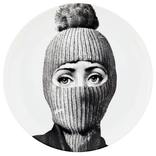
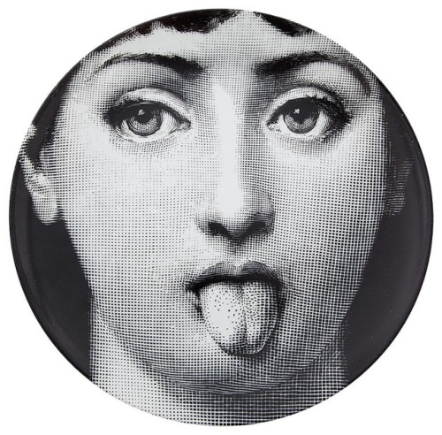
New, from one of my favorite tumblrs, Modern Hepburn.

So it truly has been forever (over a month!) since my last post but I’ve experienced some big changes that have commanded my attention: Left one job, freelanced for two others, and started a new full-time permanent gig. Whew. The last six months in general have been a big period of transition, but I can finally say I found somewhere I’m excited to stay and grow some roots. Two weeks ago, I joined Gap Inc. on their global creative team that oversees windows and in-store experience. Gap is a brand that I was obsessed with in middle school and followed ever since. To be here today is a bit unreal, but also very exciting. Go Gap!

Making it through this period affirmed a few things for me professionally. As a designer, it’s important to search for opportunities that make you happy. Work fills up so much of my time, so to spend my days and nights unfulfilled, is a waste … to me at least. YOLO. While no job is perfect, look for ways to get closer to finding it. It won’t happen overnight, it didn’t for me. Five years after graduation, I’m still on my grind making things happen. This experience affirmed to me that you truly have to put yourself and your goals first. The notion of having one job for the next 20 years is a bit outdated, at least in design (especially in nyc). If something doesn’t feel right, keep looking and don’t feel bad about it. Always keep an eye out for new opportunities and follow your heart to the opportunity that’s best for you. As corny as the sounds …

i did, and it was the most motivating moment in my life. 
— Georgia Whots, “Doing.” cir. 1933.

Anyways, enough of that rant! Now that I’m working at ONE place for the next who knows how long, I want to return to blogging and focusing on my side passions: textile + pattern design, photography, and cool design projects to curate and share. I’ve been spending lots of time on PinterestTumblr, and Instagram lately – so if you’re not following me there, do so and get into it!

tumblr_mr6aqksdMR1s6ofheo1_1280
ps.  I’m majorly into Gap’s new campaign “Back to Blue,” for many reasons. I love the subtle design – so new and fresh no? You can’t go wrong in anything blue or denim!

Follow Gap on tumblr  to see more!

tumblr_mrj7cwUos51s6ofheo1_1280-1

pss.  Follow me on all the things: PinterestTumblr, and Instagram 🙂

Read Full Post »

yellow_paint

“What a horrible thing yellow is”
Edgar Degas

To celebrate 500+ followers on Pinterest, I wanted to share some colour inspiration from some of my very own pins. I found the quote above and thought it was quite funny. Yellow is such a beautiful colour, how could someone say it’s horrible? You be the judge! And if you don’t follow me yet, follow me on Pinterest!

yellow_ikea book shelf

yellow_gin poster

yellow_door

yellow_architecture

yellow_suitcase

yellow_art school quote

yellow_fashion1

(more…)

Read Full Post »


It’s been a few weeks since my last post so I thought now would be a great time to update you guys on my freelance projects from the last few months. While things have been busier than ever at my day job (designing for Moroccanoil), I’ve been doing more and more freelance the last few months. One of the groups I most enjoy working with is ConnCAN,  an education non-profiled based in New Haven, CT. I was approached by ConnCAN last spring to work on a Field Guide (pictured above) highlighting the state of education in Connecticut. We were inspired by the graphic look of the Field Notes series of products, so we applied this theme to ConnCAN’s Field Guide.


The Field Guide is filled with lots of charts and tables all designed to match the “Field Notes” theme. I designed a set of icons that appear on each page to look like field guide badges. The look of this report was so well-recieved, that one of Deleware’s non-profit groups designed their own guide/report inspried by my design.

Another fun project I’ve been working on is a logo/branding project for a NYC-based fashion designer. After years of working for some of the biggest brands in the business, he’s decided to make his impact on the fashion world with his own label. I’m going to wait to show you the final product once his site launches, but I think some of the process/behind the scenes screen grabs are particularly beautiful. I don’t actually design that many true “logos,” nor do I do that much custom lettering, but for this project I had the opportunity to do both.

Custom “A” and “R” pictured above.

Playing with letterforms – beautiful no?

One last project I have in the pipeline is helping Two Inch Cuffs, a NY-based fashion lifestyle website, that curates an impeccable collection of clothing and accessories. I was approached by Ruben Hughes, a talented gentleman I’ve followed on tumblr for a year or two now. I’ve always admired the sense of style and taste he brings to Two Inch Cuffs.  So be sure to check out the site for Two Inch Cuffs, shop their collection, follow their journal and sign up for their newsletter, as the next one you recieve may be designed by me 🙂

One last shoutout to all the designers at Appalachian State University! I was told last week that my blog has been showed in studio classes for my thoughts on resume/portfolio design. It’s nice to come full circle, just a few short years ago I was in those same classes myself. So sending loves of love to ASU!


Read Full Post »

It’s been a while since my last post but a lot has happened in the last few months! No longer am I an unattached freelance designer, free to design for any client of my choosing. I’ve entered into an exclusive long-term (design) relationship with …. Moroccanoil! In a few days I’ll have been there 2 months. Time really does fly. While adjusting to a full-time work schedule, I’ve tried to blog here and there but I haven’t been able to get back into my grove, but I plan on changing that soon. I have a huge list of artists, designers, illustrators and photographers I’d like to share, and hopefully some new work of my own too.

I also want to celebrate that for the past FOUR consecutive months, I’ve hit 2,000 page views. While that pales in comparison to many design blogs out there, it’s miles away from the 17 views a months I had back in May 2010. This blog has been a great outlet for me to share inspiration and put into words my goals and passions, especially when it comes to design during my two years at Pratt Institute. Blogging turned into cheap therapy for a grad student that never felt at home in an MFA program. Good bad and ugly, it’s all here. And some really GREAT things have come from this blog too!

While studying abroad, I blogged about Scandinavian Textile Design and was featured on a few blogs about my travels through Sweden, Finland and Denmark. Blogging about the artists we saw and the showrooms we visited ignited my interest in learning more about textile design and writing about design in general. It also gave my blog a particular focus. Last summer I was completely shocked when I was invited to interview with a creative director that has and continues to make work I greatly admire. Last month my thoughts on resume design and interviewing were featured on another blog, also to my surprise. So while this remains a side hobby, no matter how small, your hobbies and interests can open doors! So here’s to opening new doors in the coming months and sharing more stories.
-Daniel

See more of my pin’d type quotes (here) on my pinterest.

Lastly, a quote from one of my favorite posts, and read more about Marimekko here.


Read Full Post »

A few days ago I blogged about interviewing and resumes, and I just stumbled across this post from Design Love Fest that expands what I was talking about earlier:

Q: “what do your resumes look like? are they design-y looking or no-frills?

A: Designed! when applying to a design job, your resume is often the first thing the art director sees. it’s an example of your type styling and layout skills. it doesn’t have to be jazzed with odds and ends — it can just be beautifully typeset. you want the information neatly organized with no more than three typefaces: a main headline text, a second for your dates and a third for the descriptions. anymore it will look too busy.

I agree, type choices, setting layout and layout are key! Not extra decoration and tricks.

Image

Katie’s before & After.

Image

Bri’s Before & After. Reminds me of mine, with all my extra decoration on it.

Image

Me (before).

Image

Me (currently).

Design Love Fest has a great blog & twitter, so get into it and feel the design love.

Read Full Post »


The wonderful people at J.Crew just released their 2012 J. Crew Collection and I stumbled across these images from their 770 Behind the Line blog. As we’re in the middle of winter here in NYC it’s refreshing to see COLOR! What I love so much about J.Crew (for women) is their playful use of color. They have really moved beyond the bland preppy-casual style of J.Crew in the 2000s. The J.Crew of today is so different than it was just 10 years ago. There are a few interesting articles about the transformation of J.Crew over the years under the direction of Jenna Lyons that are interesting to read. Seems like it was quite the battle but from what I’ve read, J.Crew has never done better. I wish the Men’s lines would take more risks and use more color/pattern, but I will say the NY Liquor/NYC Men’s stores are so much more well designed than the typical mall stores. So that’s something!

Anyways … what I really love about these pictures are the vibrant colors. As a male graphic designer, obviously I can’t wear this stuff (or could I? … jk), so I use this stuff as great inspiration. If I’m feeling uninspired or starting a new project, I love looking through my fashion image libraries and using the color picker in Photoshop/Illustrator to pick new color combinations. That’s one of the tricks I learned from my time in Copenhagen studying textile design. Interior design blogs and magazines are also great for this! Look for brands (or photos) that playfully use and MIX colors, and bring that to what you’re designing to create something new and surprising. Use something from one medium, be it fashion or interior design, and bring that to graphic design. Here’s what I mean:

So in love with these magenta pants .. gonna try to rock a colored pant this spring

So if this is something that is interesting to you, I have a few sites to check out.

1. J.Crew’s Behind the Line Tumblr.

2. Kate Spade’s Tumblr & Pinterest.

3. Design to Inspire Blog

4. My Tumblr! 🙂


Rebecca Bauman via J.Crew’s Tumblr.

Kate Spade NY’s Tumblr.

My Tumblr archive.


Read Full Post »

This weekend I finally made it to the new Marimekko NYC Flagship store just across from the Flatiron Building in NYC. I was curious to see how the design of the store might differ from the shops I saw in Helsinki and Copenhagen during my summer abroad. The NY store was pretty big and had lots of stuff in it! There are different sections for home products, bedding, kids stuff and women and MENS! fashion. I had no idea they were making men’s fashion items – but I’m glad they are. It’s worth stopping by to see all the beautiful printed textiles on the rolls and see how the designers apply these prints for different uses. You can notice how the scale of the pattern shifts for use on a pillow vs. a dress vs. a shower curtain or a coffee mug. It’s really inspiring to see all these beautiful prints housed together in one place and step into their colourful world.

I was also happy to find another copy of their Fall/Autumn mailer. I’d found a copy in the Copenhagen store and I really loved all the dark colors and reds they used together in that campaign. You can tell they’re making a push to enter the high fashion market and diversify beyond home goods. I think they’re off to the right track! Here are a few images below for your viewing pleasure.

I love the contrast between B&W and pops of red, so bold and graphic. Much more my style and taste .. too bad there is not a men’s version of this.

They also have a lot of pieces inspired by the beautiful birch trees found throughout most of Scandinavia.

I love the textile hanging at the bottom. Not sure how to use it on clothes, since it’s such a huge repeat. But it would look BEAUTIFUL framed/hung on a wall.

Here’s a look that pairs well with the pattern behind – but you can see they didn’t apply it directly to any pieces. It would have to be used very abstractly.

Also while you’re there, pick up their Holiday 2011 catalog.

I love the graphic design of all the Marimekko stuff- lots of big type.

Holiday Prints!

Looks like a party right? These dresses are pretty cool, with the black tights and shoes.

The store is located at 200 5th Ave in NYC – check it out!

Read Full Post »

As most of you know, last spring I was given the extraordinary opportunity to intern for the one and only Jonathan Adler, purveyor of all things happy and chic. Now is an exciting time because most of the things I’ve designed for JA are finally hitting stores and online. One of the items I’m most excited about is the Peace & Love coasters I designed. For this project, I had just a few hours to design two sets of coasters for Saks Off 5th. One design was to use a British Flag motif while the other should use art from the existing Peace & Love pillows. To make a long story short, Jonathan liked the coasters above so much, he decided to sell them in our stores and I created another simplified version of the Peave & Love artwork for Saks Off 5th.

I designed 4 different patterns using British Flag design motifs. I really likes the ones with the strips – very nautical right?

Final Design – available now at Saks Off 5th !!

Another big project was the packaging for the 2011 holiday ornaments. In the middle of March we designed these. Who knew Christmas came in the spring?

Mr + Mrs. Muse ornament packaging.

I created the pattern on the box, which is made of the iconic lips and mustache used in the Jonathan Adler Muse collection.

Another project that was super exciting is this line of typographic needlepoint pillows we designed for an upcoming Jonathan Adler book. The chapters of the book are divided into the following sections: dwell, embrace, explore, twist, and ponder. I love to play around with type, so this was the perfect project for me. I had the idea to limit each pillow to a few typefaces and colors. One pillow would have type in shades of green (dwell, see above), another red (twist) and another blue (ponder). One of the things I LOVED about working for Jonathan Adler was the ability to work on fun projects like this with crazy typefaces. In the design work I do for most clients, I’d never dream of using these typefaces, but somehow all together they’re fun and chic. Something about this style really works for Jonathan Adler and isn’t seen anywhere else.

One last project I was super excited about was a line or prints JA was developing for a big picture frame & art company. I’m not sure what happened to this project, but I spend several days coming up with really cool type prints based on Jonathan Adler’s “Alderisms” or words and phrases JA uses a lot in their stores. Sadly this is the only one I have a copy of. How cute would this be in your apartment right?

Read Full Post »

The end is finally in sight. Above is a photo of the newsprint posters I designed for This brings me joy: The Joy Project, which serves as the final project in my Pratt MFA Thesis. I’m trilled with how the posters turned out, despite last minute file issues when sending to the printer. I have over 1,000 of these posters, so if you’d like one, please let me know! The poster (above) opens further and larger discussing the project and giving opportunities for people to interact with the twitter account. I’ve started leaving these posters around the city, and will soon distribute all 1,000 of them.

After the newsprint poster was sent to the printer, I shifted ALL my focus to reworking my thesis paper – remember that? – the joyous 60+ page monster of a paper. After two weeks of work, I sent my totally reworked paper to my advisers, and now I’m patiently waiting for it to be accepted. As of now, I’m scheduled to defend on December 1st! So if all goes well, I should have all my final hurdles in completing this thesis done by the end of this week. So pray for me! I can’t even begin to tell you what a huge relief crossing these projects off my list has given me. I have so many ideas for all the projects I WANT to do, instead of HAVE TO finish, so in coming weeks I should have a bunch of new things in the works.

Before I wrap up this post – I wanted to share a GREAT source of inspiration I stumbled across in reworking my paper. I find the ideas of Bruce Mau to be very inspiring for what I’m trying to accomplish in my thesis, but they can apply to anyone really, designers and non-designers. Like Debbie Millman, I’m more interested in his ideas/approach to design than what he actually designs. As I say in my paper, “In my thesis, I’m investigating the power of joy and delight to grow as a designer and creator. Joy is an opportunity and has the power to transform and empower. This sense of empowerment can take countless applications, especially in design.” The ideas of Mau are a great example of a designer focused on the subject of growth, and an important precedent in my paper … so I wanted to share his ideas with you!

“An Incomplete Manifesto for Growth”

Written in 1998, the Incomplete Manifesto is an articulation of statements exemplifying Bruce Mau’s beliefs, strategies and motivations. Collectively, they are how we approach every project.

  1. Allow events to change you. You have to be willing to grow. Growth is different from something that happens to you. You produce it. You live it. The prerequisites for growth: the openness to experience events and the willingness to be changed by them.
  2. Forget about good. Good is a known quantity. Good is what we all agree on. Growth is not necessarily good. Growth is an exploration of unlit recesses that may or may not yield to our research. As long as you stick to good you’ll never have real growth.
  3. Process is more important than outcome. When the outcome drives the process we will only ever go to where we’ve already been. If process drives outcome we may not know where we’re going, but we will know we want to be there.
  4. Love your experiments (as you would an ugly child). Joy is the engine of growth. Exploit the liberty in casting your work as beautiful experiments, iterations, attempts, trials, and errors. Take the long view and allow yourself the fun of failure every day.
  5. Go deep. The deeper you go the more likely you will discover something of value.
  6. Capture accidents. The wrong answer is the right answer in search of a different question. Collect wrong answers as part of the process. Ask different questions.
  7. Study. A studio is a place of study. Use the necessity of production as an excuse to study. Everyone will benefit.
  8. Drift. Allow yourself to wander aimlessly. Explore adjacencies. Lack judgment. Postpone criticism.
  9. Begin anywhere. John Cage tells us that not knowing where to begin is a common form of paralysis. His advice: begin anywhere.
  10. Everyone is a leader. Growth happens. Whenever it does, allow it to emerge.

And here it is – the 1st page of the final paper, documenting my inquiry into joy … a year and a half in the making!


Read Full Post »

Older Posts »