Feeds:
Posts
Comments

Archive for the ‘Graphic Design’ Category

barnum-bailey-vintage-circus-poster-8


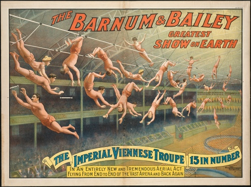
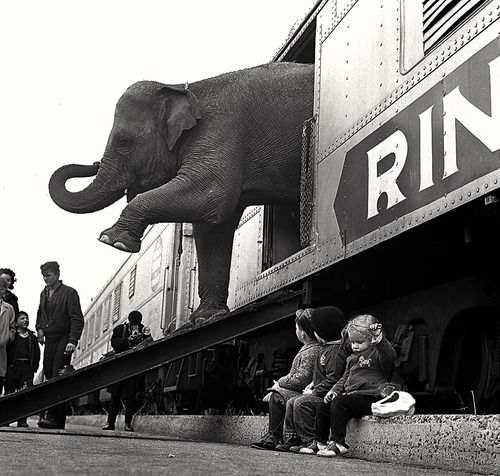
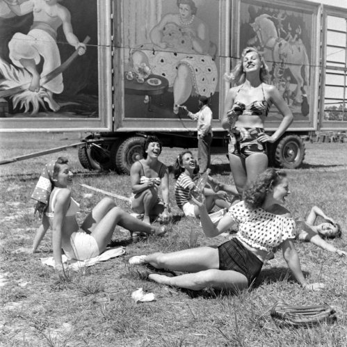
After more than a century, “the Greatest Show on Earth” is coming to and end. Recently it was announced that in May, the Ringling Bros. and Barnum & Bailey Circus will end after 146 years in business. The news comes after years of declining sales, animal rights protests and rising production costs. In modern times, this 100+ year old traveling act had to compete against the movies, Netflix, Hulu and every other form of entertainment. While I haven’t been to an actual circus in years, I’ve always thought there was something magical and romantic about it.

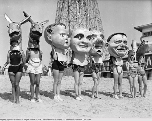
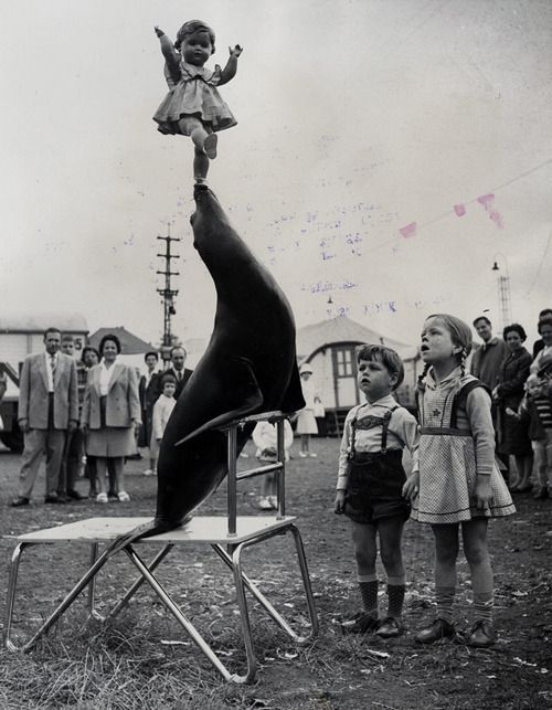
So to celebrate the final days of the circus, I wanted to share some pictures from this magical world.

circus_vintage_photo1

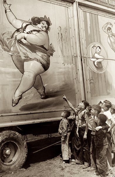
Equal parts mysterious and creepy, I’ve always thought the circus, and particularly vintage circus photos from the 1800-1950s, are so interesting!

vintage-circus-photos_2

vintage-circus-photos_1

vintage-circus-photos_4
Life Visits the Circus
(more…)

Read Full Post »

Marie-Stella-Maris-Amsterdam-Netherlands-06

The next time you find yourself in the Netherlands, you’d be mad to not check out the beautiful flagship store of lifestyle brand MARIE-STELLA-MARIS. Located in central Amsterdam, MARIE-STELLA-MARIS sells body, skin, and hair care products in addition to it’s namesake line of Mineral water and home products. This store is a graphic designers paradise, bold graphic typography, beautiful packaging and advertising, and a tastefully-designed interior to bring everything together. MSM was founded by founded by Patrick Munsters, who strongly believes in the idea of taking care of one another. MSM products are made with only the finest natural ingredients, and for each product you purchase, MARIE-STELLA-MARIS donates a fixed amount towards clean drinking water projects worldwide.

Marie-Stella-Maris-Amsterdam-Netherlands-Founder

I’m pretty much in-love in every aspect of this brand, from their mission, to their branding, store design and packaging. All of it is so clean, graphic and minimal. And by supporting this brand, you’re helping someone in need. It’s a win-win! So get into world of MARIE-STELLA-MARIS, and check out their website and foundation here. Get into it!

Marie-Stella-Maris-Amsterdam-Netherlands-04 Marie-Stella-Maris-Amsterdam-Netherlands-Interior1 Marie-Stella-Maris-Amsterdam-Netherlands-Interior2 Marie-Stella-Maris-Amsterdam-Netherlands-Interior3 Marie-Stella-Maris-Amsterdam-Netherlands-Interior4

Isn’t their production photography + advertising beautiful?? (above and below).

Marie-Stella-Maris-Amsterdam-Netherlands-Products2 Marie-Stella-Maris-Amsterdam-Netherlands-Products3

Marie-Stella-Maris-Amsterdam-Netherlands-05 Marie-Stella-Maris-Amsterdam-Netherlands-AdvertisingTotally obsessed! You can buy their products online here, and they even offer international shipping! Get into it.

Read Full Post »

tumblr_nm6hwnVHVG1qew4muo1_1280

Yesterday on Tumblr, I stumbled across this awesome series of heart prints and immediately fell in love. How great do these look in a series? So bold and graphic! After some research, I discovered these prints are the work of British graphic artist Patrick Thomas. This series was featured in Thomas’ 2013 London exhibition, ‘100 BPM.” The show was a series of silkscreened bold heart ideograms combined with found imagery and collage, a recurring motif throughout the exhibition, which was timed to coincide with the Feast of Saint Valentine. The majority of works were limited editions and unique pieces created using free-form screenprinting and collage. Much of Thomas’ other work is super graphic in nature, so naturally I love everything! According to the Hang-Up gallery in London,

Thomas has been described as an ‘icongraphiste’ by American design critic Steven Heller. His work combines iconic images to create new, powerful messages. His art avoids labels, Thomas explains “I’m interested in process, in typography, in image-making and art. What I do is hopefully something that doesn’t fit neatly into any one of these categories.

patrick-thomas-heart-target-100-bpm

I’m super-inspired by this series, and the larger body of work by Thomas. It really motivates me to start designing some of my own projects. I’m jealous that he’s already done so much work with this heart/love/target motif, but maybe there’s a way I can take this idea and put a new spin on it? I might also look into purchasing some of these prints, I’d love to get a least 4 for my apartment and hang them together. So feel the love (like I did) and get into the awesome work of Patrick Thomas!

patrick-thomas-heart-target-001 patrick-thomas-heart-target-fluoro-II patrick-thomas-heart-target-IX patrick-thomas-heart-target-te-amo

(more…)

Read Full Post »

Cover design for Esquire Magazine by George Lois 1968

Esquire is a monthly mens magazine first published in 1933 with the mission “to become the common denominator of masculine interests—to be all things to all men.” Well 82 years later, Esquire is still around with several international editions and it’s own cable TV network. I’m a particularly a huge fan of some of their iconic covers from the 1940s and 50s, and their  type-heavy covers of today. When I was in Nashville, TN over Christmas, I saw a clothing store that use spreads and covers from vintage issues as wallpaper. The images were so graphic and cool – now I’m on a mission to find some of my own. Until then, check out a few of my favorites through the years. Get into it.

Esquire cover Holiday 1959 Esquire LBJ cover. June 1967 Esquire Magazine | April 1954 Esquire Magazine 1956 Esquire Magazine cover from October 1956

Esquire magazine, June 1965, Great Britain. Cover, %22007%22 Sean ConneryHow great are these vintage covers (above)? Some of these covers were so iconic, they were redone years later …

Esqure 1966

60 Years of Women We Love, 1966 (above).

Esquire 2003 Britney Spers

Britney Spears, 2003 (above).

Esquire Robert Downey Jr Esquire Spain _Woody Allen Esquire_Malaysia Spanish Esquire

Today Esquire seems to be know for their type-heavy expressive covers. Can’t get enough of these! And for George Clooney.

George Clooney Esquire (Malaysia) George Clooney Esquire_Russia George Clooney_Esquire Singapore George Clooney_Esquire USA

Seems like he’s graced the cover more than anyone else. But of course I can see why. If you enjoyed this post, check out my entire Pinterest board dedicated to magazine covers here.

Get into it!

Read Full Post »

Sephora_Holiday_2014_2Hope everyone had a merry merry Christmas! Another brand I’ve had my eye on this holiday season is Sephora. I saw their store windows in both San Francisco and NYC this year, and I’m loving the playful patterns, bright colors and model images mixed in. Looks very festive and “holiday” looking without resorting to making everything red and green. I also love how elevated everything looks. Job well done Sephora! Check out more images from the campaign and their Holiday packaging below. Get into it!

Sephora_Holiday_2014_3 Sephora_Holiday_2014_4 Sephora_Holiday_2014_5 Sephora_Holiday_2014_6 Sephora_Holiday_2014_7 Sephora_Holiday_2014_8

Cute right? Hopefully you saw some of this stuff under your tree this year. If no, go treat yo self!

Read Full Post »

flatiron_9One project I’ve been OBSESSED with for a while is the wheatpaste posters in Nike’s RUN Flatiron NYC store. For the project, Nike commissioned several designers to create graphic posters on the subject of running, NYC and the brand itself. The posters are so graphic and bold individually, but look great together. I love this style of guerrilla advertising and would love to do something like this for a brand I’m working for one day. It looks like the Portland-based The Pressure and designer Josh Finklea, and Travis Barteaux (amount others) worked on this project – definitely check out their sites. I really admire how Nike (and the designers) took risks and created bold stuff like this. It really works for them. So get running, and get into it!

Nike_RUN_Flatiron_2014-06-18+at+7.47.04+PM Nike_RUN_Flatiron_2014-06-18+at+7.47.28+PM Nike_RUN_Flatiron_2014-06-18+at+7.48.08+PM Nike_RUN_Flatiron_2014-06-18+at+7.48.44+PM

1406242442904 1406242744379 1406242882724

Nike_RUN_Flatiron_Instore_1

(more…)

Read Full Post »

i_am_a_man-protest2

While I don’t like to get super “political” these days, the the events in Ferguson (and across the country) have been on my mind. In some ways it’s amazing how far we’ve come as a country, but these events are a clear reminder of how far we still have to go. I’m reminded of images from a 1968 Civil Rights protest in Memphis. The images are so strong and powerful, and from a design/type sense, quite beautiful and well-designed. We’re all men (and women), all the same.

i_am_a_man-poster1 i_am_a_man-poster2 i_am_a_man-protest1 i_am_a_man-protest3 i_am_a_man-protest4

i_am_a_man-poster4“All men are created equal …” Equality is a beautiful thing! Get into it.

Read Full Post »

6522273_1_l[1]

Roy Lichtenstein American Flag, 1985 (above).

At work our design team spends lots of time looking at all things America(n) and objects that symbolize American style. And what does this better than the American flag? Nothing! One of my new interests is finding different ways the flag can been graphically re-represented, especially by designers and artists. I’d never really thought about the American flag in this way, so I love seeing how creatively it can be recreated. In this post are some of my favorite modern twists on the classic American classic. Get into it, and may God continue to bless America.

19-dissent7-450

0969e103445a6186bf9dec36cd7aca23

1528ba6e5da1ba02a72bd2eb1135a4f4

9379d55e7b3d080c060574fe1519719d

60429ec71162f712d5123d2956a5fe6b (more…)

Read Full Post »

Sonny Clark Blue Note record cover

Sonny Clark Blue Note Album Cover (above).

The other week I blogged about vintage jazz album covers and today I wanted to share a second round of favorites from this period. Many of these album covers were designed by Reid Miles for Blue Note Records. According to Wikipedia, “After working in New York in the early 1950s for John Hermansader and Esquire magazine, Miles was hired in his own right around 1955 by Francis Wolff of the jazz record label Blue Note to design album covers when the label began releasing their recordings on 12″ LPs. Miles designed several hundred covers, frequently incorporating the session photographs of Francis Wolff and, later, his own photographs, although many of his later designs dispensed entirely with photographs.” It’s pretty amazing he designed hundreds of these covers, what a great artist output! Hopefully one day I can get my hands on some of these classic covers. Get into it.

Gil Melle Patterns in Jazz Album Cover
Gil Melle Patterns in Jazz Album Cover (above).

Indestructible by Art Blakey. Cover design by Reid Miles

It's Time by Jackie McLean. Cover design by Reid Miles
It’s Time by Jackie McLean. Cover design by Reid Miles (above) – love this one typographically!

Joe Henderson. Cover design by Reid Miles
Joe Henderson. Cover design by Reid Miles (above).

Let Freedom Ring by Jackie McLean. Cover design by Reid Miles
Let Freedom Ring by Jackie McLean. Cover design by Reid Miles (above).

Midnight Blue by Kenny Burrell Cover design by Reid Miles
Midnight Blue by Kenny Burrell Cover design by Reid Miles (above).

The Magnificent Thad Jones Blue Note 1527 12" LP 1956
The Magnificent Thad Jones Blue Note 1527 12″ LP 1956 (above).

Thelonious Monk with Sonny Rollins and Frank Foster (1954)

Thelonious Monk with Sonny Rollins and Frank Foster (1954, above). This particular cover was done by Andy Warhol, he did a whole series of album overs which are pretty great.

(more…)

Read Full Post »

Jazz LP covers from the 1940s to 1990s TASCHEN

I’ve seen this “Jazz Covers” book for a while now and after stumbling across a ton of beautiful typographic + illustrated album covers on pinterest, I couldn’t wait to share a few of my favorites. Most of these classic covers were designed by Reid Myles for Blue Note Records. It’s cool how the design of these covers mimic the expressive nature of the music on the albums. Design inspiring art indeed. I can’t wait to get my hands on this series of books from Taschen. Here are a few of my favorites below. Get into it.

Kenny Dorham Blue Note 4127 (1963)
Kenny Dorham, Blue Note 4127 (1963) (above).

Andy Warhols Early Jazz Cover
Andy Warhol early Jazz cover (above).

BLUE NOTE 7018 - Boogie Woogie Classics - Meade Lux Lewis 1944
BLUE NOTE 7018 – Boogie Woogie Classics – Meade Lux Lewis 1944 (above).

Bongoes Reeds Brass Vol. 2 (1961)
Bongoes/Reeds/Brass Vol. 2 (1961) (above).

Dexter Gordon's Our Man in Paris by Francis Wolff & Reid Miles 1963
Dexter Gordon’s “Our Man in Paris” by Francis Wolff (photo) & Reid Miles (design), 1963 (above).

Duke Ellington Historically Speaking LP 1956
Duke Ellington: Historically Speaking Label: Bethlehem BCP 60 12” LP 1956 Design (above).

(more…)

Read Full Post »

Older Posts »