Feeds:
Posts
Comments

Archive for the ‘dcwdesign Projects’ Category

ap-frame-413-oklahoma-theatre-poster-1943

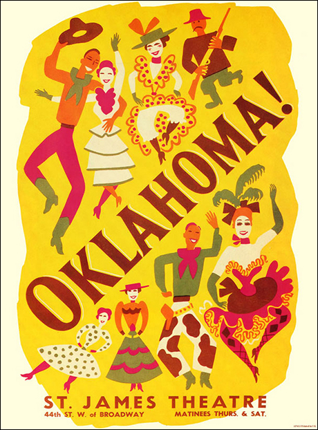
Vintage Playbill for Oklahoma

As 2016 draws to a close (thank God!), instead of dwelling on all the awful events of the past 365 days, I’m searching for new ways to ignite my creative passion, find joy in side projects, and create abundance through my abilities. Sounds lofty right? Well, it really all goes back to my Pratt MFA thesis I recently blogged about after the election.

marthagraham1

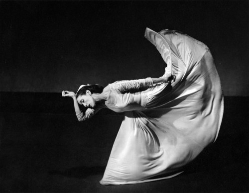
Martha Graham (above).

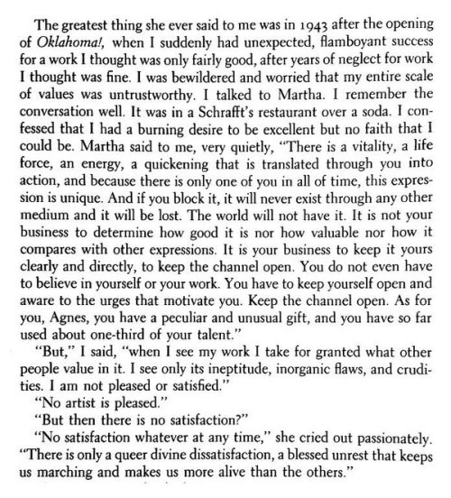
So what does this have to do with Oklahoma!? Over the weekend, I stumbled across on Instagram post from the Ace Hotel of a page from Agnes de Mille’s biography of Martha Graham. For those who don’t know, Martha Graham was a LEGENDARY dancer and choreographer who’s artistry is compared to that of Frank Lloyd Wright and Picasso for her contribution to the arts. In the passage, Agnes de Mille had recently found wild success  for her work for Oklahoma!, a new musical that became an overnight success. But de Mille wasn’t satisfied as she felt like she’d done better work before that never reached the same success or acclaim.

de Mille states to Graham,


“I had a burning desire to be excellent,

but no faith that I could be” 

In response, Graham gives the most amazing advice, which certainly speaks to me as a designer, but is applicable to artists in all mediums. Graham says,

“There is a vitality,
a life force,
a quickening
that is translated through you into action,
and because there is only one of you in all time,
this expression is unique.

And If you block it, it will never exist through any other medium and be lost.
The world will not have it. It is not your business to determine
how good it is
nor how valuable it is
nor how it compares with other expressions.

It is your business to keep it yours clearly and directly
to keep the channel open.
You do not even have to believe in yourself or your work.
You have to keep open and aware directly to the urges that motivate YOU.

Keep the channel open…
No artist is pleased…

There is no satisfaction whatever at anytime
There is only a queer, divine dissatisfaction
a blessed unrest that keeps us marching
and makes “us” MORE alive than the others.”

Martha Graham
( – a letter to Agnes De Mille-)


Amazing right?? The Instagram post (below) literally stopped me in my tracks. I struggle constantly with a feeling of not being “good enough,” or not having an idea that’s original enough. So much so that I typically don’t start anything at all. I’m the one blocking my “channel” .. the only thing (or person) standing in my way is me!

b1sjqm0igaa0xpy

So that’s the plan for 2017, to keep my channel open. Create abundance with my abilities, and return to a state of joy through exploration, making and sharing my work. I hope you’ll join me on my journey!


Read Full Post »

tumblr_lxutqkvgkJ1qz6f9yo1_r1_500
New, from one of my favorite tumblrs, Modern Hepburn.

So it truly has been forever (over a month!) since my last post but I’ve experienced some big changes that have commanded my attention: Left one job, freelanced for two others, and started a new full-time permanent gig. Whew. The last six months in general have been a big period of transition, but I can finally say I found somewhere I’m excited to stay and grow some roots. Two weeks ago, I joined Gap Inc. on their global creative team that oversees windows and in-store experience. Gap is a brand that I was obsessed with in middle school and followed ever since. To be here today is a bit unreal, but also very exciting. Go Gap!

Making it through this period affirmed a few things for me professionally. As a designer, it’s important to search for opportunities that make you happy. Work fills up so much of my time, so to spend my days and nights unfulfilled, is a waste … to me at least. YOLO. While no job is perfect, look for ways to get closer to finding it. It won’t happen overnight, it didn’t for me. Five years after graduation, I’m still on my grind making things happen. This experience affirmed to me that you truly have to put yourself and your goals first. The notion of having one job for the next 20 years is a bit outdated, at least in design (especially in nyc). If something doesn’t feel right, keep looking and don’t feel bad about it. Always keep an eye out for new opportunities and follow your heart to the opportunity that’s best for you. As corny as the sounds …

i did, and it was the most motivating moment in my life. 
— Georgia Whots, “Doing.” cir. 1933.

Anyways, enough of that rant! Now that I’m working at ONE place for the next who knows how long, I want to return to blogging and focusing on my side passions: textile + pattern design, photography, and cool design projects to curate and share. I’ve been spending lots of time on PinterestTumblr, and Instagram lately – so if you’re not following me there, do so and get into it!

tumblr_mr6aqksdMR1s6ofheo1_1280
ps.  I’m majorly into Gap’s new campaign “Back to Blue,” for many reasons. I love the subtle design – so new and fresh no? You can’t go wrong in anything blue or denim!

Follow Gap on tumblr  to see more!

tumblr_mrj7cwUos51s6ofheo1_1280-1

pss.  Follow me on all the things: PinterestTumblr, and Instagram 🙂

Read Full Post »

dcwdesign_typography_served

Today I got quite the surprise in my inbox from the folks at Behance. My work for Jonathan Adler is being featured on Typography Served, a site with curated work from leading creatives on Behance. What an honor! Thanks Behance!

Read Full Post »

dcwdesign_youth_presentation_2.1.2012_p2.indd

Several weeks ago, I was invited to speak at the United Nations Youth Assembly about my 2010 trip to Australia for the 63rd UN DPI/NGO Conference. I blogged about my experiences in Australia (here), and blogged a lot about this trip inspiring my Pratt MFA thesis. So when I was asked to speak to youth about my experiences at the UN, I gladly accepted! I was nervous speaking to experts in the field about my outside experience in Australia several years earlier but also thought my outsider perspective might resonate with other youth people at the conference. I remember attending a conference like that three years ago (read here) and wanting to connect with the speakers but never really got there. With this in mind, I focused my presentation on the importance of youth and why design matters.

dcwdesign_youth_assembly_tag

My ID tag, officially welcoming me into the United Nations!

youth_presentation_2.1.2012_p2.indd youth_presentation_2.1.2012_p2.indd

One of the biggest points I made is the amazing potential designers and nonprofits have when they collaborate together. Collaborations between unexpected partners often lead to unexpected and surprising results. One prime example is my experience as a graphic designer at a UN Conference centered on Public Health. Attending this conference sparked my interest in the subject of joy and using one’s skills and abilities to create change in the world. Many of the projects we created in the class at Pratt strove to do just that.

youth_presentation_2.1.2012_p2.indd

Kelsey Welsch redesigned the MDGs icons and created an amazing project linking Material Health to all the other MDGs. youth_presentation_2.1.2012_p2.indd youth_presentation_2.1.2012_p2.inddThe MDG Youth village created by myself and students at Fordham University.

In closing, I wanted to bring focus from design back to YOUth, and end on an aspirational note. On the last day of the Australia conference, Patrick Ip (my roommate for the week) spoke about “What and Why” in regards to youth. He said, “Often youth are defined by WHAT we are; teacher, student, doctor, etc … not WHY we do it. Many of us, no matter WHAT we do, want to help, and it’s important to focus on WHY. For when we define ourselves by WHAT we do, we limit what we are capable of doing. But when we define the WHY, the possibilities are endless.” This really spoke to me on the last day of the conference and is still something I think about today. If there was one thing people took from away my speech, I hoped it would be Patrick’s great words.

youth_presentation_2.1.2012_p2.indd

dcwdesign_youth_assembly_room

A packed house of students from all over the world.

youth_presentation_2.1.2012_p2.indd

If you want to learn more about designers and nonprofits/NGOs partnering together, check out Pratt’s Project Public initiative. And remember, if you focus on the WHY in life, and not come from a place of WHAT, any door can be open to you no matter what you do in life. Cheers!

youth_presentation_2.1.2012_p2.indd


Read Full Post »


It’s been a few weeks since my last post so I thought now would be a great time to update you guys on my freelance projects from the last few months. While things have been busier than ever at my day job (designing for Moroccanoil), I’ve been doing more and more freelance the last few months. One of the groups I most enjoy working with is ConnCAN,  an education non-profiled based in New Haven, CT. I was approached by ConnCAN last spring to work on a Field Guide (pictured above) highlighting the state of education in Connecticut. We were inspired by the graphic look of the Field Notes series of products, so we applied this theme to ConnCAN’s Field Guide.


The Field Guide is filled with lots of charts and tables all designed to match the “Field Notes” theme. I designed a set of icons that appear on each page to look like field guide badges. The look of this report was so well-recieved, that one of Deleware’s non-profit groups designed their own guide/report inspried by my design.

Another fun project I’ve been working on is a logo/branding project for a NYC-based fashion designer. After years of working for some of the biggest brands in the business, he’s decided to make his impact on the fashion world with his own label. I’m going to wait to show you the final product once his site launches, but I think some of the process/behind the scenes screen grabs are particularly beautiful. I don’t actually design that many true “logos,” nor do I do that much custom lettering, but for this project I had the opportunity to do both.

Custom “A” and “R” pictured above.

Playing with letterforms – beautiful no?

One last project I have in the pipeline is helping Two Inch Cuffs, a NY-based fashion lifestyle website, that curates an impeccable collection of clothing and accessories. I was approached by Ruben Hughes, a talented gentleman I’ve followed on tumblr for a year or two now. I’ve always admired the sense of style and taste he brings to Two Inch Cuffs.  So be sure to check out the site for Two Inch Cuffs, shop their collection, follow their journal and sign up for their newsletter, as the next one you recieve may be designed by me 🙂

One last shoutout to all the designers at Appalachian State University! I was told last week that my blog has been showed in studio classes for my thoughts on resume/portfolio design. It’s nice to come full circle, just a few short years ago I was in those same classes myself. So sending loves of love to ASU!


Read Full Post »

As most of you know, last spring I was given the extraordinary opportunity to intern for the one and only Jonathan Adler, purveyor of all things happy and chic. Now is an exciting time because most of the things I’ve designed for JA are finally hitting stores and online. One of the items I’m most excited about is the Peace & Love coasters I designed. For this project, I had just a few hours to design two sets of coasters for Saks Off 5th. One design was to use a British Flag motif while the other should use art from the existing Peace & Love pillows. To make a long story short, Jonathan liked the coasters above so much, he decided to sell them in our stores and I created another simplified version of the Peave & Love artwork for Saks Off 5th.

I designed 4 different patterns using British Flag design motifs. I really likes the ones with the strips – very nautical right?

Final Design – available now at Saks Off 5th !!

Another big project was the packaging for the 2011 holiday ornaments. In the middle of March we designed these. Who knew Christmas came in the spring?

Mr + Mrs. Muse ornament packaging.

I created the pattern on the box, which is made of the iconic lips and mustache used in the Jonathan Adler Muse collection.

Another project that was super exciting is this line of typographic needlepoint pillows we designed for an upcoming Jonathan Adler book. The chapters of the book are divided into the following sections: dwell, embrace, explore, twist, and ponder. I love to play around with type, so this was the perfect project for me. I had the idea to limit each pillow to a few typefaces and colors. One pillow would have type in shades of green (dwell, see above), another red (twist) and another blue (ponder). One of the things I LOVED about working for Jonathan Adler was the ability to work on fun projects like this with crazy typefaces. In the design work I do for most clients, I’d never dream of using these typefaces, but somehow all together they’re fun and chic. Something about this style really works for Jonathan Adler and isn’t seen anywhere else.

One last project I was super excited about was a line or prints JA was developing for a big picture frame & art company. I’m not sure what happened to this project, but I spend several days coming up with really cool type prints based on Jonathan Adler’s “Alderisms” or words and phrases JA uses a lot in their stores. Sadly this is the only one I have a copy of. How cute would this be in your apartment right?

Read Full Post »

Click image above to flip through entire book!

If you follow the link above, you can literally flip through one of my two inspiration sketchbooks I created during my 7 weeks in Copenhagen. During our study tour of Sweden and Finland we were instructed to collect everything: scarps of paper, brochures, posters, postcards, anything. Everyday we had drawing assignments to help us get used to sketching and drawing inspiration. As someone that doesn’t consider themselves a strong drawer, this was quite a challenging exercise. So many times I take pictures or collect them online so I can “remember” something I liked. While it’s good practice to document as many sources of inspiration one can find, something magical happens when you take time to draw it. Taking the extra time to figure something out and draw the lines and angles cements it in your mind much more vividly than a picture can. We take pictures in a secon, and we quickly forget about them. With drawing you are investigating and thinking about what you see, and transfering it from life onto the page. Milton Glaser talked a lot about this during this summer course. He also talks about it a lot in his book, Drawing is Thinking. In The Accidental Masterpiece, Michael Kimmelman talks about this too. He says,

“Cameras made the task of keeping a record of people and things simpler and more widely available, and in the process reduced the care and intensity with which people need to look at the things they wanted to remember well, beacuse pressing a button required less conectration and effort than coposing a percise and comely drawing.”

But this isn’t a post about drawing per say. It’s more a post about process and the documentation of mine during my trip. One of the greatest hallmarks of Scandinavian Design is process. We were told this again and again. We were encouraged to experiment, make, sketch, paint and take pictures. Many of our experiments were trail and error but together culminated in our final textile designs. In this course, the process was more important than the final product. This is in stalk contrast to design education in the US. I can say this honestly because there’s many times I’ve done a project in a night or two days, totally disregarding process. While this helps me and other designers get by, we’re not really learning anything. We often resort to ideas we already had and that process gets exhausting. We’re left with uninspired work and no new ideas. That’s why process is so important. After this trip I feel more full with ideas for design projects than ever before. A lot of this I credit to the first mentioned sketchbooks!


I loved the shades of greens and brown I saw on buildings in Helsinki, Finland. The organ pipes appear many times in my sketchbook – I think they’d make a great pattern so that’s something I hope to work with later on.

A study of black & white.

This is a free giveaway we were given at Valilla Interior. I loved the colors and graphic patterns of their textiles. Instead of keeping this brochure in a folder I decided to bite the bullet, cut it up and glue it into my book. Now all my inspiration is together and in context with similar inspiration.

Illums Bolighus is a BEAUTIFUL store in Denmark and Sweden. It’s part design store, part kitchen, bath, home, and clothing department store. Basically they have everything you need to make your home beautiful. They also have beautiful ads like this one above. In love with the shades of grays here.

I ripped this down from the street in Copenhagen. Love the ripped edges too – gives it some character. Don’t be afraid to leave edges unfinished and rough, you can use it to create interest in your sketchbook or design work later on.

In this page I ripped up a Marrimeko ad to try and create something new. The opposite page is one of the early circles exercises I drew in the process of creating my final print.

Here’s an example of printed things I found during my trip. I saved everything and glued them into this book. Now its all in one place anytime I need to look at it. To see the entire sketchbook, go here!

Now when I look back at this book, I can isolate type treatments, color combinations, textures, techniques, and general inspiration for new projects. I tried to think of each spread as a compositions by mixed unrelated materials together creating new juxtapositions. Now I can’t take all the credit for collecting and documenting design in this style. All the credit goes to one of our instructors, Helle Vibeke Jensen. We visited her studio early in our trip and that day had a profound effect on everyone in the program. Helle Vibeke has been keeping sketchbooks in this manner for YEARS. Her studio is a library of cataloged inspiration from all over the world. Each time she goes on a trip, she buys a new Moleskine and begins collecting scraps and drawing. Here’s some photos from our studio visit.

Above: Her studio. Loved these blue chairs. Makes me dream for my own studio one day.

One of her many supply and inspiration drawers. So much fun stuff to play with.

Helle Vibeke’s library, full of her sketchbooks and books she’s illustrated and designed. To see more of her work, check out her website here.

Read Full Post »

Above is my final digital textile print !!! It’s all lead up to this 130x130cm piece of fabric. At this point (above) in the printing process it was drying before the washes started. While digital printing seems quicker because everything is printed from a super fancy fabric plotter, you still have to do ALL the washes. Also steaming and washing a huge piece of dark fabric is also tricky … and heavy when wet. But after a few hours of work, my piece is printed, steamed, washed, boiled, washed, dried, and ready to hang! I’ll give you a guys a peak into the process for the creation of my print.

As for inspiration for my print I kept noticing/sketching circle patterns. I noticed them again and again on our study tour. Circles were in the piles of wood, on the manhole covers, street signs, and were strong elements in one of my favorite monuments in Finland. During the study tour our primary task was to create a sketchbook documenting our inspiration. I collected and drew anything I found or saw that was interesting. Here are a few of my favorite pages, many of which you’ll see inspired my print.

Above: The yellow and oranges here were used in my final print.


I have an entire Moleskine filled from the study trip. Normally when I go on trips or look for inspiration I just take photos. I think to myself, “I have a photo, that’s enough, I can go back to it later.” But how many times do we actually go back to those photos? Not very often in my case. Drawing the actual thing, or printing the photo out and writing notes about it in a book crystallizes the memory so much more vividly. I took found pieces of design I liked, booklets, posters from the street, and combined these with drawings, color swatches and notes to create a visual diary full of inspiration. Now anytime I want to look for an idea from the trip, it’s all in one place, and having a physical object is so much nicer than photos on the computer.

So I knew I wanted to create a pattern with circles, and I’d been greatly inspired by all the Scandinavian design I’d been experiencing over the last few weeks. In the beginning a lot of my designs were very retro looking, which I liked. But this direction got away from my original idea creating a pattern that dealt with circles, in wood specifically. The rings of a tree make really beautiful patterns in wood – so why not a print ?!? So I began to move back to that direction and I came up with this final design (below).

Above: The final print and color way, dark blue background with accents of white, yellow, and light blue.

Above: Light background color way. I liked this too but thought the dark background had more depth and contrast.

Above: For some reason this reminds me of candy – like candy canes.

THE PRINTING PROCESS …

The textile prints from a fancy digital textile printer ..

Fabric is loaded like a roll of paper then printed on.

(more…)

Read Full Post »

As many of you know, I’m currently enrolled at the DIS school in Copenhagen for six weeks learning about textile design. I spent last week blogging about all the amazing designers and artist we’ve come across. Now I’ll show you some of what I’ve been working on. Since we returned from our study tour two weeks ago, we’ve been in the studio everyday printing and creating textile samples.

First we started with the heat transfer method. With this type of printing, you mix dye to create colors, then paint them onto pieces of paper. Once this is dried, you can cut out shapes, layer, and overprint these pieces of dyed paper to create patterns. Once you’ve created your design, you place the dyed paper onto the fabric’s surface, then apply heat. We used a heat press machine, but I assume this could be done by ironing at home. The nice thing about this meathod – you see immediate results, and there isn’t a lengthy wash process, like with screen printing. The bad part, when using synthetic fabric, this particular dye comes out totally different than it looks in dye form or even on the dry paper. The colors change so much when applied to heat. After much trail and error, I came up with these two designs inspired by wood patterns I kept seeing during our trip.

My first attempt at layering with heat transfer to create something tree-looking.

My finished design, using four layers. From background green to black on top, hiding registration marks.

After a few days of this method, we moved to screen printing with fabric and dyes. I’ve had experience with ink and paper screen printing so the process came quickly to me. BUT – fabric takes SOOO much longer to dry, so I quickly became frustrated by how much longer screen printing fabric takes. If you don’t wait for your layers or dry, you’ll ruin your print and the colors will mix or run. The first few days we used cut outs and open screens to create designs. This is a great way to screen print at home. It’s very similar to the method of using contact paper to create a stencil. The last few days we burned a screen to create a stencil with photo emulation. This allows for more intricate designs with finer detail. While I love screen printing, each design has to be steamed, then washed in cold and hot water (4 or 5 washes sometimes), then boiled, washed one more time, then dried. By this point your colors have likely changed and faded. One of my plaid designs I was so excited about pre-wash faded into light neon pastels post-wash. But it’s all part of the process I guess.

Above: First stripe design created using paper cutouts.

Above: My final stripe design.

Above: My paid before washing (and fading).

This design was created using cutouts, which I later turned into a series studying overlapping.

Below: After this series, I moved to photo stencils, and I created the following designs:

I wanted to create a series of 3 textiles with the same colors and different variations on the same theme.

Above may be my final pattern turned into a digital print .. but I’m coming up with some new ideas this weekend.

In this design I played with just my stencils and no solid circles of color.
The colors aren’t quite right but interesting to see.

Read Full Post »

St. Vincent’s Hospital “Place Project” — Full View

Here are screen shots of my finals projects after my first semester in Pratt’s MFA program. This year I was in three studios, Graduate Seminar, and Thesis (17 hours — before this point, I had never taken more than 9). While some classes I really enjoyed (Visual Language and Transformation Design), one in particular I felt absolutely no connection with (Technology Studio). Despite my lack of enthusiasm for Technology Studio, I’m really happy with my final project, “Romantically Uninvolved: 2010 Annual Report” — an annual report on my “dating life” (of lack there of) during 2010. Once everything is posted and presented, I will spend more time talking about each project. So enjoy the pictures, they’re probably better than whatever BS MFA artist statements I’ll come up with later 😉

Close-up of St. Vincent’s Poster, 26×42 Poster, Visual Language Studio

A peak into my “Creative Process”(a mess). 30×30 Poster, Transformation Design Studio

Close-up of “Process” Poster, “Let your haters be your motivators”

Cover of “Romantically Uninvolved: 2010 Annual Report” 20-page Report, Technology Studio

Interior Spread

Close-up of NYC Map in Annual Report.

Read Full Post »

Older Posts »