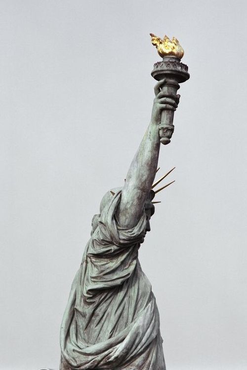
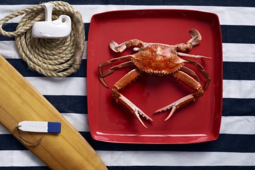
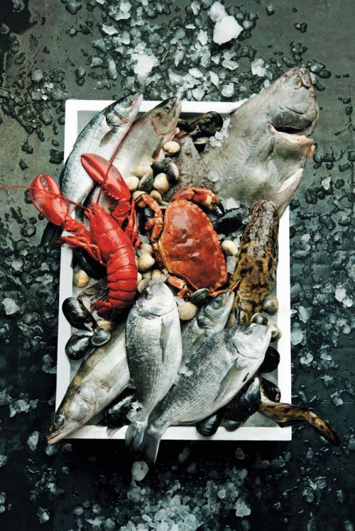
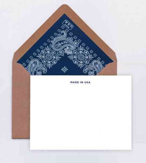
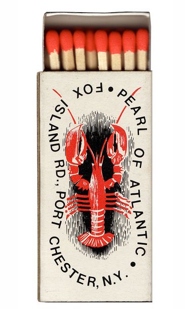
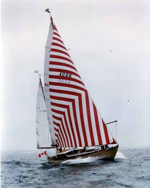
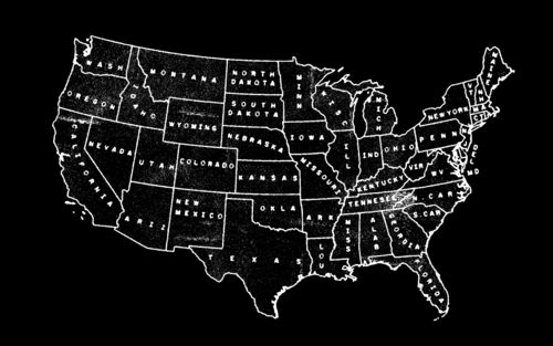
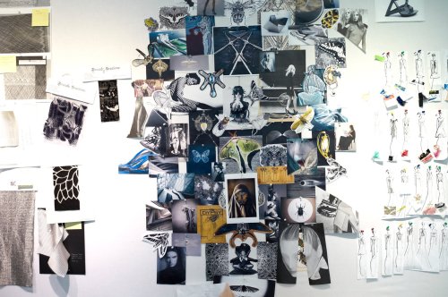
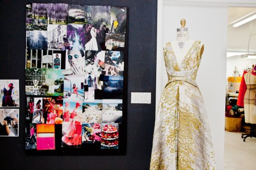
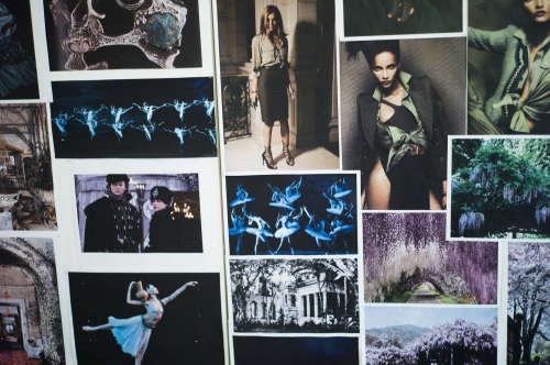
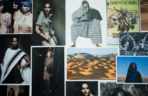
Continuing with my series of American-themed posts celebrating Memorial Day, today I’m sharing an “American Summer” collection/mood board of images I put together for a work project. One of my favorite parts of the design process is gathering inspiration. I love grouping seeming unrelated images and creating stories that speak to a theme or concept. This practice is used heavily in fashion when designers create mood boards for upcoming collections. I blogged about a few fashion week mood boards I found a while back. So get into this American Summer collection – and see more images on my Pinterest Board here. Happy Memorial Day!
Posts Tagged ‘Inspiration’
American Summer
Posted in Illustration, tagged america, american, american summer, american summer mood board, fashion mood boards, Inspiration, memorial day, mood boards, pinterest, red white and blue mood board, summer mood board, travel on May 24, 2014| Leave a Comment »
Monday Inspiration!
Posted in Inspiration, Life Rants, tagged debbie millman, illustrated essays, imagination, Inspiration, look both ways on June 10, 2013| Leave a Comment »
“Every once in a while — often when we least expect it — we encounter someone more courageous, someone who choose to strive for that which (to us) seemed unrealistically unattainable, even elusive. And we marvel. We swoon. We gape. Often , we are in awe. I think we look at these people as lucky, when in fact, luck has nothing to do with it. It is really about the strength of their imagination; it is about how they constructed the possibilities for their Life. In short, unlike me, they didn’t determine what was impossible before it was even possible.”
from Fail Safe by Debbie Millman
Love her.
Emily Haasch
Posted in Art, Inspiration, tagged art, arts, collage, collage artist, collage work, designer, Emily Haasch, Inspiration on April 26, 2013| Leave a Comment »
tiny no. 12, 2012
Today on tumblr I stumbled across the collage work of Chicago-dweller/designer Emily Haasch. According to her bio, Emily describes herself as the following,
“Emily Haasch is a designer, collage artist, art student, ordinary nerd, tiny person, pixel enthusiast, avid reader, exhaustive writer, Newcastle drinker, friendly dog-petter, obsessive researcher, brand maker, risk taker, True Life watcher, witty storyteller, loves the city of Rockford, hates the city of Rockford, parking lot explorer, amateur jalapeño farmer, conceptual thinker,practical doer, Wal-Mart shopper, and future owner of an Internet timeshare.”
Whew, what a description right? I love these small collages and her Wrestler series, which I’ll share later. Her work is simple, graphic and enjoyable to look at. If you want to see even more of her work, check out her website, tumblr and follow her on twitter. And if you want to own an Haasch original for yourself, check out her store.
Get into it!
Travel Sketchbooks of Macon et Lesquoy
Posted in Inspiration, Travels, tagged a lovely being, arts, illustration, Inspiration, Macon & Lesquoy, Macon et Lesquoy blog, Moleskine, moleskines, nyc sketchbooks, sketchbooks, travel sketchbooks on April 24, 2013| 1 Comment »

In March, one of my favorite blogs, A Lovely Being blogged about Macon & Lesquoy‘s Travel sketchbooks from a trip to NYC. I created sketchbooks like this from my travels in Copenhagen and I keep meaning to get back in the habit. I have a fresh pack of Moleskines that are just begging for this treatment. So until I get back in the habit, enjoy these from Macon & Lesquoy!
Jonathan Adler!
Fashion Week Mood Boards
Posted in Fashion, Inspiration, tagged Bibhu Mohapatra, fashion, fashion inspriation, fashion mood boards, gilles mendel, Inspiration, J. Mendel, Joseph Altuzarra, mood boards, NYFW on September 17, 2012| Leave a Comment »
Friday I stumbled across this great post on T Magazine’s blog showing the mood boards that inspired three designers (J. Mendel, Joseph Altuzarra, and Bibhu Mohapatra) to create their Spring/Summer 2013 collections at this seasons NYFW. Mood boards are one of my favorite ways to start when beginning new design projects, especially identity projects for new brands. They’re e a good way to look at color, type, symbols and imagery to evoke a certain feeling or communicate an idea. It’s commonplace in fashion to start collections this way and it can be a helpful exercise for graphic design too.
The first image (above) is Bibhu Mohapatra‘s mood board, “With his iPhone, he shot the shimmering coral-tipped, green-bodied moth against the old barn wall where it was perched. For his spring collection, his tenth, Mohapatra was focused on metamorphosis––”each look is a change in life,” he says––and on the idea of new energy coming and old energy peeling off. Also pictured here are geometric shapes, from a detailed piece of artwork by the Japanese stencil-artist Kako Ueda, a simple but personal picture of railroad tracks weaving in and out that was shot in Mohapatra’s native India and tons of black-and-white imagery of butterflies, dragonflies and spiders.”
“Sometimes it just stems from a feeling — it doesn’t have to have a rhyme or a reason,” says Gilles Mendel of his sources of inspiration each season. “For spring 2013, I was inspired by these amazing photographs of Japanese wisteria gardens, which ended up informing color, prints and textures.” The flower-informed color palette seen here and at the J. Mendel show, on Sept. 12, drew from deep irises and violets, tiger lilies, pale roses and a “jolt of cornflower blue,” Mendel says.
Each season, Joseph Altuzarra, the recent CFDA Award winner for women’s wear, builds his mood boards from thousands of pictures. For his Spring 2013 collection, which included pencil-striped linen skirts and work-wear classics like railroad engineers’ jackets (but with slits in the sides for a caping effect), one inspiration bled throughout: Carine Roitfeld. “It began with Carine,” says Altuzarra of the fashion editor who is often spotted in banker shirts and pencil skirts, with her jacket almost always thrown over her shoulders. “She embodies this attitude toward clothes that is very Altuzarra.”
Architectura Inspiration
Posted in Architecture, Interior Design, tagged architectura, architecture, Inspiration, interior design, stairway design on June 22, 2012| 3 Comments »
It’s been a crazy week since I last posted. I recently moved from one Brooklyn apartment to another and have been preoccupied with settling in, unpacking and adjusting to a new neighborhood. And since I’m been examining and planning for my new space, I’ve had interior design and architecture on the brain a lot this week. A few days ago I found this awesome blog, Architectura. This blog is curated by 4 design students/graduates Paula Gonzalez (Ireland), Samuel Zeller (Switzerland), Tiago Leal (Portugal) and Timothy Hyde (Austria). I’m not really sure how these four got together and started their blog, but I love the variety of images they collect showcasing industrial design, interior design, and modern + historic architecture. While I’m planning to start a schedule of more frequent posts next week, sit back and enjoy a few of my favorites from Architectura, and check out their archive of images here.
One of my favorite buildings in NYC, near the High Line Park.
Love this interior.
Cool stairway design (above and below).
Another great interior.
Lastly, someone buy this place for me. Pretty sweet beach house no?
Their June 2012 archives. Pretty awesome!
Kate (Spade) + Florence (Broadhurst)
Posted in Fashion, Patterns, Textiles, tagged florence broadhurst, Inspiration, kate spade, kate spade ny, maija isola, textile design, textile designers on February 5, 2012| 1 Comment »
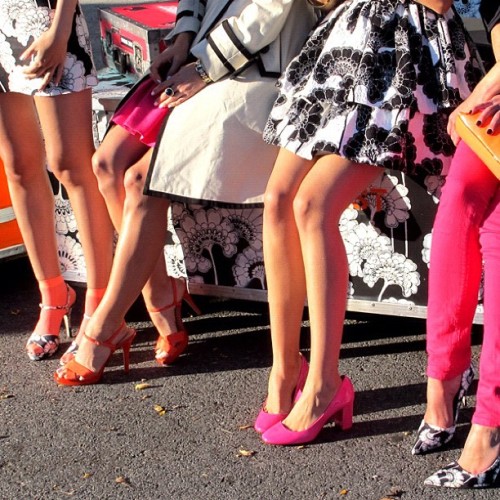
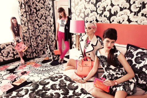
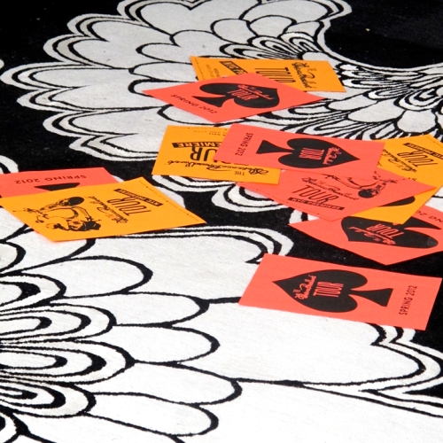
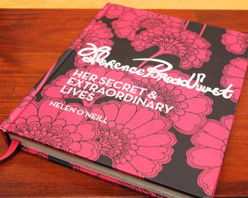
Get into this video from the Spring 2012 campaign from the folks at Kate Spade NY featuring the work of textile designer Florence Broadhurst. I’m really digging the black and white graphic patterns paired with pops of neon color. From a design standpoint this is really cool – I’m all about black + white plus a pop of color (or two). Before seeing the video and checking out Kate Spade’s blog I’d never heard of Broadhurst. Just like Maija Isola at Marimekko, Broadhurst seems like a larger than life personality with equally large artistic talent. It’s nice to see female textile designers hitting it big now, and pattern/textile design coming more and more in fashion. I feel like the whole practice of textile and pattern design is finally starting to get the praise it deserves.
There’s an interesting article about Broadhurst on Architecture Digest here. AD writes,
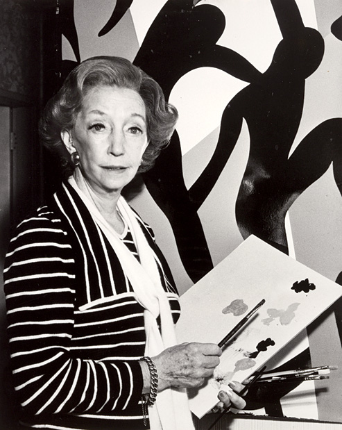
There have been women in history, such as the hostesses of the 18thcentury Parisian salons, who had the charisma and the discrimination to gather talent around them and associate themselves with it. Florence Broadhurst—chanteuse in Shanghai in the 1920s, couturier on Bond Street in the ’30s, painter in Australia in the ’50s and designer of extraordinary wallpaper from the early ’60s until her brutal and unsolved murder in the ’70s—was such a personality. Broadhurst’s legacy of 530 hand-printed wallpapers was bought by David Lennie in 1989 as part of a 5,000-piece archive called Signature Prints. “The power is in the sheer size of her work,” says Lennie.
There is no question that it was Broadhurst’s larger-than-life personality, marked by a strident voice bursting from a slight frame under a dome of bright orange hair, that inspired the collection and marketed it. Without Florence Broadhurst, there would be no Florence Broadhurst wallpapers.
No such thing as too much pattern!
See – Black & White and neon – how great does that look?
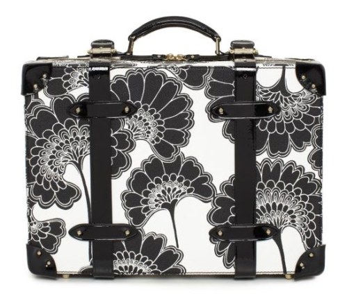
Sweet suitcase.
The book – buying this today!
Color Inspiration by J. Crew
Posted in Art, Fashion, Graphic Design, tagged color, dcwdesign, fashion, Inspiration, j. crew, j.crew spring 2012, kate spade, kate spade ny on February 4, 2012| Leave a Comment »
The wonderful people at J.Crew just released their 2012 J. Crew Collection and I stumbled across these images from their 770 Behind the Line blog. As we’re in the middle of winter here in NYC it’s refreshing to see COLOR! What I love so much about J.Crew (for women) is their playful use of color. They have really moved beyond the bland preppy-casual style of J.Crew in the 2000s. The J.Crew of today is so different than it was just 10 years ago. There are a few interesting articles about the transformation of J.Crew over the years under the direction of Jenna Lyons that are interesting to read. Seems like it was quite the battle but from what I’ve read, J.Crew has never done better. I wish the Men’s lines would take more risks and use more color/pattern, but I will say the NY Liquor/NYC Men’s stores are so much more well designed than the typical mall stores. So that’s something!
Anyways … what I really love about these pictures are the vibrant colors. As a male graphic designer, obviously I can’t wear this stuff (or could I? … jk), so I use this stuff as great inspiration. If I’m feeling uninspired or starting a new project, I love looking through my fashion image libraries and using the color picker in Photoshop/Illustrator to pick new color combinations. That’s one of the tricks I learned from my time in Copenhagen studying textile design. Interior design blogs and magazines are also great for this! Look for brands (or photos) that playfully use and MIX colors, and bring that to what you’re designing to create something new and surprising. Use something from one medium, be it fashion or interior design, and bring that to graphic design. Here’s what I mean:
So in love with these magenta pants .. gonna try to rock a colored pant this spring
 So if this is something that is interesting to you, I have a few sites to check out.
1. J.Crew’s Behind the Line Tumblr.
2. Kate Spade’s Tumblr & Pinterest.
3. Design to Inspire Blog
4. My Tumblr! 🙂

Rebecca Bauman via J.Crew’s Tumblr.
Kate Spade NY’s Tumblr.
My Tumblr archive.
Airport Posters
Posted in Architecture, Art, Graphic Design, Patterns, tagged city posters, design, Inspiration, Lian Ng & Jean Orlebeke, patterns, prints, publique living on January 31, 2012| 1 Comment »
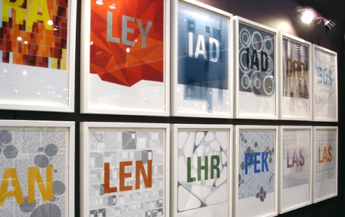
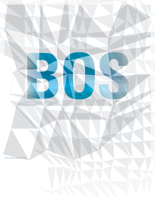
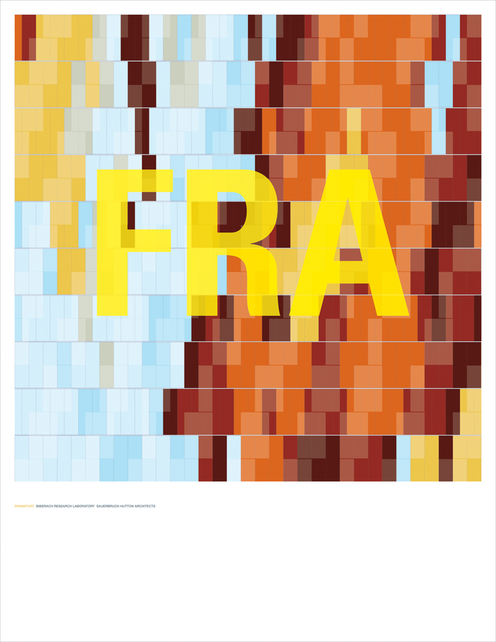
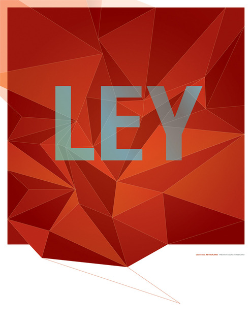
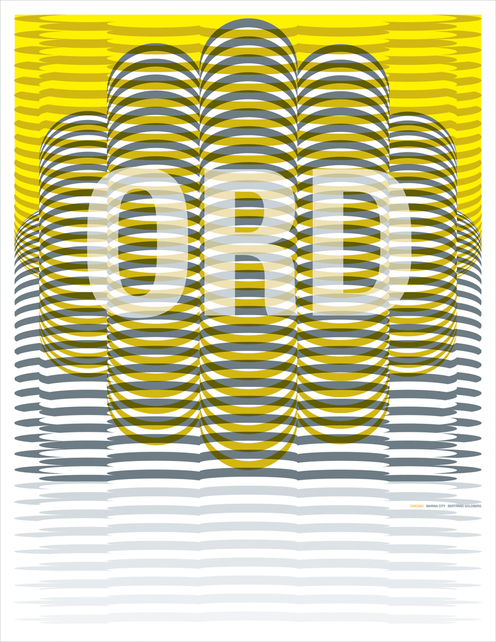
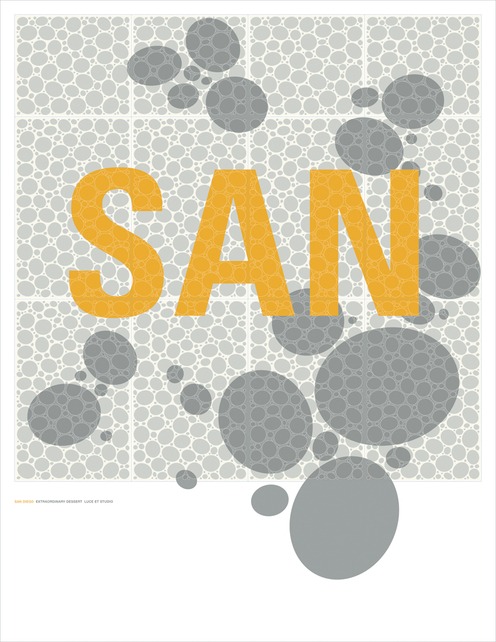
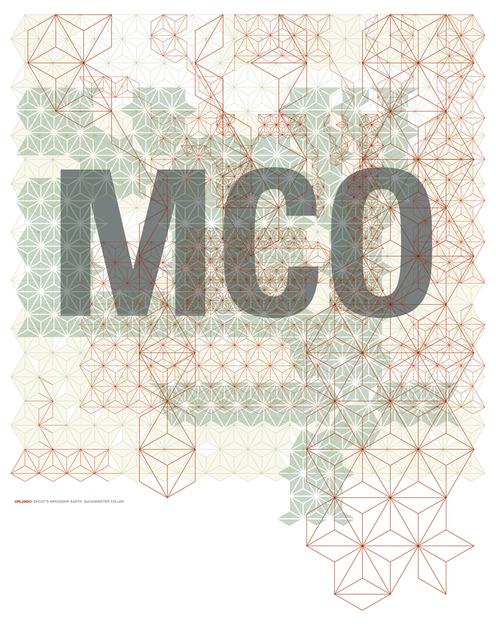
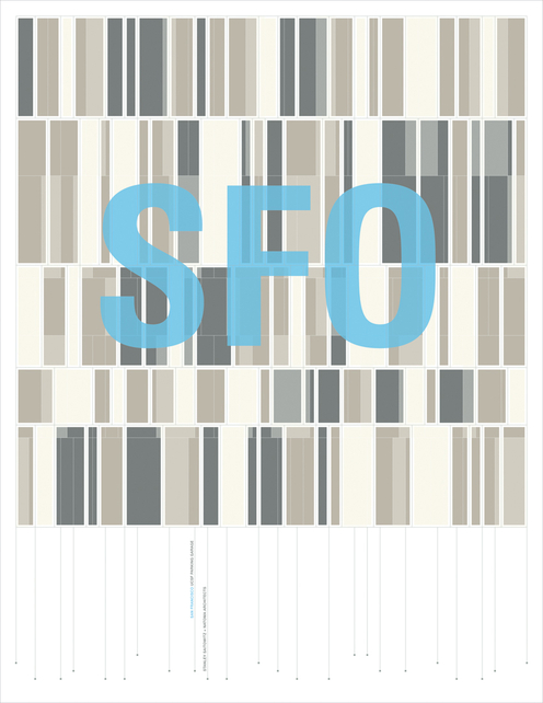
The last few months I’ve been working with patterns and environmental graphics for one of my projects at work and I wanted to share this project by Lian Ng & Jean Orlebeke. I stumbled across it years ago while looking through Dwell magazine and I’m so happy I found a site that has all the prints. For $125 one can be yours! According to Publique Living,
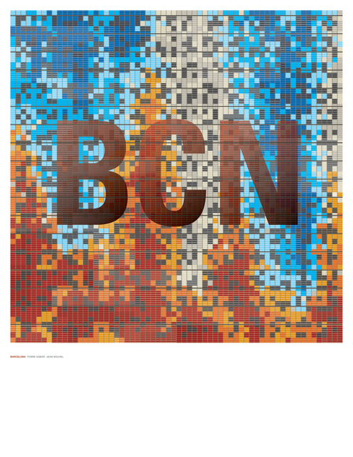
This series of artwork inspired is by the distinctive architectural element from buildings around the world. Whether it be a pattern or shape that distinguishes these buildings, it is the first layer of visual iconic recognition. The cities in which these buildings reside in are called out by their airport code instead of their names, creating another layer of graphic distinction, akin to the visual alignment between architectural elements and buildings. The codes also function as a beacon of destination, proclaiming the cities’ association with inspiring architecture. An interpretive project from Lian Ng and Jean Orlebeke, in limited edition of 180, available unframed only.
I love the idea of this project, being inspired by architectural forms and turning that inspiration into graphic patterns and prints. In my project at work I’m trying to find ways to turn basic shapes into compelling repeat patterns for use on walls and glass throughout a building. It’s definitely a challenge but this project is a great example of how simple (or complex) shapes and lines can create compelling graphics. Here are a few of my favorites … now if anyone would like to get me a print for my bday … I’d love you long time.
You can purchase prints here, at Publique Living.
