Feeds:
Posts
Comments

Posts Tagged ‘kate spade’


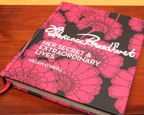
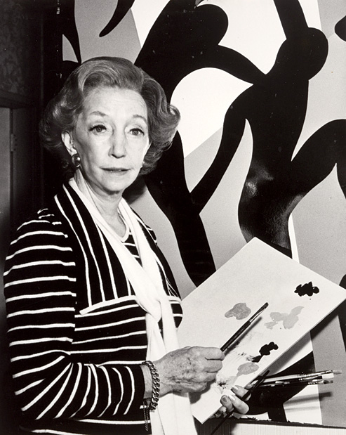
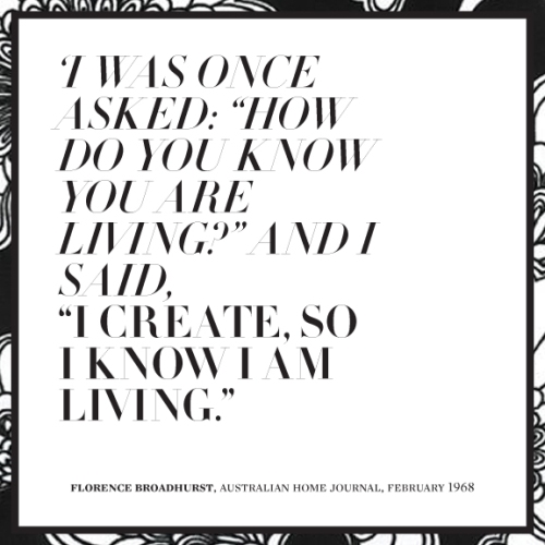
In February I blogged about the work of wallpaper/pattern designer Florence Broadhurst after Kate Spade NY featured her iconic prints in their new collection. I was so inspired by her work and story that I bought her biography, Florence Broadhurst: Her Secret & Extraordinary Lives by Helen O’Neill. I finally got to reading it this weekend and I couldn’t put it down! Broadhurst was an amazingly complicated woman: singer, actor, clothing designer, socialite, truck yard operator, and finally, iconic wallpaper designer in her 70’s. How could one person lead so many lives? Her life came to an untimely end when she was brutally murdered in her studio and her murder remains unsolved until this day.

It was particularly interesting to hear about her life and travels, and how it influenced the studio she lead for over 15 years. In the book you learn about her curious methods, the artists she hired to work for her, many of whom were incredibly young and how she constantly reinvented herself. You also get to see the huge breath of her work, which stands close to 500 different pattern designs.

Sadly after Broadhurst’s death, her designs were quickly forgotten. Wallpaper went out of fashion and so did the bold iconic designs for which she was known. Minimalism was in. For years her screens lay unused in a factory falling into decay. There were several times when all her designs were almost thrown away because they were deemed to expensive to even store. It wasn’t until the 1990s that her work was rediscovered, collected and restored. Luckily for us, her work was saved and is being produced by hand once again day by Signature Prints.

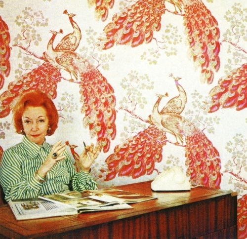
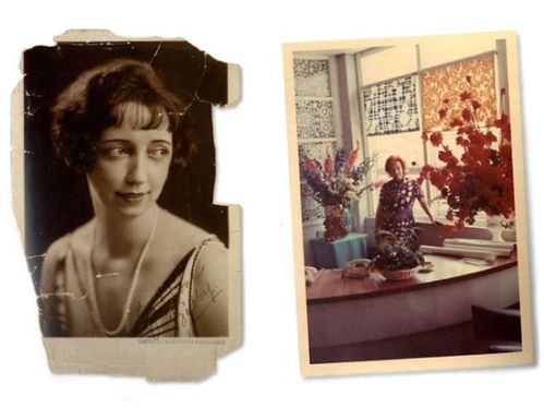
Florence and her crazy orange hair at her desk. On the wall is Peacocks, one of her favorite prints.

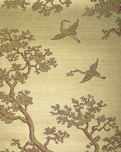
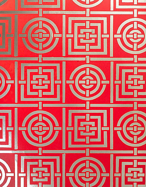
Many of her wallpaper prints were printed on gold and silver Mylar.

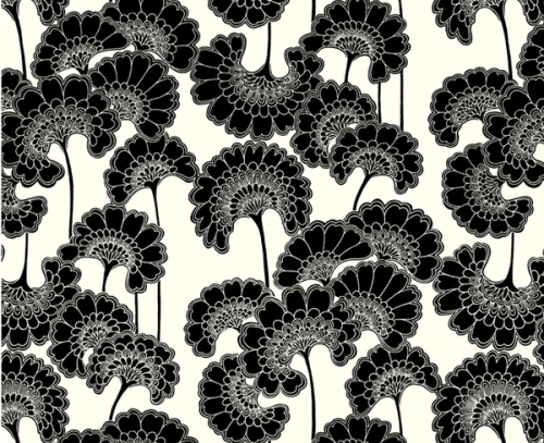
Japanese Floral, one of her most well-known prints.
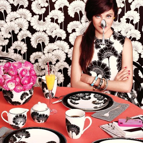
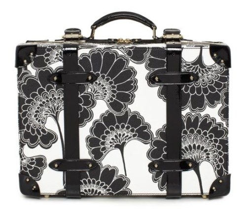
This print was used for Kate Spade’s Florence Broadhurst collection (below).

A modern take on classic Broadhurst (above).

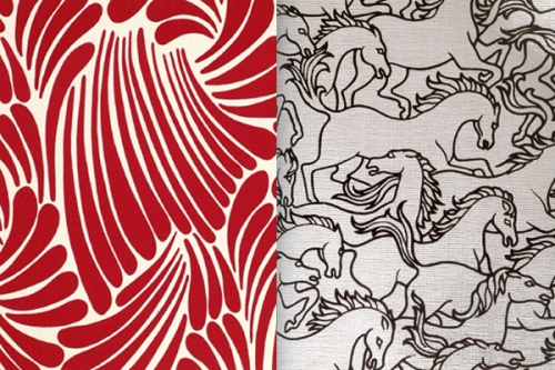
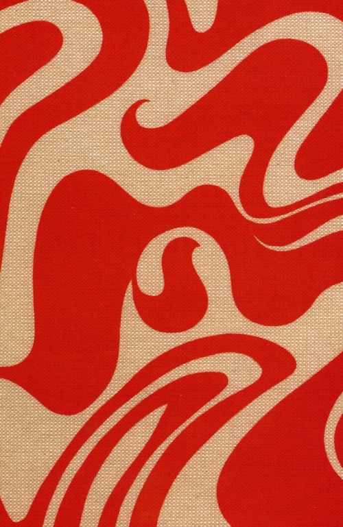
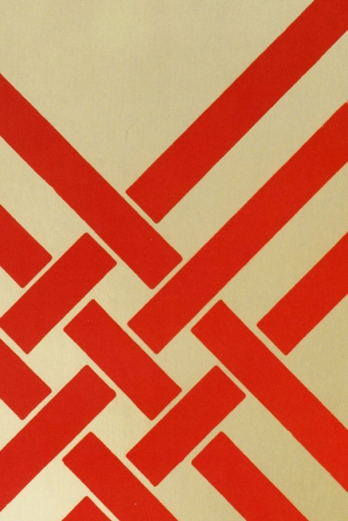
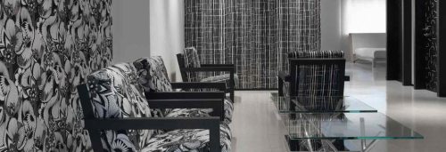
While a lot of her designs were organic and featured scenes of nature, many her designs were also bold and geometric.

Today her work can be seen on more than just wallpaper. Signature Prints, which owns the rights to Broadhurst’s collection now reproduces them on rugs, pillows, furniture and or course, wallpaper.

It’s amazing to see patterns designed in the 60s/70s and almost forgotten now used in such modern ways 40 plus years later.

She seems like quite the powerhouse person to know at the time. If you want to know more, pick up her book here or check out Signature Prints website about their collection featuring images, bios and videos all about Florence Broadhurst. I hope you enjoy her work as much as I continue to do so!
Read Full Post »

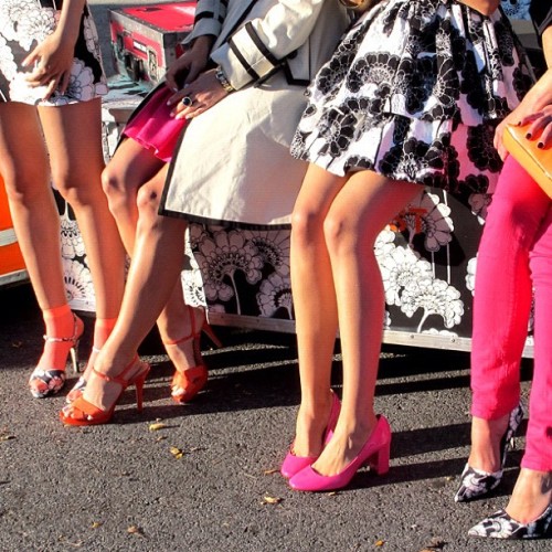
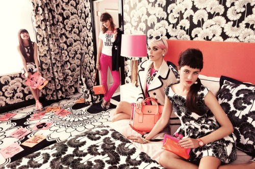
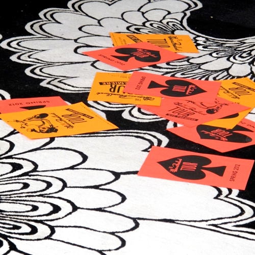
Get into this video from the Spring 2012 campaign from the folks at Kate Spade NY featuring the work of textile designer Florence Broadhurst. I’m really digging the black and white graphic patterns paired with pops of neon color. From a design standpoint this is really cool – I’m all about black + white plus a pop of color (or two). Before seeing the video and checking out Kate Spade’s blog I’d never heard of Broadhurst. Just like Maija Isola at Marimekko, Broadhurst seems like a larger than life personality with equally large artistic talent. It’s nice to see female textile designers hitting it big now, and pattern/textile design coming more and more in fashion. I feel like the whole practice of textile and pattern design is finally starting to get the praise it deserves.

There’s an interesting article about Broadhurst on Architecture Digest here. AD writes,

There have been women in history, such as the hostesses of the 18thcentury Parisian salons, who had the charisma and the discrimination to gather talent around them and associate themselves with it. Florence Broadhurst—chanteuse in Shanghai in the 1920s, couturier on Bond Street in the ’30s, painter in Australia in the ’50s and designer of extraordinary wallpaper from the early ’60s until her brutal and unsolved murder in the ’70s—was such a personality. Broadhurst’s legacy of 530 hand-printed wallpapers was bought by David Lennie in 1989 as part of a 5,000-piece archive called Signature Prints. “The power is in the sheer size of her work,” says Lennie.

There is no question that it was Broadhurst’s larger-than-life personality, marked by a strident voice bursting from a slight frame under a dome of bright orange hair, that inspired the collection and marketed it. Without Florence Broadhurst, there would be no Florence Broadhurst wallpapers.

No such thing as too much pattern!

See – Black & White and neon – how great does that look?

Sweet suitcase.

The book – buying this today!

Read Full Post »


The wonderful people at J.Crew just released their 2012 J. Crew Collection and I stumbled across these images from their 770 Behind the Line blog. As we’re in the middle of winter here in NYC it’s refreshing to see COLOR! What I love so much about J.Crew (for women) is their playful use of color. They have really moved beyond the bland preppy-casual style of J.Crew in the 2000s. The J.Crew of today is so different than it was just 10 years ago. There are a few interesting articles about the transformation of J.Crew over the years under the direction of Jenna Lyons that are interesting to read. Seems like it was quite the battle but from what I’ve read, J.Crew has never done better. I wish the Men’s lines would take more risks and use more color/pattern, but I will say the NY Liquor/NYC Men’s stores are so much more well designed than the typical mall stores. So that’s something!

Anyways … what I really love about these pictures are the vibrant colors. As a male graphic designer, obviously I can’t wear this stuff (or could I? … jk), so I use this stuff as great inspiration. If I’m feeling uninspired or starting a new project, I love looking through my fashion image libraries and using the color picker in Photoshop/Illustrator to pick new color combinations. That’s one of the tricks I learned from my time in Copenhagen studying textile design. Interior design blogs and magazines are also great for this! Look for brands (or photos) that playfully use and MIX colors, and bring that to what you’re designing to create something new and surprising. Use something from one medium, be it fashion or interior design, and bring that to graphic design. Here’s what I mean:

So in love with these magenta pants .. gonna try to rock a colored pant this spring

So if this is something that is interesting to you, I have a few sites to check out.

1. J.Crew’s Behind the Line Tumblr.

2. Kate Spade’s Tumblr & Pinterest.

3. Design to Inspire Blog

4. My Tumblr! 🙂


Rebecca Bauman via J.Crew’s Tumblr.

Kate Spade NY’s Tumblr.

My Tumblr archive.


Read Full Post »

How to Communicate with Aliens, Fall 2010, Pratt MFA

Now that I’ve returned from Denmark and the colorful world of textile design, it’s time to return to graphic design and branding. And that’s exciting (to me). I’m so thankful I got to do something new and challenging the last two months. I feel inspired and rejuvenated to finish my thesis and start the next chapter of my life … working in NYC.  Before I left Denmark I spent hours applying to countless design jobs for anything I felt I was remotely qualified for. And to my delight, on Monday I received the good news I’d been waiting for … someone wanted to hire me! I’ll reveal full details when it becomes 100% official. I went on a few other interviews because it’s great practice talking about one’s work and I wanted to explore all my options. One interview I was very excited (and nervous) for was a designer position at a huge branding firm, one I’d admired since I moved to NYC. Very intimidating, but also an exciting opportunity.

During the interview, I talked about my work experience, favorite projects, my interests in design, etc and then was asked, What is your favorite brand? I was stumped. It’s a simple enough question right? I ended up talking about how interesting the entire Gap logo fiasco is compared to the success Starbucks redesign. Which I do truly think is interesting. Both Starbucks and Gap are iconic global brands. But one did it so wrong while the other flourished. People said during the Gap logo scandal that some logos are so well established and iconic, they should be left alone. I argue Starbucks built just as much brand identity as Gap, perhaps more, and they were embraced. Why is this? And more importantly why do we care?

This brings me back to a project from one of my Pratt MFA studios. For the project we had to communicate humanity or “humanness” to aliens. I proposed sending aliens an alphabet comprised of logos establishing a shared language and making a commentary on American values. A modern day Rosetta Stone, sponsored by Adobe, Budweiser, Coke, etc .. While this idea isn’t new, lots of these logo alphabets exist, it’s so interesting to think about these logos as living things, as brands, that communicate. In this project the alphabet symbolizes way more than letterforms and logos, they are cultural symbols of our society at a specific period in history. While listening to Design Matters one night, I heard this quote by Phillip Meggs:

It’s so interesting how in the last 10 years brands have really become alive. They’re living things. While brand loyalty has existed since the creation of brands themselves, brands they were not always living things. I believe the shift happened with the creation of social media. We all have these digital lives, alter egos, and so do these brands. They have personalities that must communicate as effectively on the iPad as they do in the store. I think that’s so fascinating because as a designer working in brand strategy, you’re creating emotional relationships that must be nurtured. So things brings me back to the original question, what is my favorite brand?? While researching brands, I came across report from Interbrand about America’s most valuable brands:

Read and download the full report here.

In thinking of which brands are my favorite, or that I find the most interesting, I decided to come up with a list. Initially when I think about brands, I only think about retail brands. This is due to the lifestyle fashion and retail try to sell consumers. I didn’t even consider food brands in the grocery store, which are just as powerful as these retail giants, and probably even more so since we interact with them so frequently. According to Stores.org, “Americans have an ongoing love affair with brands. Threaten to take away their Dawn dishwashing detergent or their Kleenex and you’d better be ready for a knock-down, drag-out fight: Those items, along with Bounty paper towels and Crest toothpaste, are among the products shoppers choose most often when they roll their carts up and down the supermarket aisles.” I’m completely guilty of this. For example, I only drink coke products, I’m totally addicted to Aquafresh toothpaste, and I generally don’t trust store brands. Some of these brands are my favorite because I use their products religiously, like Coke or Apple. Other brands I admire the lifestyle they symbolize (Kate Spade, J.Crew). With these brands I want to live in the beautiful glossy world they create. I’m totally under their spell.

Here are some of my favorite brands, in no particular order …
UNI QLO // Fashion Retail // Japan // link
Coca-Cola // Food & Beverage // Global // link
Obama  // Political // US // link
Apple // Computers & Tech // Global // link
Kate Spade // Retail // US // link
J. Crew // Retail // US // link
J. Crew Behind The Line – follow their blog here.
So what’s your favorite brand and why ?!?!

Read Full Post »

I’m coming out of the closet and confessing my love for a girl, the one and only, Kate Spade. My love affair with Kate is truly so secret to anyone that knows me. Now I going to pronounce my love for the world to see. Since I’m returning to the US in less than 7 days, I thought I’d do another 7 Designers series, and while Kate Spade isn’t an example of Scandinavian design, some comparisons can easily be made. What makes Kate Spade stand out to me is their playful use of color. Every time I pass their store in Soho or see one of their ads, I always think about how beautiful their world looks. Color is also incredibly important in textile design, perhaps the most important element. Our teachers have told us colors are what sells patterns and textiles, not necessarily the design. This is also true in graphic design – color adds so much to design and is so loaded with content and meaning. I’m also in love with the photography and type that’s used in the Kate Spade ads from the last several years. They’re really stepping up their design game. I’d love to find out who is the creative mastermind behind their current look. Let’s look at some examples ..

Now my favorite ads Kate Spade has done is their 2009 Holiday campaign. I remember seeing these in Manhattan during my first Christmas in the city. I saw the ads below wheatpasted to a wall in Soho and tried to take the best pictures I could with my iphone. Here’s what I got.

Notice the use of my favorite typeface Bodoni!

Love the picture, love the colors, and especially love how they’re playing with type. So beautiful I think.

Here’s another one I found online – I wish I had copies of the whole “20 ways to merry-make” campaign.

So want to know more about how color inspires the Kate Spade team? I recently noticed Kate Spade set up a blog, The Weekly Spade: a blog about color. Lots of great color inspiration there. They also have a Behind the Curtain blog showing sneak peaks into their campaigns, special projects, and things they love. So much beautiful inspiration. Enjoy and fall in love!

Green from the Weekly Spade.

And Blue for July!

Read Full Post »