Feeds:
Posts
Comments

Posts Tagged ‘textiles’

PAOM_LOOK3_05b_1200x800_1200

Today while browsing Pinterest I stumbled across the Leta Sobierajski x Print All Over Me collection and stopped in my tracks. I haven’t blogged about patterns/prints too much lately, so consider this post a return to form. I seriously can’t get enough of these images. Great patterns, fun colors + poses … what a fun project! Leta Sobierajski is a multidisciplinary freelance designer & art director in New York City. She combines mediums in design, photography, art, and styling to develop tangible compositions for print, digital, and motion. In 2014, she was recognized as a top 20 under 30 designer in Print Magazine’s New Visual Artists issue. I’m also super-into the typeface she designed, Marle, which can be purchased exclusively at Ten Dollar Fronts. It’s so great to see graphic designers experimenting with patterns. This project definitely inspires me to step up my game and get back into creating patterns of my own. But until then, get into more of Leta’s collection for Print All Over Me below.

PAOM_LOOK3_03_598x800 PAOM_LOOK3_FABRIC

PAOM_LOOK1_02_598x800 PAOM_LOOK2_01_1200x800_1200 PAOM_LOOK4_02_1200x800_1200

PAOM_LOOK3_01_598x800 PAOM_LOOK4_FABRIC

How great are these? If you want to check out more of Leta Sobierajski’s work, check out her site, her collection for Print All Over Me, or follow her on social media. Get into it!

PAOM_LOOK1_01_598x800

Read Full Post »

Maharam_Pattern_stories_1_10_a_968

Graphic Thought Facility (London, above)

While searching for pattern inspiration today on Pinterest, I stumbled across a cool blog post on Maharam’s website about a collection of patterns by a group of graphic designers. I (shockingly) had never heard of Maharam before, and I’m so happy I found them! Maharam was founded in 1902. From small beginnings, Maharam transformed from a source of theatrical textiles for costume and set design in the 1940s to a pioneer of performance-driven textiles for commercial interiors in the ’60s. Today Maharam partners with designers from all disciplines creating conceptual, performance and fashion textiles for countless companies.

In the post Maharam writes,

Patterns are the double helix of the textile industry—the visual DNA that serves to establish the identity of a company. In the pre-digital era, companies like Pucci and Marimekko found a way to create and make distinct visual vocabularies their own. As Maharam moved into the digitized world of the 21st century, we challenged ourselves with a design research initiative that could capture emerging post-analog trends and yield a new pattern language that we could call our own. 

In collaboration with Pentagram’s Abbott Miller, Maharam invited an international group of ten entities at the forefront of graphic design to create ten patterns each. The participants included A4 Studio (New York), Marian Bantjes (Canada), cyan (Berlin), Graphic Thought Facility (London), Harmen Liemburg (Amsterdam), Karel Martens (Arnhem), Abbott Miller (New York), Niessen & de Vries (Amsterdam), Post Typography (Baltimore), and Casey Reas (Los Angeles).

As a trained graphic designer that also studied textile design, these two diciplines work so well together. I think all graphic designers should learn about textile and pattern design. The images below are some of my favorites from Maharam’s 1/10 Pattern Stories post. Tomorrow I’m going to share even more patterns and photos from Maharam’s NYC design studio. Get into it!

Maharam_Pattern_stories_1_10_b_968
Harmen Liemberg (above).

Maharam_Pattern_stories_1_10_c_968
Niessen & de Vries (above).

Maharam_Pattern_stories_1_10_e_968
cyan (above).

Maharam_Pattern_stories_1_10_f_968
Abbott Miller (above and below). This is pretty cool no? Flattening a car and making a graphic pattern. Love it.

Maharam_Pattern_stories_1_10_i_968
Maharam_Pattern_stories_1_10_j_968
Harmen Liemburg (above).

Maharam_Pattern_stories_1_10_h_968
Niessen & de Vries (above).

Read Full Post »

Josef Frank_Textile Manhattan 315 Linen

Josef Frank “Manhattan” textile on Linen (above).

Today I bring you my third (and final) post in a series about Scandinavian textile designer Josef Frank. Originally I’d intended to release these posts back to back (to back) but work got a little crazy, so better late than never! As my other posts focused on nature/plants and bird motifs, this post contains some of Frank’s more unique patterns. “Manhattan” is one of my favorite Frank patterns, partly because I live in NYC, but also because how graphic it is. The way it repeats is also pretty inventive. From 1942-1946, Josef Frank lived and worked as a visiting professor at the New School for Social Research in New York. Frank found Manhattan’s city plan so interesting in its brutal simplicity that he created the Manhattan design which includes a map of the island. Frank designed similar patterns in this style for Stockholm, both of its city grid and another depicting its architecture. I hope you enjoy this final look (at least for now) of one of my favorite textile designers, Josef Frank. If you see anything you like, check out Svenskt Tenn‘s website, or Just Scandinavian here in NYC to see Frank’s work in person.

Svenskt Tenn Josef Frank Textiles_Manhattan

Frank’s “Manhattan” textile in person at Svenskt Tenn in Stockholm (above) from my study tour of Sweden. As you can see below, this pattern has been applied to several products at Svenkst Tenn including coasters, laminated wooden trays and pillows. I have one of the small trays, but would love the Manhattan print on just about anything.

Joes Frank Svenskt Tenn Manhattan Birch Tray Josef Frank Svenskt Tenn Manhattan Coasters Josef Frank Svenskt Tenn Manhattan pillow

Josef Frank_Textile Terrazzo PillowJosef Frank “Terrazzo” pillow (above).

According to Svenskt Tenn’s website, of Frank 160+ patterns, only two varied from nature motifs, “Terrazzo” is one of such prints (below). This print was sent to Estrid Ericson as a gift on her 50th birthday in 1944.

Josef Frank_Textile Terrazzo 315 Linen

Svenskt Tenn Josef Frank Textiles_Terrazzo

I was lucky enough to see “Terrazzo” in person during my visit to Svenkst Tenn in 2011. This pattern also comes on everything from pillows to plates (below).

 Josef Frank_Textile Terrazzo Plate
(more…)

Read Full Post »

svenskt_tenn_interior

Interior by Svenskt Tenn (above) – the Stockholm-based store producing Frank’s textiles

Almost 3 years ago, I blogged about the amazing architect turned textile designer Josef Frank during my study tour across Scandinavia. Since it’s been so long I thought I’d refresh everyone’s memory this week with a series of posts devoted to this wondrous designer. For those that don’t know, Josef Frank (1885-1967) is very famous in the Scandinavian design (and especially textile world) but I hadn’t heard of him until studying abroad in 2011. During his long career, Frank designed 170 patterns for printed fabrics, about 125 of which have been printed at least once. Roughly 40 of them are classics, most of them floral patterns, which although more than fifty years old, have not lost their freshness. These fabrics were produced exclusively for Svenskt Tenn, the modern day gatekeeper of Frank’s legacy. Today his fabrics are applied to everything from curtains, pillows, wood trays, handbags and furniture. Visiting their store was an amazing experience and I can’t wait to go back!

Today I’m sharing a few of my favorite floral motif patterns. It’s clear nature served as a hugely inspiring source for the designer. Many of these prints are considered “classics” and are printed on just about anything today. What I love so much about these patterns is that despite having a narrow focus (plants, flowers, etc), each is illustrated so differently. Some prints are very realistic, a few look like botanical specimens, while others are fantastical imaginations of exotic botanical scenes. I hope you enjoy this trip down (blogging) memory lane as I once again share the beautiful work of Josef Frank. Get into it!

Josef Frank Textile La Plata 315 Linen

“La Plata” by Josef Frank on Linen (above).

Josef Frank Textile Loops 315 Linen copy

“Loops” by Josef Frank on Linen (above).

Josef Frank Textile Milles Fleur Cotton

“Milles Fleur” (the French translation for a Thousand Flowers) by Josef Frank on Linen (above). I love in this pattern, none of the flowers touch, each is an individual precious illustration instead of an all-over pattern repeat, less intertwined and complex, but still beautiful.

Josef Frank Textile Primavera 315 Linen

“Primavera” by Josef Frank on Linen (above).

Josef Frank_Textile Brazil 315 Linen

“Brazil” by Josef Frank on Linen (above). One of my favorites – look at the amazing colors!

Josef Frank_Textile Celotocaulis 315 Linen

“Celotocaulis” by Josef Frank on Linen (above). This pattern was originally designed by Josef Frank in the 1920s. Caulis is the Latin word for flower stalk and Celoto comes from an Asian flower species characterized by a plume-like flower cluster. This pattern is very different in style and repeat as you can see above with only slight pattern shifts.

Josef Frank_Textile Djungel 315 Linen
“Djungel” (or jungle) by Josef Frank on Linen (above).

Josef Frank_Textile Nippon 315 Linen

“Nippon” by Josef Frank on Linen (above).

Josef Frank_Textile Notturno 315 Linen

“Notturno” by Josef Frank on Linen (above).

Josef Frank_Textile Drinks 315 Linen

“Drinks” by Josef Frank on Linen (above). Also one of my favorites, love how this pattern looks like botanical illustrations, and how each plant is surrounded by black, making the illustrations look like cutouts. Super graphic!

Josef Frank_Textile Poisons 315 Linen

“Poisons” by Josef Frank on Linen (above).

Josef Frank_Textile Tulpan Cotton

“Tulpan” (or Tulips) by Josef Frank on Linen (above). Huge Frank classic.

Josef Frank_Textile Vegetable Tree 315 Linen

“Vegetable Tree” by Josef Frank on Linen (above).

Hope you enjoyed Day 1 of my Josef Frank series, tomorrow I’ll be sharing more of Frank’s patterns, but with a new theme. Stay tuned.

Read Full Post »

23e1e59396ed9438fa7016f965a24ba9

4 by Leo Reynolds. See more on Flickr here

This fall, my humble little design blog turned 4! This August also marks my 4-year anniversary of moving to New York City. How time flies. I started this blog while attending Pratt Institute and earning my Design MFA. In a Motion Design studio we were to document process and inspiration for the semester and speak about design. Now, almost 200 posts and 61,000 views later my blog is still chugging along. Today there’s a tighter focus design, be it Scandinavian design, textiles, prints and patterns, photography, advertising, fashion or my rants about life. While this blog is no “Design Sponge,” or the myriad of other blogs out there, it servers as an opportunity for me to share what I’m into, curate content and write about design. This has been particularly useful for getting jobs and getting my name out there, something I never expected. So I just wanted to say thanks for browsing and following me these 4 years. So here’s to the next 4! 

3866483815_e1d9a9a8f4_z

6278706366_4243f3e726_z

6936748821_3ed7c9f17e_z

7688537244_b6b92a4544_z

See more photos by Leo on his Flickr page. Get into it! 

(more…)

Read Full Post »

kapitza geometric cover 1

Kapitza Geometric + 100 Geometic Pattern Fonts

Months ago I stumbled across Kapitza’s Geometic pattern book while researching textile design and feel deeply in love with the colorful visuals. How great is it that designers began developing pattern fonts much the same way pictorial or symbol fonts exist today. The book was developed by sisters Nicole & Petra Kapitza who together run the independent design firm Kapitza. According to abduzeedo.com, “Both sisters share a passion for everyday life, minimalism, patterns & colour. Their studio is based in East London, a vibrant and dynamic area which forms part of the inspiration for their work. Other inspirations include nature, people and software. The sisters have been developing an extensive series of unique picture fonts and illustrations that lie somewhere between image resource and art project.”

kapitza_geometric_pattern_spread_four3

kapitza_geometric_pattern_spread_four1 kapitza_geometric_pattern_spread_four2

So you may ask, what are pattern fonts? “Pattern fonts can be installed on your computer just like any other font. But instead of letters they contain a graphic shape on the keys. The power of pattern fonts lies in the way they allow patterns to be created in any software application (from word processing to graphics); and standard font features – like size, leading and letter spacing – make tweaking and tuning pattern designs limitless and easy.” – abduzeedo.com

kapitza_geometric_pattern_spread_six1 kapitza_geometric_pattern_spread_six2 kapitza_geometric_pattern_spread_six3

Sadly, it appears the book is out of stock, but check out the website to see if more are available here. You can also purchase just the pattern fonts (here) or vector art (here). So get into Kapitza’s Geometric pattern book with the video and happy patterning!

Read Full Post »

dvf_love_is_life_2

Last week I began following Diane von Furstenburg (@DVF) on Instagram and they’ve been posting some really interesting photos. I love fashion brands that use Instragram, Tumblr, Facebook etc. to give fans a unique behind the scenes look at the brand. DVF does this quite well, and even shares a “Print of the Week” from their pattern/textile library. As a textile/pattern design lover I get so excited when they post them.

dvf_pattern1 dvf_pattern2 dvf_pattern3 dvf_pattern4

How great are these patterns? The first one is hands down my favorite! If I was a girl I’d dress ALL in graphic patterns.

dvf_animalprint dvf_patterns_models dvf_patterns_models2 dvf_patterns_models3

I love seeing how they mix patterns and textiles at DVF. It’s a tricky business and they do it so well!

dvf_diane_group

Couldn’t have a DVF post without posting one of Diane herself!

dvf_love_is_life_1

So get into the graphic print greatness that is DVF and be sure to check out their Spring 2013 show at NY Fashion Week. Also be sure sure to follow Diane von Furstenburg on Twitter and Instagram (@DVF) for a behind the scenes look at the brand. And remember, love is life! -Diane

Read Full Post »


In February I blogged about the work of wallpaper/pattern designer Florence Broadhurst after Kate Spade NY featured her iconic prints in their new collection. I was so inspired by her work and story that I bought her biography, Florence Broadhurst: Her Secret & Extraordinary Lives by Helen O’Neill. I finally got to reading it this weekend and I couldn’t put it down! Broadhurst was an amazingly complicated woman: singer, actor, clothing designer, socialite, truck yard operator, and finally, iconic wallpaper designer in her 70’s. How could one person lead so many lives? Her life came to an untimely end when she was brutally murdered in her studio and her murder remains unsolved until this day.

It was particularly interesting to hear about her life and travels, and how it influenced the studio she lead for over 15 years. In the book you learn about her curious methods, the artists she hired to work for her, many of whom were incredibly young and how she constantly reinvented herself. You also get to see the huge breath of her work, which stands close to 500 different pattern designs.

Sadly after Broadhurst’s death, her designs were quickly forgotten. Wallpaper went out of fashion and so did the bold iconic designs for which she was known. Minimalism was in. For years her screens lay unused in a factory falling into decay. There were several times when all her designs were almost thrown away because they were deemed to expensive to even store. It wasn’t until the 1990s that her work was rediscovered, collected and restored. Luckily for us, her work was saved and is being produced by hand once again day by Signature Prints.

Florence and her crazy orange hair at her desk. On the wall is Peacocks, one of her favorite prints.

Many of her wallpaper prints were printed on gold and silver Mylar.

Japanese Floral, one of her most well-known prints.
This print was used for Kate Spade’s Florence Broadhurst collection (below).

A modern take on classic Broadhurst (above).

While a lot of her designs were organic and featured scenes of nature, many her designs were also bold and geometric.

Today her work can be seen on more than just wallpaper. Signature Prints, which owns the rights to Broadhurst’s collection now reproduces them on rugs, pillows, furniture and or course, wallpaper.

It’s amazing to see patterns designed in the 60s/70s and almost forgotten now used in such modern ways 40 plus years later.

She seems like quite the powerhouse person to know at the time. If you want to know more, pick up her book here or check out Signature Prints website about their collection featuring images, bios and videos all about Florence Broadhurst. I hope you enjoy her work as much as I continue to do so!

Read Full Post »

This weekend I finally made it to the new Marimekko NYC Flagship store just across from the Flatiron Building in NYC. I was curious to see how the design of the store might differ from the shops I saw in Helsinki and Copenhagen during my summer abroad. The NY store was pretty big and had lots of stuff in it! There are different sections for home products, bedding, kids stuff and women and MENS! fashion. I had no idea they were making men’s fashion items – but I’m glad they are. It’s worth stopping by to see all the beautiful printed textiles on the rolls and see how the designers apply these prints for different uses. You can notice how the scale of the pattern shifts for use on a pillow vs. a dress vs. a shower curtain or a coffee mug. It’s really inspiring to see all these beautiful prints housed together in one place and step into their colourful world.

I was also happy to find another copy of their Fall/Autumn mailer. I’d found a copy in the Copenhagen store and I really loved all the dark colors and reds they used together in that campaign. You can tell they’re making a push to enter the high fashion market and diversify beyond home goods. I think they’re off to the right track! Here are a few images below for your viewing pleasure.

I love the contrast between B&W and pops of red, so bold and graphic. Much more my style and taste .. too bad there is not a men’s version of this.

They also have a lot of pieces inspired by the beautiful birch trees found throughout most of Scandinavia.

I love the textile hanging at the bottom. Not sure how to use it on clothes, since it’s such a huge repeat. But it would look BEAUTIFUL framed/hung on a wall.

Here’s a look that pairs well with the pattern behind – but you can see they didn’t apply it directly to any pieces. It would have to be used very abstractly.

Also while you’re there, pick up their Holiday 2011 catalog.

I love the graphic design of all the Marimekko stuff- lots of big type.

Holiday Prints!

Looks like a party right? These dresses are pretty cool, with the black tights and shoes.

The store is located at 200 5th Ave in NYC – check it out!

Read Full Post »

Since I missed yesterday, today is a combination post, which is fitting because I learned a lot about Erik Bruun’s work from my trip to Vallila’s studio. So I guess it was meant to be. Above are two posters designed by Erik Bruun, probably his best known work from the 1960’s. Jaffa is a brand of orange lemonade/soda in Scandinavia, sort of like orange Crush. I love the graphic look of these posters, very retro, and I love with the colors. I saw earlier versions of these posters below at the Design Museo in Finland. While researching Bruun, I learned Jaffa recently decided to capitalize on their brand legacy and has begun licensing their vintage artwork to other companies. Vallila Interior is one of these companies. Recently Vallila took these posters and turned them into curtains and textiles. It’s great to see how these designers and companies are related here in Scandinavia.

Bruun spent his childhood in the village of Säiniö on the Carelian isthmus. In the war years his family was forced to move to Helsinki, where he later enrolled in the Central School of Industrial Design. He graduated as a graphics designer in 1950. After graduation, Bruun worked for three years as an exhibition designer and advertisement artist. In 1953 he founded his own design studio, where he produced the most of his work. Bruun’s works are diverse and numerous. They include posters, postcards, stamps, and most notably the reverse sides of the last ever series of the Finnish Markka banknote series from year 1986.

The first Bruun poster I saw (above) at Design Museo. I really like the the more naturalistic style in the print (below).

So Jaffa and Erik Bruun bring us to Vallila Interior. Normally every year the study tour visits Marimekko, but this year they were closed for summer holiday. While I’m sad I missed out on that, it was great to see another company that takes a different approach to textiles. We’re also the first group to visit Villila, based is also based Helsinki, Finland. Vallila has a huge showroom filled with some of the most beautiful curtains and interior textiles I’ve seen combined with beautiful lighting and furniture. While Marimekko seems to cater to fashion and surface design on products, Villila mainly focuses on interior textiles, like carpets, rugs, curtains, etc. I think as they grow, they might begin moving more into a “Marimekko” direction but who knows. Below is a screenshot from their website, where you can view their entire catalog of textiles. You can even download their entire catalog for free.

Typically, Vallila releases two unique collections a year with new patterns and colorways; each collection contains around 30 patterns. After 75 years of business, Valilla now has a library of over 200 prints and colorways. Today contract and retail are the biggest business ventures for the company, which now employees 140 people. Another interesting note, our tour guide mentioned that for the first time in their history, Vallila has begun to brand themselves a comprehensive identity, in the true graphic design sense of the word, much like Marimekko has done for years. If (or when) they make it to the US, I’d love to work with them, or buy some of their stuff!

A Sample table of textiles available at Vallila with home, office, and commercial grades of fabric, plus their own lines of designer textiles.

Lots of bold graphic patterns.

Their showroom is organized by color, with textile colorways grouped together. Great way to see how different patterns change due to color alone.

One of my favorite patterns. Something about this orange really works.

Purple, green, and blue.

They even have type curtains!

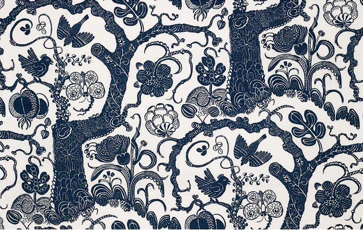
These would make pretty awesome wallpapers right?

Up next is another Finnish designer, Kaj Frank. Coming tomorrow.

Read Full Post »

Older Posts »