Feeds:
Posts
Comments

Posts Tagged ‘illustration’

Andreas Samuelsson_illustration2


Recently I stumbled across the illustration of Andreas Samuelsson and quickly fell in love with the simple style and bright colors he uses in his work. His bio states, “Letters, stylized objects, symbols and details are important elements of Andreas Samuelsson’s creativity. He likens his way of working to a musician sampling audio clips. “I like to put the pieces together and build up pictures quite freely”, he explains. “The goal is to break down an image so that it becomes as pure as possible.” –Molly & Co.  Awesome huh? Scroll below to see a few of my favorites. If you’d like to see every more, check out his entire portfolio site here. Get into it!

Andreas Samuelsson_illustration1

Andreas Samuelsson_illustration3.5

Andreas Samuelsson_illustration3

Andreas Samuelsson_illustration4

Andreas Samuelsson_illustration6

Andreas Samuelsson_illustration7

Andreas Samuelsson_illustration8

Read Full Post »

Isabel + Ruben Toledo Target (1)

Isabel x Ruben Toledo for Target (above).

The other day I gave an introduction to one of my favorite artists/illustrators Ruben Toledo and his work with Nordstrom. Today I’d like to share more of his work and a little more about the artist. The piece above (actually a beach towel) was created to celebrate opening a new Target store in NYC, and I’m lucky enough to own this beauty. Cute right? So a little more about the artist: Ruben Toledo was born in Havana, Cuba in 1961. Toledo is a painter, sculptor, illustrator, fashion chronicler and critic, and surrealist. He has designed mannequins, store windows, award statuettes, scarves, fabrics, dishes and book covers for Penguin Classics. He has painted murals, portraits, album covers and gallery walls. He has also created illustrations for the top fashion magazines from around the world including The New Yorker, Vogue, Harper’s Bazaar, Town & Country, Paper, Visionaire, Interview and The New York Times. Some of my favorite work from Toledo comes from the book The Little Black Book of Style by Project Runway’s Nina Garcia. The book is soooooo cute and illustrated beautifully by Toledo. Years ago in college I gave it as christmas gifts. So sit back, scroll, and get into more of Toledo’s work below.

Ruben_Toledo_Illustration_3
Ruben_Toledo_Illustration_4 Ruben_Toledo_Illustration_5 Ruben_Toledo_Illustration_6
(more…)

Read Full Post »

Buffalo Pong Wallpaper: Digital and gouache Na Kim 2012
Buffalo Pong Wallpaper, 2012.

Today I’m super excited to share illustrated patterns by Na Kim and her delightfully illustrated resume (scroll down). How great is this buffalo x ping pong wallpaper pattern? I love this style of pattern making; taking individual illustrations and repositioning them to create a repeat pattern. And I like that she’s doing so in such a playful way. They’re totally random (or at least appear to be) but work together so well. I love the unexpected combinations! Wouldn’t this pattern, and the ones below, make really cool socks or something? I’m all about it.

Buffalo Pong Gouache on Paper © Na Kim 2012

Her original Buffalo Pong illustration (above).

Mallard-mallot Pattern 2012 Digital+Gouache © Na Kim 2012

Mallard-mallot Pattern, 2012 (above).

Mallard-Mallot 2012 Gouache on paper © Na Kim 2012

Whale Ballin’ Reloaded Wallpaper © Na Kim 2012

Whale Ballin’ 2012 (above). Aren’t these fun?

So I found Na Kim’s illustrated resume first (below), and patterns second, which reminded me of a subject I’ve touched on a few times, resume design. Some months ago, I blogged about what a bad idea “creative” resumes are, especially in the graphic design field. However, in this case I absolutely love Na Kim’s illustrated resume. It just makes sense. She’s a talented illustrator and has a unique typographic style of lettering. I’m not saying all designers (or typographers) should do this, but when it speaks to your skills, and you’re able to inject a sense of personality AND skill into it, then why not.

So if you’re liking what you see, check out Na Kim’s website and blog.
Get into it y’all!

na-kim illustration

graceplay003_640

Love love love! (everything above and below).

boys will be boys 2011 Ink on Paper

he said she said 2011

I AM NOT AFRAID OF RICHARD SERRA. 2009 Gouache on paper

im no kennedy 2011

the good life 2010

Read Full Post »

jonathan Burton playing cards_4

For several weeks, I’ve been noticing the playful expressions of playing card design (if that’s a thing) floating around the internets. I began collecting examples to create a blog post, then I came across the work of Illustrator Jonathan Burton for the Folio Society, which was so great, he deserved his own post. I’m absolutely in love with his “Odd Bodies” set of playing cards, the jack of diamonds above being my favorite (above). My first thought was, how amazing would these be as a large scale prints? Looks like Burton is a step ahead of me as you can purchase prints in his shop. I want one so badly!!! I can’t find a link to buy the cards online so I’m not exactly sure what these were used for. Maybe they sold out already? I can see why! See more of the Odd Bodies set below. Get into it!

jonathan Burton playing cards_3 jonathan Burton playing cards_5 jonathan Burton playing cards_6 jonathan Burton playing cards_7 jonathan Burton playing cards_8jonathan Burton playing cards_1 (more…)

Read Full Post »

Leanne Shapton_Book Cover - Extraordinary Things to Do

Last year around this time, I stumbled across the beautiful work of New York artist/illustrator/designer (and Pratt Alum!) Leanna Shapton after a trip to John Derian here in NYC.  I found her book, The Native Trees of Canada, and was immediately hooked. Much like Maira Kalman, I love her illustration style and use of painted typography. Once I spent more time looking into Shapton, I discovered she’s designed many beautiful book covers, and written + illustrated many books of her own. I seriously can’t get enough of her work and style. As my friend Theresa pointed out, “she’s like the Sofia Coppola of graphic design.” So true and well put.  According to the bio on her site, “Shapton grew up in Mississauga, Ontario, and attended McGill Univesity and Pratt Institute. After interning at SNL, Harper’s Magazine and for illustrator James McMullan, she began her career at the National Post where she edited and art-directed the daily Avenue page, an award-winning double-page feature covering news and cultural trends. She went on to art direct Saturday Night, the National Post’s weekly news magazine.” Years later, she started a non-profit imprint, J&L Books, specializing in art and photography books, in addition to writing/illustrating her own.

Leanne Shapton_Book Cover - Native Trees of Canada

Leanne Shapton_Book Cover - A Wander in the Woods


Leanne Shapton_Book Cover - Not That Kind of Girl

Leanne Shapton_Book Cover - Swimming Studies

Leanne Shapton_Book Cover - Swimming Studies2

Leanne Shapton_Book Cover - The Tree


(more…)

Read Full Post »

Sketchbook_Macon et Lesquoy_NYC01
In March, one of my favorite blogs, A Lovely Being blogged about Macon & Lesquoy‘s Travel sketchbooks from a trip to NYC. I created sketchbooks like this from my travels in Copenhagen and I keep meaning to get back in the habit. I have a fresh pack of Moleskines that are just begging for this treatment. So until I get back in the habit, enjoy these from Macon & Lesquoy!

Sketchbook_Macon et Lesquoy_NYC03

Sketchbook_Macon et Lesquoy_NYC04

Sketchbook_Macon et Lesquoy_NYC05

Sketchbook_Macon et Lesquoy_NYC02

Jonathan Adler!


Read Full Post »

D*Face_Puerto-Rico-Reflections

This weekend, UK-based artist D*Face posted pictures of a recently completed mural in Puerto Rico (pictured above). Much like Shepard Fairey, D*Face’s work first began popping up as “tags” and small-scale pieces on the streets. Today, his work can be seen as large-scale murals on billboards/building walls and in galleries all over the world. While Fairey is known to have a bad rap, D*Face seems to have evaded the controversy and lawsuits that plague Fairey. I began following D*Face once I saw his work plastered on walls in NYC’s Meatpacking district. I love his Lichtenstein-inspired illustration style and the characters that pop up in his work. One fun fact, he designed the album artwork for Christina Aguilera’s 201o release, Bionic. Very graphic and very colorful, just what I like!

D*Face_Puerto-Rico-Reflections2

D*Face_LA1

D*Face in LA, Going Nowhere Fast show at the Corey Helford Gallery, 2011 (above and below).

D*Face_LA2

D*Face_LA3

  D*Face_LA5

D*Face_LA4

The artist and his finished work!

(more…)

Read Full Post »

kapitza geometric cover 1

Kapitza Geometric + 100 Geometic Pattern Fonts

Months ago I stumbled across Kapitza’s Geometic pattern book while researching textile design and feel deeply in love with the colorful visuals. How great is it that designers began developing pattern fonts much the same way pictorial or symbol fonts exist today. The book was developed by sisters Nicole & Petra Kapitza who together run the independent design firm Kapitza. According to abduzeedo.com, “Both sisters share a passion for everyday life, minimalism, patterns & colour. Their studio is based in East London, a vibrant and dynamic area which forms part of the inspiration for their work. Other inspirations include nature, people and software. The sisters have been developing an extensive series of unique picture fonts and illustrations that lie somewhere between image resource and art project.”

kapitza_geometric_pattern_spread_four3

kapitza_geometric_pattern_spread_four1 kapitza_geometric_pattern_spread_four2

So you may ask, what are pattern fonts? “Pattern fonts can be installed on your computer just like any other font. But instead of letters they contain a graphic shape on the keys. The power of pattern fonts lies in the way they allow patterns to be created in any software application (from word processing to graphics); and standard font features – like size, leading and letter spacing – make tweaking and tuning pattern designs limitless and easy.” – abduzeedo.com

kapitza_geometric_pattern_spread_six1 kapitza_geometric_pattern_spread_six2 kapitza_geometric_pattern_spread_six3

Sadly, it appears the book is out of stock, but check out the website to see if more are available here. You can also purchase just the pattern fonts (here) or vector art (here). So get into Kapitza’s Geometric pattern book with the video and happy patterning!

Read Full Post »

Brutalized Portrait of a Gentleman 2_Chad Wys

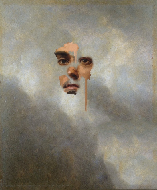
Brutalized Portrait of a Gentleman 2 – Chad Wys

Back in December, I stumbled across the work of Chad Wys on Pinterest and quickly feel in love with bold graphic nature of his paintings. If this is a genre or modern “style” of painting, I’m totally into artists and designers creating work this way (Wys’ work visually reminds me of Julio Alan Lepez – I blogged about Lepez back in September here). I love the idea of taking old paintings and objects and deconstructing, reclaiming or re-presenting them in new ways. Aesthetics aside, the work of Wys is smart and I appreciate the writing that goes with it. It shows the thought he channels into the creation of his work. He’s not just sitting there adding paint splatters to paintings to be controversial or ironic. Wys has a large variety of work spanning different mediums, but together you can tell they were created by the same person, without looking redundant or repetitive.

Nocturne 103_Chad Wys

Nocturne 103 – Chad Wys

Brutalized Gainsborough 2_Chad Wys

Brutalized Gainsborough 2 – Chad Wys

On his website, Wys writes, “A major strand throughout much of my artwork, beyond the broader inquirers into what art means socially, is the notion of object: object ownership, objectification of history, objectification of people, objectification of artwork and its many mediums; objectification of aesthetic pleasure; etc.  I often explore/exploit the idea of objecthood: how we decorate our lives with arbitrary, as well as meaningful, things; how we objectify the ones we love and the strangers we see; how we objectify pain and death; how we objectify complex and sensitive cultural histories … My artwork is also, at its core, an experimentation in composition, color, and form. Through a variety of mixed media I have chosen as my inspiration a color palette that is at times complimentary and at other times purposfully contradictory, or seemingly destructive. The literal destruction of an object is secondary, in my mind, to the overall effect created by color (dis)harmony and the overall aesthetic-emotional experience of the reclaimed and reinvented object.” – Chad Wys, 2012

Know Your Color Charts 1_Chad Wys  Know Your Color Charts 2_Chad Wys

How cool are these “Know Your Color Charts” series?

Nocturne 108_Chad Wys

Nocturne 108 – Chad Wys

Nocturne 110_Chad Wys

Nocturne 110 – Chad Wys

Arrangement in Skintones 8_Chad Wys

Arrangement in Skintones 8 – Chad Wys

I also think this series above, Arrangements in Skintones, is pretty great too. Wys currently calls Chicago, Illinois home and if you’d like to learn more about him, or see more of his work, check out his portfolio site, follow him on tumblr or twitter and you can even like him on facebook. Hope you’ve enjoyed Chad’s work as much as I do. Get into it.

Read Full Post »

Image

162 Stanton

Windows of New York is a project by NYC-based graphic designer José Guizar. Each week Jose draws different windows he sees during his travels around NYC. You’re probably thinking, windows? Why would anyone be inspired by windows? As someone also living in NYC, I can attest to the large variety in architecture that appears throughout the city. This is such a simple idea and José illustrates his area of exploration so well. This project really speaks to his skill as an illustrator! So take a trip through NYC with José and his Windows of New York. See the entire project here.

Image

290 Lafayette

Image

461 W. 47th

Image

617 9th

Image

199 E. 4th

Image

962 Lexington

See them all here – Windows of NY.

Read Full Post »

Older Posts »