Feeds:
Posts
Comments

Posts Tagged ‘creativity’

15003347_1299508733427203_7340106932711347740_o

What a week it has been…

I, like the a majority of Americans in this country were stunned, heartbroken and deeply disturbed by the US election results this week. I’ve been lazy in 2016. Admittedly, I’ve only blogged twice this year. Not only have I been lazy in blogging and forcing myself to create the new work I’ve been talking about (for years), but lazy politically. I voted in both the primary and the general elections. But that’s all I did. I didn’t give my time, money or contribute my skills to electing our next president. And looked what happened. Hillary lost for many reasons. But I refuse to forget and not fight for the optimistic version of American she and Bernie Sanders talked about. I will no longer be lazy.

So in the mean time, it’s important to mourn, vent, and act. I feel a DEEP sense of dread and despair, but I feel compelled to channel those feelings into action. You may wonder, this is a design blog, what does the election have to do with art and design?

14940085_10153794285726853_928823874242338737_o

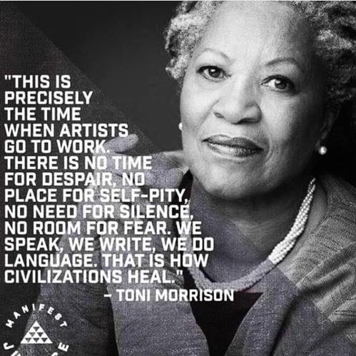
In 2015, Toni Morrison wrote this beautiful article for ‘The Nation’ that perfectly illustrates our role as artists and designers in times like these. Morrison writes,

This is precisely the time when artists go to work. There is no time for despair, no place for self-pity, no need for silence, no room for fear. We speak, we write, we do language. That is how civilizations heal.

I know the world is bruised and bleeding, and though it is important not to ignore its pain, it is also critical to refuse to succumb to its malevolence. Like failure, chaos contains information that can lead to knowledge—even wisdom. Like art. –link

So in 2016, and beyond. I’d like to personally challenge myself to do just that. Not only give my time, money and services to causes I care about, but to finally create the work that speaks to me and brings me joy. It’s so important in times of darkness to find light and joy.

dcw_design_joy

Poster from my thesis project, above.

Years ago, I blogged countless times about my Pratt MFA thesis centered around the search for “Joy” in the creative process and in a creative life. It consumed me for a solid year. While the process of creating and writing my thesis at Pratt gave me little joy (ironic right), time and distance have inspired me to explore this topic again. And in light of current events, finding, creating and sharing joy has ever been more important. So that’s my challenge to myself. I’m putting this out there in the universe, in words. So keep me accountable.
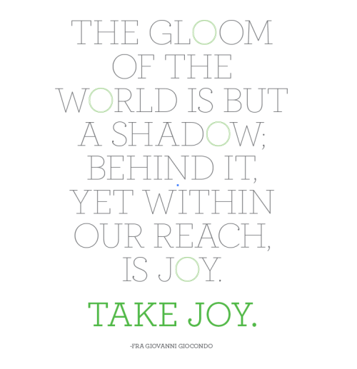
And take joy.


Read Full Post »

Brutalized Portrait of a Gentleman 2_Chad Wys

Brutalized Portrait of a Gentleman 2 – Chad Wys

Back in December, I stumbled across the work of Chad Wys on Pinterest and quickly feel in love with bold graphic nature of his paintings. If this is a genre or modern “style” of painting, I’m totally into artists and designers creating work this way (Wys’ work visually reminds me of Julio Alan Lepez – I blogged about Lepez back in September here). I love the idea of taking old paintings and objects and deconstructing, reclaiming or re-presenting them in new ways. Aesthetics aside, the work of Wys is smart and I appreciate the writing that goes with it. It shows the thought he channels into the creation of his work. He’s not just sitting there adding paint splatters to paintings to be controversial or ironic. Wys has a large variety of work spanning different mediums, but together you can tell they were created by the same person, without looking redundant or repetitive.

Nocturne 103_Chad Wys

Nocturne 103 – Chad Wys

Brutalized Gainsborough 2_Chad Wys

Brutalized Gainsborough 2 – Chad Wys

On his website, Wys writes, “A major strand throughout much of my artwork, beyond the broader inquirers into what art means socially, is the notion of object: object ownership, objectification of history, objectification of people, objectification of artwork and its many mediums; objectification of aesthetic pleasure; etc.  I often explore/exploit the idea of objecthood: how we decorate our lives with arbitrary, as well as meaningful, things; how we objectify the ones we love and the strangers we see; how we objectify pain and death; how we objectify complex and sensitive cultural histories … My artwork is also, at its core, an experimentation in composition, color, and form. Through a variety of mixed media I have chosen as my inspiration a color palette that is at times complimentary and at other times purposfully contradictory, or seemingly destructive. The literal destruction of an object is secondary, in my mind, to the overall effect created by color (dis)harmony and the overall aesthetic-emotional experience of the reclaimed and reinvented object.” – Chad Wys, 2012

Know Your Color Charts 1_Chad Wys  Know Your Color Charts 2_Chad Wys

How cool are these “Know Your Color Charts” series?

Nocturne 108_Chad Wys

Nocturne 108 – Chad Wys

Nocturne 110_Chad Wys

Nocturne 110 – Chad Wys

Arrangement in Skintones 8_Chad Wys

Arrangement in Skintones 8 – Chad Wys

I also think this series above, Arrangements in Skintones, is pretty great too. Wys currently calls Chicago, Illinois home and if you’d like to learn more about him, or see more of his work, check out his portfolio site, follow him on tumblr or twitter and you can even like him on facebook. Hope you’ve enjoyed Chad’s work as much as I do. Get into it.

Read Full Post »