Feeds:
Posts
Comments

Posts Tagged ‘joy’

15003347_1299508733427203_7340106932711347740_o

What a week it has been…

I, like the a majority of Americans in this country were stunned, heartbroken and deeply disturbed by the US election results this week. I’ve been lazy in 2016. Admittedly, I’ve only blogged twice this year. Not only have I been lazy in blogging and forcing myself to create the new work I’ve been talking about (for years), but lazy politically. I voted in both the primary and the general elections. But that’s all I did. I didn’t give my time, money or contribute my skills to electing our next president. And looked what happened. Hillary lost for many reasons. But I refuse to forget and not fight for the optimistic version of American she and Bernie Sanders talked about. I will no longer be lazy.

So in the mean time, it’s important to mourn, vent, and act. I feel a DEEP sense of dread and despair, but I feel compelled to channel those feelings into action. You may wonder, this is a design blog, what does the election have to do with art and design?

14940085_10153794285726853_928823874242338737_o

In 2015, Toni Morrison wrote this beautiful article for ‘The Nation’ that perfectly illustrates our role as artists and designers in times like these. Morrison writes,

This is precisely the time when artists go to work. There is no time for despair, no place for self-pity, no need for silence, no room for fear. We speak, we write, we do language. That is how civilizations heal.

I know the world is bruised and bleeding, and though it is important not to ignore its pain, it is also critical to refuse to succumb to its malevolence. Like failure, chaos contains information that can lead to knowledge—even wisdom. Like art. –link

So in 2016, and beyond. I’d like to personally challenge myself to do just that. Not only give my time, money and services to causes I care about, but to finally create the work that speaks to me and brings me joy. It’s so important in times of darkness to find light and joy.

dcw_design_joy

Poster from my thesis project, above.

Years ago, I blogged countless times about my Pratt MFA thesis centered around the search for “Joy” in the creative process and in a creative life. It consumed me for a solid year. While the process of creating and writing my thesis at Pratt gave me little joy (ironic right), time and distance have inspired me to explore this topic again. And in light of current events, finding, creating and sharing joy has ever been more important. So that’s my challenge to myself. I’m putting this out there in the universe, in words. So keep me accountable.

And take joy.


Read Full Post »

Hello everyone, while I’m in this limbo period trying to figure out what I’m going to create for my final thesis project, I thought I’d give you guys some links I found this week. First up is the band The Weeknd. I saw their Thursday EP on a blog weeks ago but didn’t listen to it until last night. I’m in this group! Or is it just a him? I’m not totally sure. Either way you should check them (him) out. You can download their first two EPs on their website FOR FREE and LEGALLY! Just go here to download. I really like the song Rolling Stone from the Thursday cd, listen here.

Another place for great LEGAL & FREE music is Urban Outfitters music site, UO Music. Each week you can download free mixes through iTunes. Go to their LSTN page to download the free mixes, each has about 15 free songs. They also have another page, Music Mondays where you can get 5 free songs every Monday. So if you’re ready to embrace your inner hipster, check that out.

On the design inspiration front I found two blogs I was excited about this week. The first is aqua-velvet.com. As I do with every new blog I find (and like) I go back as far as I can through their posts. I’ve found so many great posts on this blog, lots of vintage modern design inspiration and some pretty cool photo collections. I’ve been posting a ton of theses to my tumblr recently to share with others. So if you don’t have tumblr, check out the blog.

Another source is that is thesis oriented is the blog aestheticsofjoy.com – !! A blog about joy in design. Sound familiar? I’m seriously an idiot for not finding this blog earlier as it would have been so helpful in the thesis writing process. There are some really great projects on here, joy-related or not. The site is a project by Ingrid Fetell, an industrial designer for Ideo and Pratt graduate. She also lives in NYC so I’m hoping to meet or talk with her about both of projects. Here’s a little more info on Fetell,

“My work explores the emotional relationships between people and things, particularly the basic objects we interact with every day. Many of these interactions are unthinking—the way we sink into a chair or grasp a cup—and my goal is simply to expose the emotionality inherent in the material action. On a deeper level, I’m interested in the dialogue between objects and our long-term emotional well-being. Much has been said about the unhealthy culture of consumption in modern life, and I believe part of the solution lies in designing products that are emotionally satisfying in a more durable way. The designs on this site are physical explorations of questions related to this premise — questions about empathy + emotion, movement + materials, social issues + sustainability.

My current focus is Aesthetics of Joy, a blog and book-in-progress that draws on insights from neuroscience and psychology to suggest ways that design can enhance our emotional health and well-being. The project looks at the unconscious effects of architecture, products, fashion, and art on our psyche, and suggests ways that better design might lead the way to happier, healthier, more sustainable lives.”

One of my favorite posts is this one about “The Joy of Illegal Rainbows” by “Rainbow Warrior” (lol) working in Albuquerque, New Mexico. According to Fetell, “The warrior is a street artist working in Albuquerque, using spilled paint to pour rainbows off the tops of buildings. The charm of the story is in how the community has rallied to the warrior’s defense. This Facebook page has drawn 1,492 fans “in support of the Rainbow Warrior, whomever s/he may be.” And the soul of the story is in the warrior’s own words. This is the warrior on his/her inspiration for painting the rainbows:

About three or four years ago … I was feeling really depressed and I had this notion that if I went out and painted a rainbow, maybe someone would see it and feel what I was feeling or feel anything as intensely as I was. The first one I did, I just literally dumped the paint over the side of a pretty ugly, abandoned, alleyway building.

JOYFUL INDEED!


Read Full Post »

In this post I’m going to give you a small peak into how I go about creating the visual responses that make up This brings me joy. The Joy Project.  The first time I read each letter I like to make sure I’m somewhere alone so I can truly reflect and connect with the person that wrote it. I generally read each letter a few times to decide which response is the most touching, original or would make the best visual response. The challenge with this round of postcards is that I don’t know the sender. Each letter was given to a friend of a friend so I’m designing for someone I don’t know. This is good and bad as I’m removed of prior knowledge of that person that ultimately informs the visual response I create them (it’s almost like cheating in a way). It’s also bad at the same time because I have no idea what they’ll like – and I’m hoping I’ll design something that strikes a cord. In the first round, I knew who wrote each letter and knew who I was designing for … and could use that to create something I knew they’d like.

In the example above “Dinah Washington” was listed as something that brings this person joy. I’m only vaguely familiar with the Swingin’ Miss D from her song “Relax, Max” that was used in a Double Tree commercial a few years ago. I liked the song so much from the commercial I downloaded it and Miss D now lives in my “Jazz/Oldies” playlist on iTunes. When thinking how to visualize the song and Dinah Washington, the tagline Relax, Max is so simple and bold, I knew a typographic solution could communicate the song, something bold yet playful. I played around with a couples versions in Illustrator below …

The music of the song makes me think of vintage neon sings, or multicolored letters on vintage record singles from the period.

I wanted to make the type look old so I was playing with adding a more yellow background to give it that vintage feel. But at this point it was just retro, and not retro-modern.

Above: After many tweaks, here is the final version! See it and 70 more here.

Here’s another example. The response I loved from this particular letter was, “the first kiss.” That’s something everyone can relate to and it certainly brings me joy, the excitement of that first kiss with a potential  mate. And here comes the challenge. I don’t know the person … who do they like to kiss? Boys? Girls? Is this a straight, gay, pan or a-sexual person?? Who could know?!? Therefore typography or images that aren’t too specific should be used. That way the receiver of this postcard, and anyone viewing this response within the project, can be free to interpret the statement “the first kiss” anyway they want. That is ultimately my goal with most of these responses, that any view can place themselves within the picture. Here is how the process worked for “the First Kiss.”

I started playing with the letters of the words “kissed”  and noticed the two “ss” would be fun to play with. I could reflect one ‘S’ so the letters themselves could kiss, thus freeing me from finding a photo of a kissing couple. Whew.

Then I arrived here (above), I love the type but it was looking a bit too Valentine’s day …

I decided to go through my iTunes and look for songs that dealt with the subject matter. The words “and then we kissed” kept coming to mind which are lyrics to a Britney Spears song (withhold judgement). I experimented with adding lyrics of the song and layering them to create a web of emotion visualizing a moment … that moment when your mind races just before a kiss.

Above: The final version, “The first kiss”

Here’s a look at a few of the newly designed projects below.  I now have a collection of 70+ visual responses on the project website, thisbringsmejoy.com

“The Modern Love column in the NY Times”

“Durham, NC”

“Too Wong Foo! Thanks for Everything Julie Newmar”

“Immersion, the merging of the past, present and future”

“Complexity”

“Dancing solo”

Read Full Post »

So I couldn’t pick just 7 designers in seven days! I came across Maija Loukari and her work for Marimekko and immediately fell in love. Along with Maija Isola, I think Maija Loukari is one of my favorite designers currently working for the company. I really like her illustration style with simple shapes, bold outlines, and pops of color. Her website is also pretty cool with a wider selection of her illustration and textile work beyond Marimekko.

I found this video (above) by Marimekko from their 60th Anniversary show in Helsinki, Finland. Marimekko is really stepping up their branding in addition to the products they sell with their signature textiles. In Helsinki I got to visit one of their concept stores with new product ideas and store layouts. There’s another concept store here in Copenhagen I need to visit. I’m hoping for my final pattern design to create something with a vintage feel, in color and form, with a modern twist. I think Loukari has a natural skill for illustrating in this way.

Marimekko just opened their online store in the US – so I predict they’re looking to expand more in the states. So far the only store I’ve seen is their pop up store in Soho’s Crate & Barrel. So if you’re in NYC, or lucky enough to be in a place with a Marimekko store, be sure to check out their colorful world of beautiful patterns. Here’s more examples of their work and another GREAT video from their youtube channel.

Maija Louekari coasters for Marimekko. Love her B&W images with pops of color.

A selection of Marimekko pillows.

Louekari textile print, from her website.

I love how this Louekari print is paired with matching dishes that look like they’re part of the print.

Check out the Secret of Marimekko video – so well done and inspiring!

A little more about the company:

“Marimekko is a Finnish textile and clothing design house renowned for its original prints and colors. The company designs and manufactures high-quality interior decoration items ranging from furnishing fabrics to tableware as well as clothing, bags and other accessories.

When Marimekko was founded in 1951, its unparalleled printed fabrics gave it a strong and unique identity. Marimekko products are sold in approximately 40 countries. In 2010, the brand sales of Marimekko products worldwide were around EUR 150 million and the net sales amounted to EUR 73 million. The number of Marimekko stores totalled 84 at the year end. The key markets in 2011 are North America, Northern Europe and the Asia-Pacific region. The Group employs around 390 people.”


Read Full Post »

(BEFORE)

(AFTER!!)

My MFA thesis exhibition officially opened Friday April 22nd at Pratt Manhattan on W14th. If you’re in NYC, it’s open to the public until May 3rd! Check it out!!

After all the blood, sweat, and tears the show came together. I guess it always does right? I will get better pictures in the coming days but these are all I have for now. The opening went great! I saw lots of people I knew and meet lots of new ones too. In terms of how the show was received, I think my exhibition accomplished all my goals. My hope was that people would read the letters, see the work, take a moment to pause and smile, thinking about what brings joy/happiness in their life. I also wanted to make a project that was easy to understand and digest. I think I did just that. I can’t describe the joy I felt seeing people read the letters with a huge smile on their faces. It made me feel like all the stress was worth it. A lot of people said the work was beautiful and let’s be real, that’s one of the greatest compliments one could get. So everything worked out, mission accomplished.

I still have a feeling the powers at be aren’t convinced about my inquiry into joy and the body of work I created for the exhibition. I judge this b/c the only thing my adviser said to me during the opening was, “Are you getting good constructive criticism?” .. how about “good job,” or “it came together nicely,” or anything nice to say, EVER? I told her a lot of people were touched and were excited to talk to me about the project and how beautiful everything was. She just said, ohhh okay, in that sort of judgmental way, as if people saying beautiful design work is a bad thing. I’m sorry, its not easy to make beautiful work and work that people actually connect with. She’s such a hater. BUT — my plan this week is to use my paper to make my argument perfectly clear. I say this now, but I’m actually excited to finish it.

I had people in the space write down  joy statements and I got a TON of responses, I think I’m going to post them on the wall during the show. I think it will make my wallpaper a little more interesting. One flaw I noticed was that many people weren’t connecting the dots between the projects, they didn’t realize the letters came first, which inspired another project, then another. I think I could have labeled things differently, or been more clear. So there’s room for improvement there! I also wish I could have left an address sign up sheet during the opening to collect addresses of people that would like to participate in the future. Would have been great to have another 20+ people to send new letters to … for the next wave. Ideas for next time! Here’s a few more pictures.

My framed visual responses on the floor of my studio, all 60 of them!

This was my space during set up on Thursday. A mess!

My finished space Friday morning. Added a third row of cards last minute.

Close-up of postcards, and the postcard packaging (right, hanging on wall)

The website thisbringsmejoy.com – will be the digital home for this project in May!

Thanks to everyone that came to the opening and a special thanks to Nick, Theresa, and Nefeli, who were each so helpful to me during the entire process.

I couldn’t have done it without you!
xoxo

Read Full Post »

Because by TD Jakes, this brings my joy.

Today was my 1st official day of set-up in my exhibition space. My primary goal was to wallpaper the removable wall and cover my large wall with 6 yards of fabric I bought at Mood yesterday. When I got to my space to hang the wallpaper, I noticed the printed pieces were still too small. The prints I spent over $50 on were a waste. Luckily, Staples didn’t have a line, so I printed in B&W, and it actually looks pretty damn good. Should have done it from the beginning, I have no idea what I was thinking.

Later in the day my friend Theresa came by to help me hang all the fabric. It’s insane how much time and money both of us spent just COVERING our walls. This has nothing to do with our projects, but we’ve invested so much time prepping our walls. In the time we did that, another classmate hung his entire show. Oh well, good things from to thosethat face adversity, I like to think. Note to self, always pick exhibition spaces with finished walls. Here’s some pictures from the day.

Oh, and tomorrow I get to see Debbie Millman speak at Pratt! Can’t wait for that!!

My wallpaper and the monitor, which will display my animated project logo. The text is every joy response I got from my letters, all 760 of them, in alphabetical order!

Another shot for context.

Before …

After! – My friend Nefeli.
I’ll be doing this on Thursday. Yes, we have to sand, prime, and paint our own tables ..

La Vie en Rose by Louis Armstrong, this brings me joy.

1 of 60 that will be on display at my show!

Read Full Post »

A New Show

The first MFA show has already open and closed, and now it’s my turn. I’m frantically trying to print/produce everything for Friday’s opening. I feel like I’m in a decent place, but I’m at the point where every time I print something, I keep making more work for myself. For example, my postcards are printed, all 60 of them! They look beautiful. Now I have to trim 90 postcards by hand. I’m also trying to print one more book, design my own wallpaper, and I need to find a way to hang all my letters. It’s going to be a mad dash until the very end. PRAY 4 ME! I’m going to keep this post light on text and heavy on images. My thoughts on everything will come later. I hope you can come out Friday night, find more info about our show on the website, anewshow.com

The 1st show, sans people! The space came together amazing, despite all the drama.

Close up of my friend Theresa’s space, I LOVE this project (and everything she makes). So beautiful!

Rebecca’s space, such a talented lady. This will also be my space come Friday

So on to my projects, in progress …

All my postcards, or visual joy responses, printed on the floor for the 1st time.

My friend Nick stepping on my thesis!!!

Proof of my postcards in colour from Village Copier. My packaging design is the top page.

IN-LOVE with my packaging, now I just have to cut out and put them together … might be tonight’s project.

Fried okra, this brings me joy.

First look at the actual cards. Everyday I’m going to show two prints until my show opens. This is the first.

Rainbow sprinkles, this brings me joy. 

Two more images coming tomorrow! xoxoxo


Read Full Post »

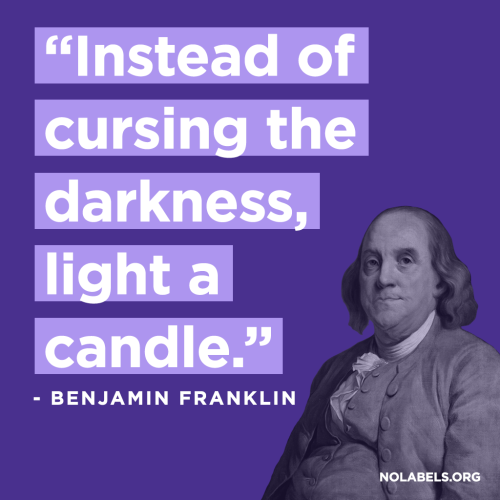
Why so low-brow? That is the question of the day, or was a few weeks ago. As I’m plugging ahead with my visual projects, I thought I’d take some time to reflect and share some of the thesis writing process with you fine people. Ever wonder what comments on the first draft of a thesis paper might look like? Well you’re in for a treat! I’m going to share some of the greatest hits I received from one of my advisers, who shall remain nameless …

First up, why so low-brow, Jonathan Adler edition. For those of you who don’t know, I am writing my thesis on the subject of joy, specifically joy in design, where it can be found, how it can be used for the creation of new work, and its importance in the creative process. In my paper, I listed precedents and antecedents, or artists/designers/projects that have inspired or informed my work. I divided these artists/designers/projects into three groups: Joy in Art & Design, Commerce, and Application.

In the paper I talk about Jonathan Adler as an example of Joy in Commerce. JA has a pottery background and created an extremely successful business centered around his joy and passion, pottery and interior design. He’s created a brand, uniquely his own, that frankly doesn’t take itself too seriously. JA talks a lot about happiness and joy in his books and this is referenced in many places within the product line. The playful use of color, pattern, and design appears everywhere. Since I’ve worked at JA for 10 weeks now, I’ve noticed this first hand. For anyone who doesn’t think good design plays a role at JA is out of their mind, I know personally because I’m the one spending hours designing some of his “low-brow” products.

My adviser went to a lecture some years ago with Jonathan Adler and Eva Zeisel, another antecedent in my paper. Both are potters by trade so I assume the that’s why they were paired together. One would notice in my paper, Adler and Zeisel appear in different categories, Zeisel is listed in the Artist/Design category and JA in Commerce. They were intentionally separated since they have distinctly different interests and opinions on design. They are also from different generations and have opposing ideas on the role of design in society. WHICH I THINK IS GREAT! A lot of what makes the world go round is different opinions, goals, and applications for design. How great is it that we’re in a field called design and we can do so many things? I love it.

My adviser has a strong dislike for JA due to his commercial leanings. She finds him shallow, superficial, and apparently low-brow. While I’m not defending his personal character anywhere in my paper, the fact remains he went from selling his first order of pots to creating a rapidly expanding brand with close to 15 stores in the US. So Jonathan’s success in design is bad because he’s become wealthy from his business and continues to find ways to do so? It’s the American dream, and why should he be so lambasted for it? It’s like the whole design and selling out thing.

I never want to be a starving artist. Period. Or a starving designer. I love brands, I love branding, I buy things, I want people to buy things I make and design. And I’m not going to hell for wanting to do so! I want to take what I’m passionate about, what I enjoy, what I love, what BRINGS ME JOY, and find ways to share and market those things. I took this picture a few weeks ago on Pratt’s Brooklyn campus. How appropriate right? I came from a family where I was never given much. I always had what I needed, but beyond that I had to provide my own opportunities. When I wanted a car, I got a job that I walked to every day so I could buy my first car. I got myself through high school while working over 30+ hours a week, still making straight As. I worked through college, and I’m even working close to 30 hours a week while being a full time graduate student, at a school I’m paying for MYSELF.

Why should that matter? I know we’re not supposed to talk about money, but money matters. I’m driven by money and I do want to be successful. And is that a sin, no? I’m not saying I want to be rich at the expense of others and never give back. I believe quite the opposite. I decided to go to Pratt, and make a significant investment in my future to better myself, and I’m determined to see it pay off, in one way or another.

I feel like I’m continually coming against this wall in my program between designing for academics/design for other designers, and designing for the real world. Obviously, I have little interest in design in an academic sense. I’d love to teach one day, but I’m more interested in how design can change the world, create opportunities, and enhance business, than talk theory, concept, and ideology.

The other week a student mentioned, “In the MFA program, there were a lot of projects that weren’t successful visually/design-wise, but were conceptually strong, therefore they were successful.” I thought we were “Communication Designers” and the majority of our communication methods were visual? (Granted, some solutions are verbal or audio, but they still COMMUNICATE). I’m sorry, if you have an idea, and you can’t make it, and it doesn’t work, perhaps it’s not successful. You can’t talk ideas and concepts until you’re blue in the face … that’s not how things work in the real world. And I want to be in the real world.

The picture of Jay-Z is from an issue of Oprah magazine (another low-bow source of information) I was reading over Christmas break. It really struck a cord with me. I think this idea is one the greatest things one can learn from Graduate School. The whole purpose in the end is to define who you really are, as a designer or artist, and then create a market, job, or area of interest for you. I’m never going to truly be a success if I try to become something I’m not. So maybe I’m low-brow and uninterested in academics for academics sake. There are others who can do that ten millions times better than me, more thoughtfully and passionately that I ever can. And they should do that! And they will find joy and success in that. I want to be successful as myself, imperfect and glossy, unacademic, shallow, low-brow, and whatever else they may call it. But I’d rather be true to myself, than change my joy and passion, especially in design, for anyone else.

/end rant.

Read Full Post »

The last few weeks have been quite busy. Besides Thesis, I’m taking one other traditional class at Pratt this semester, Cross-Disciplinary Studio. The class merges design and architecture into one class, combining model making/architectural exploration and graphic design. I enjoy the class, minus its 6-hour length every week. Literally we sit in one room for six hours and critique. It’s exhausting. Before my birthday last week, our big project was due, and I was surprisingly happy with the results. My model came together better than I ever expected though it doesn’t photograph well. I found a way for me to flesh out thesis ideas with this project, and I’ll document the process to create a Exhibition Proposal while will be a book in my thesis exhibition. Adding a 3D proposal, or a joy project in a physical space, would be a nice component to all the things I’ve done with print or online.

I like my posters (for that project), but I have no room to hang them, so I might put together a branding guide or something of that nature. In regards to the joy letters, I’m tham as project 1, and for each letter, I’ll create a visual response. Both letter + response will be displayed in my thesis exhibition this April, but I’d like to find a home for them online. When I met with my adviser, he gave me lots of ideas to turn this into a self-sustaining project. Earlier in my thesis I had entrepreneurial aspirations so I think it will tie in nicely to my original thesis ideas. I’m planing to continue this project after my time at Pratt, so if I could make this project pay for itself somehow, I’d be more than thrilled.

Here are some visuals from my 1st Cross-Disciplinary Design Studio:

You can see how I’ve used the branding idea from my previous post and turned it into another project. I’m also using text from the letters all together in my exhibition as a wallpaper behind a video screen. I previously wanted to do a poster of all the joy definitions together, but I think creating a wall paper of the text will be much more visually impressive. Now how to make post paper look like wallpaper will be another thing ..

Today we had the creative director from Sullivan speak to our class. Sullivan is a “communication strategy” and design firm located here in NYC. It was interesting to hear all about design and branding in an MFA class. I was surprised how IN-DEPTH he went into this one project, but nice to hear about that stuff time to time. Now I’m debating what I want to do professionally after school and which direction I want to take. The idea of branding strategy is interesting to me, and I see applications for it at JA, so hopefully I can explore that more in the last month of my internship. The last two weeks I’ve done a TON of packaging for new products so I should have my first designs in JA Store and B&N soon! After the presentation I started thinking again about slickness and gloss in design. In our program, its practically a sin to doing something glossy and slick. But in the real world, that’s preciously what one needs to get a branding/design job. So I’m going to look for new ways to design slicker than slick for design jobs, and more personal and hand-done stuff for my exhibition. Can I do both?? We shall see!

Read Full Post »

Above is the working logo for my “Capstone” project. As I’ve spent the last few months asking people what brings them joy, I’m calling this larger project “This Brings Me Joy: The _ Project. Why the blank? I originally called it “The Joy Project” but what I like about the adaptability of joy, and the myriad of responses and definitions I’ve received, is that joy takes so many forms, and can be so many things. Therefore the logo and identity of the project should do the same. This is an example of how it works:

I’ve sent 40 letters out to friends in New York, North Carolina, and a few other places. I ask each person what brings them joy, what makes them smile, what makes you happy, etc. For a few minutes, or however long they care to reflect, I’ve asked them to write down as many sources of joy they can think of. As of today, I have 25 of these lists. They’re all so different and so personal. They make me so happy to read too! After reading, I enter everyone’s “joy” into one master list in Excel which I’ll use to create a huge poster with every single response I have. I literally have 100s of joy items at this point, so far the item that’s appeared most is sex, followed closely by red wine and cheese. How funny is that?

Here are some images of the letters:


So here’s an idea how all this will fit in my thesis space. I have roughly 16ft on one wall, and 6 ft on a small side wall. I’d like people to come to the space, read my statement (which I still need to write) and see the experience I designed (the letters I sent). Then they’ll be able to see all the visuals inspired by this inquiry into joy. My only fear is this doesn’t have much to do with graphic design as a subject. This particular project has nothing to do with joy in graphic design. I talk a ton about that in my paper and I think that’s enough. I want to create a pure experience on the subject of joy, about one subject, through many voices. I think that will be way more powerful than if I dilute the experience with close but not exactly related projects. I’m trying to KEEP IT SIMPLE as my boo Jason says.

Here’s a preliminary version of what the huge poster will full list could look like. I’ll finish this when I stop adding letters to the exhibition. Eventually I’m going to need to establish a cut-off point so I’m not reworking stuff on the last day.

So this week I want to finish MY JOY poster, the list I made, and make something similar in style to the cards I sent out. Something with lots of type, photos, and abstracted bits and pieces. And above all, it must be beautiful. That’s my primary concern to be honest. Then you’ll be able to read the letters in the space and see the hand writing/different solutions to the same assignment, then read everything all together at the end. I’m also planning one more surprise for the show, which I wont give away till opening!

So stay tuned!!

Read Full Post »

Older Posts »