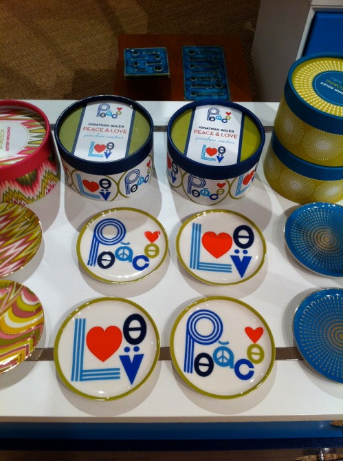
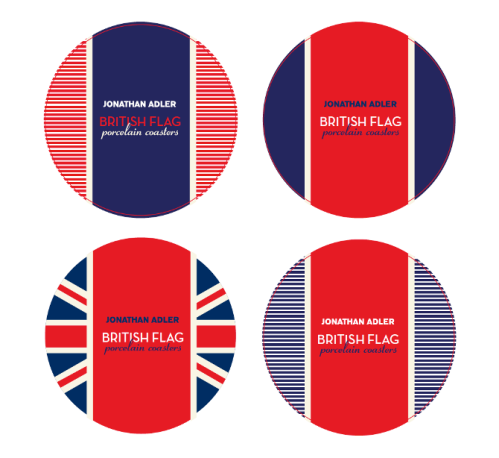
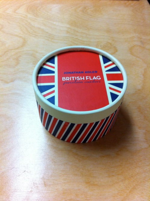
As most of you know, last spring I was given the extraordinary opportunity to intern for the one and only Jonathan Adler, purveyor of all things happy and chic. Now is an exciting time because most of the things I’ve designed for JA are finally hitting stores and online. One of the items I’m most excited about is the Peace & Love coasters I designed. For this project, I had just a few hours to design two sets of coasters for Saks Off 5th. One design was to use a British Flag motif while the other should use art from the existing Peace & Love pillows. To make a long story short, Jonathan liked the coasters above so much, he decided to sell them in our stores and I created another simplified version of the Peave & Love artwork for Saks Off 5th.
I designed 4 different patterns using British Flag design motifs. I really likes the ones with the strips – very nautical right?
Final Design – available now at Saks Off 5th !!
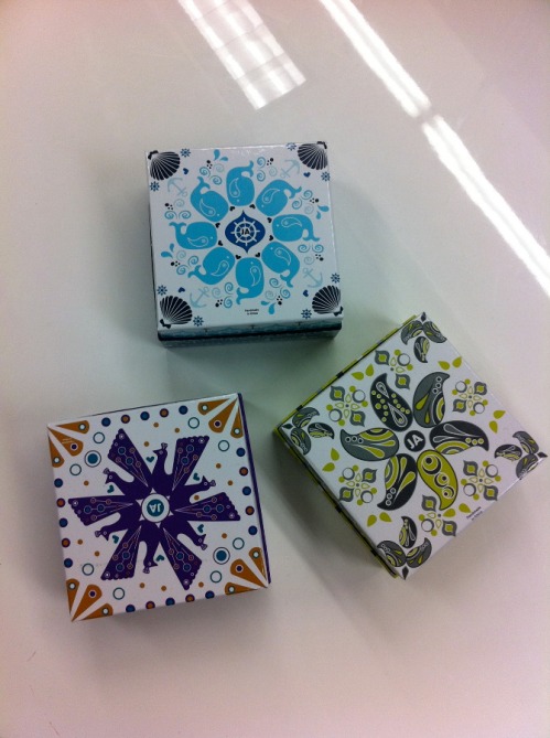
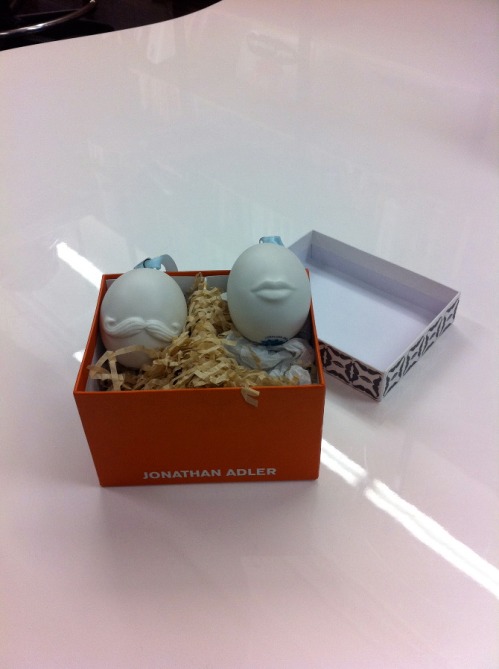
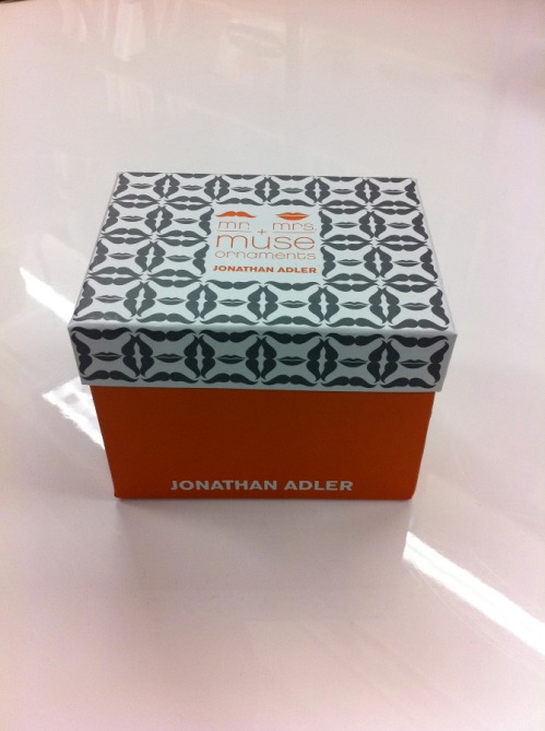
Another big project was the packaging for the 2011 holiday ornaments. In the middle of March we designed these. Who knew Christmas came in the spring?
Mr + Mrs. Muse ornament packaging.
I created the pattern on the box, which is made of the iconic lips and mustache used in the Jonathan Adler Muse collection.
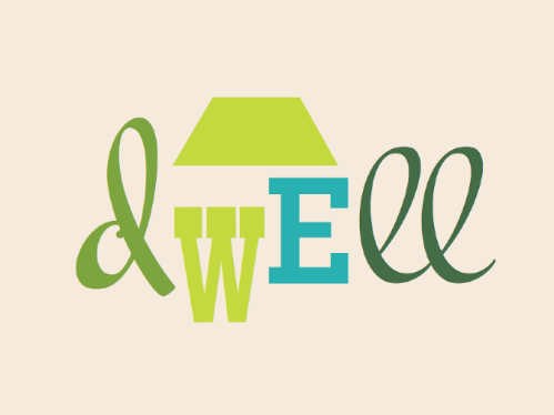
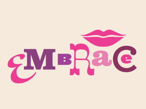
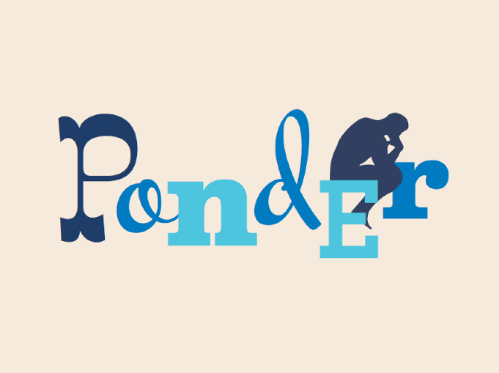
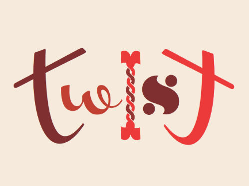
Another project that was super exciting is this line of typographic needlepoint pillows we designed for an upcoming Jonathan Adler book. The chapters of the book are divided into the following sections: dwell, embrace, explore, twist, and ponder. I love to play around with type, so this was the perfect project for me. I had the idea to limit each pillow to a few typefaces and colors. One pillow would have type in shades of green (dwell, see above), another red (twist) and another blue (ponder). One of the things I LOVED about working for Jonathan Adler was the ability to work on fun projects like this with crazy typefaces. In the design work I do for most clients, I’d never dream of using these typefaces, but somehow all together they’re fun and chic. Something about this style really works for Jonathan Adler and isn’t seen anywhere else.
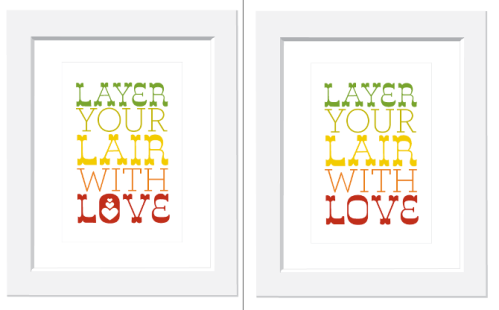
One last project I was super excited about was a line or prints JA was developing for a big picture frame & art company. I’m not sure what happened to this project, but I spend several days coming up with really cool type prints based on Jonathan Adler’s “Alderisms” or words and phrases JA uses a lot in their stores. Sadly this is the only one I have a copy of. How cute would this be in your apartment right?
