Feeds:
Posts
Comments

Posts Tagged ‘product design’

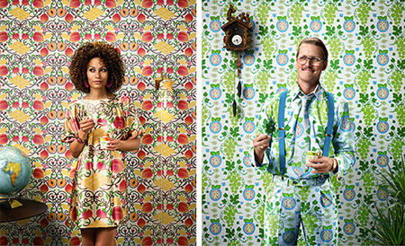
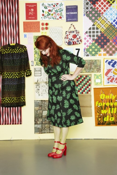
Photo: Anna-Lena Ahlström

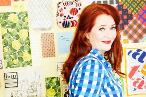
Today I’m sharing the work of Scandinavian pattern/textile designer and illustrator Lotta Kühlhorn. I stumbled across Lotta’s work while browsing the Huset Shop website (a great place for Scandinavian design inspiration) and immediately recognized her work from my travels to Sweden and Denmark last summer. Lotta is a great example of a designer using bold graphic colors and prints to create simple yet beautiful pattern designs. I particularly enjoy her fruit and vegetable patterns. According to her bio on Huset Shop,

Lotta Kühlhorn is a Swedish-born illustrator and designer. She started her professional career while attending Konstfack University College of Arts, Crafts and Design. Lotta is known for her bold patterns and vibrant colors. In the 1990s, she was one of the first Swedish designers to begin experimenting with the graphic elements of “junk culture,” using pop art, films and mass produced items as the basis for her inspirations. Lotta’s simple “happy-making” products are inspired by her childhood and feature a bit of retro seventies style. –Huset Shop

I really love that she turned ‘junk culture’ or things considered lowbrow into beautiful patterns and works of art. What I really enjoy about Scandinavian Design in general is designers in this genre use simple elements, patterns and shapes found around them and create pieces of art from it. It’s not that deep and conceptual … and THANK GOD! Scandinavian design is stripped down to its simplest elements and is therefore democratic and more accessible to a larger population. That’s what I’d like to do with my work. Just look at IKEA and H&M, two Swedish designed brands with simple, honest approaches to design and world-wide appeal. I don’t think as designers we should be creating barriers to understanding and communication. But I digress ..

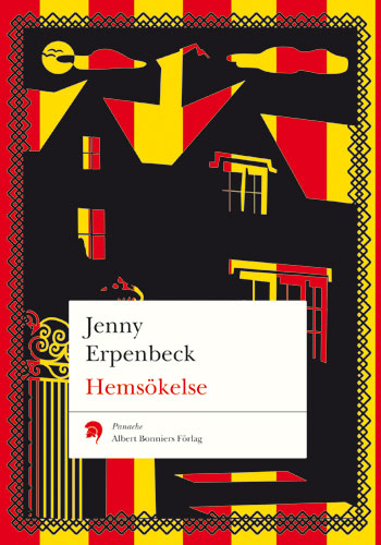
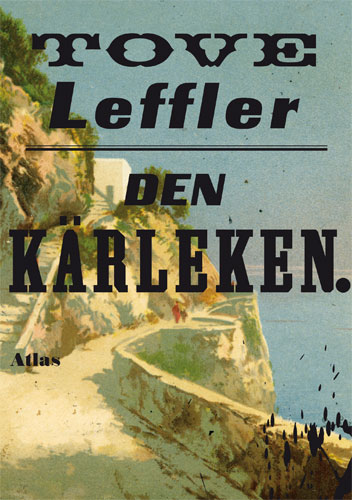
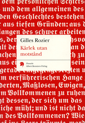
I also like that Lotta designs book covers, which as a graphic designer myself, I really connect to.  So check out her work below, on Huset Shop and on her website here. Enjoy!

I love her simple illustrative style. Great for patterns and surface design.

Pear Mugs.

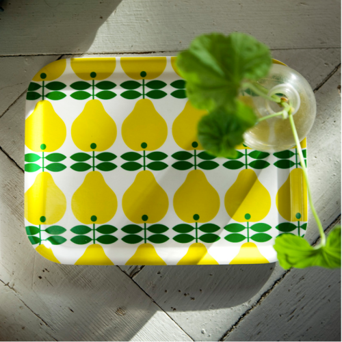
Pear Tray – cute right?

Hotplate.

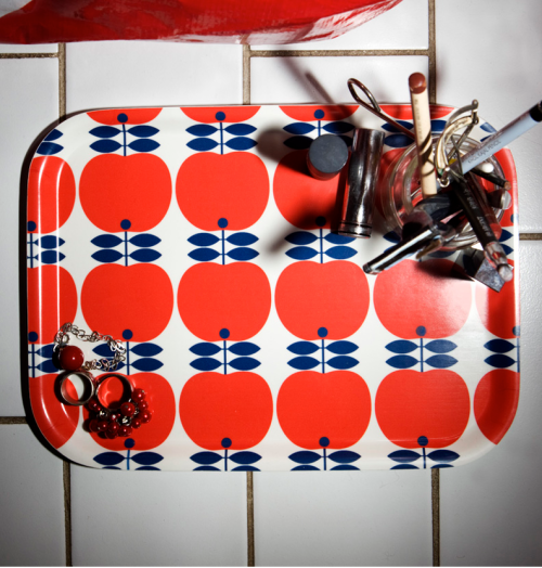
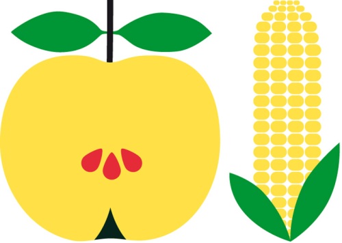
Apples.

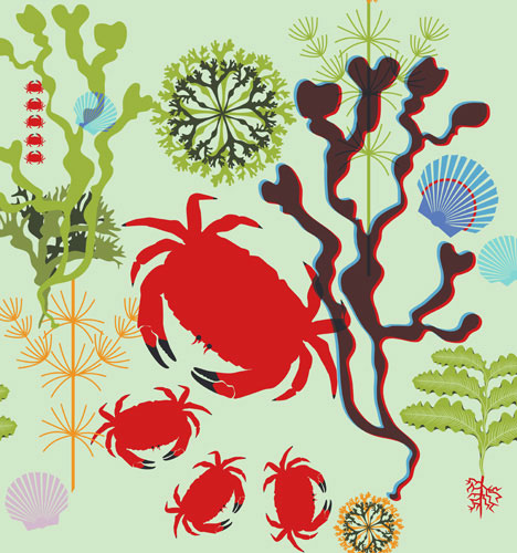
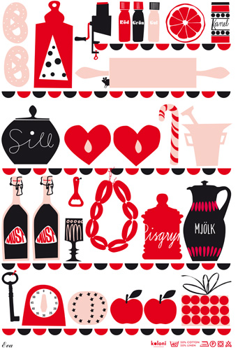
As an illustrator, her work varies in complexity of pattern.

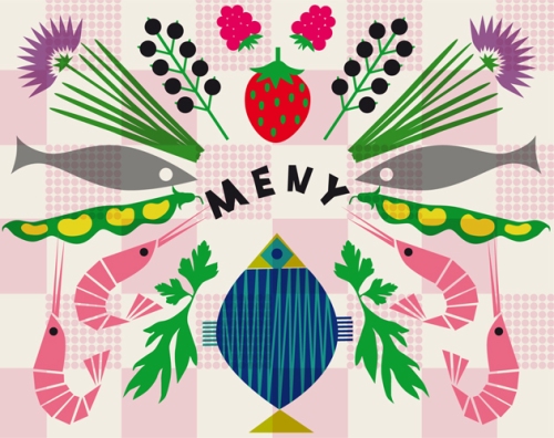
Great kitchen illustration. Love.

Lotta uses this same approach to book cover design. I want a set of all her books!

I’m going to blog more about her book cover designs later this week, so stay tuned! Hope you enjoyed the work of Lotta Kuhlorn so far!
Read Full Post »

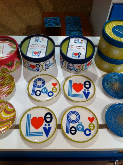
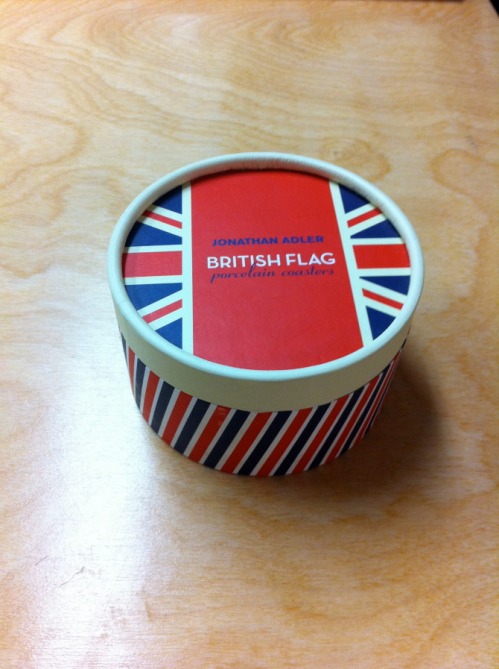
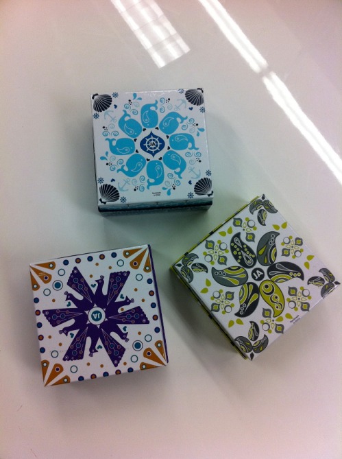
As most of you know, last spring I was given the extraordinary opportunity to intern for the one and only Jonathan Adler, purveyor of all things happy and chic. Now is an exciting time because most of the things I’ve designed for JA are finally hitting stores and online. One of the items I’m most excited about is the Peace & Love coasters I designed. For this project, I had just a few hours to design two sets of coasters for Saks Off 5th. One design was to use a British Flag motif while the other should use art from the existing Peace & Love pillows. To make a long story short, Jonathan liked the coasters above so much, he decided to sell them in our stores and I created another simplified version of the Peave & Love artwork for Saks Off 5th.

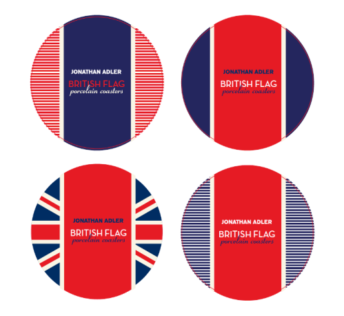
I designed 4 different patterns using British Flag design motifs. I really likes the ones with the strips – very nautical right?

Final Design – available now at Saks Off 5th !!

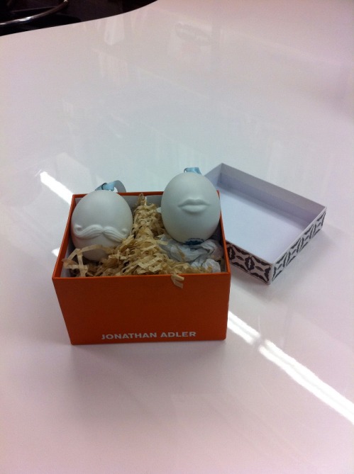
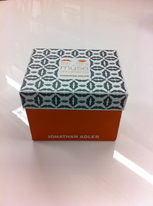
Another big project was the packaging for the 2011 holiday ornaments. In the middle of March we designed these. Who knew Christmas came in the spring?

Mr + Mrs. Muse ornament packaging.

I created the pattern on the box, which is made of the iconic lips and mustache used in the Jonathan Adler Muse collection.

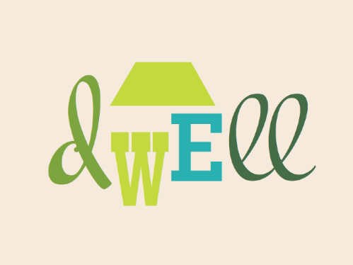
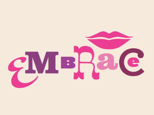
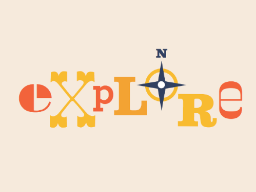
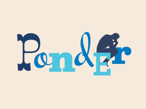
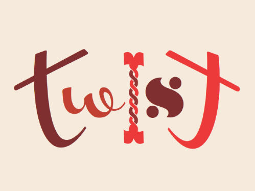
Another project that was super exciting is this line of typographic needlepoint pillows we designed for an upcoming Jonathan Adler book. The chapters of the book are divided into the following sections: dwell, embrace, explore, twist, and ponder. I love to play around with type, so this was the perfect project for me. I had the idea to limit each pillow to a few typefaces and colors. One pillow would have type in shades of green (dwell, see above), another red (twist) and another blue (ponder). One of the things I LOVED about working for Jonathan Adler was the ability to work on fun projects like this with crazy typefaces. In the design work I do for most clients, I’d never dream of using these typefaces, but somehow all together they’re fun and chic. Something about this style really works for Jonathan Adler and isn’t seen anywhere else.

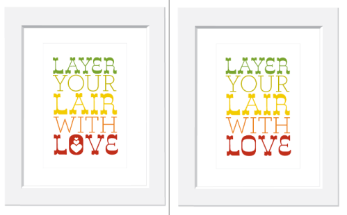
One last project I was super excited about was a line or prints JA was developing for a big picture frame & art company. I’m not sure what happened to this project, but I spend several days coming up with really cool type prints based on Jonathan Adler’s “Alderisms” or words and phrases JA uses a lot in their stores. Sadly this is the only one I have a copy of. How cute would this be in your apartment right?

Read Full Post »

Objectified Letterpress Poster

Good Design is as little design as possible. -Objectified

I just got back from Pratt’s showing of Objectified by Gary Hustwit, the director of Helvetica. This time he documents industrial/ product design. GREAT GREAT movie!

Here are some of my favorite quotes:

Every object tells a story, if you know how to read it – Henry Ford

Design is the search for form …

Good Design is honest.

Q:How many designers does it take to change a light bulb?
A: Does it have to be a light bulb?

The DVD comes out October 13th.

http://www.objectifiedfilm.com/

Read Full Post »