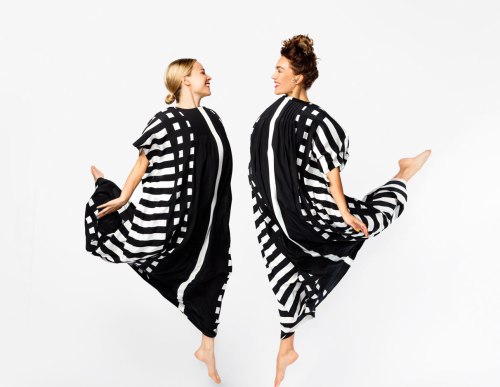
Marimekko’s spring/summer 2017 collection reintroduces five iconic garments from the 1960s and 1970s.
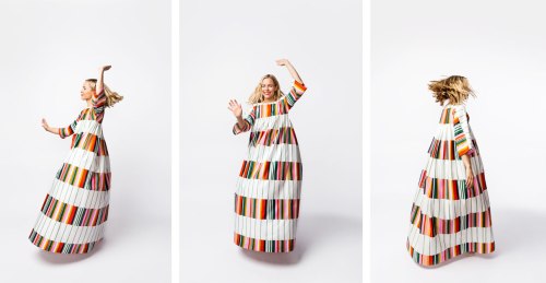
Last week I stumbled across a post on Marimekko’s Instagram that stopped me in my tracks. The post (above), features a look from the spring/summer 2017 collection where Marimekko reintroduces iconic looks from the 1960s and 70s. I’ve been a huge fan of Marimekko since graduate school when I took a textile design course at the Danish Design School in Copenhagen. Marimekko, a design house founded in Finland in 1951, is known for their colorful and iconic pattern and textile designs. Today their prints not only adorn textiles and clothing, but also items for your home.
“Over the years, Marimekko has remained true to its original mission of bringing joy to everyday life. A positive and empowering lifestyle brand marrying creativity with function, Marimekko continues to delight the world with timeless, yet distinctive designs for fashion, accessories and home décor.”
I love the idea of heritage brands using their archives to create new collections. Gap recently did this with the Generation Gap collection from the 90’s. Brands today, especially fashion brands with rich histories, should make this a regular practice. Perhaps they keep the designs 100% the same, or they update vintage patterns and silhouettes to todays tastes. Whatever they decide, I can’t get enough!
Marimekko is a brand that I have so much respect and admiration for, so I’m thrilled to share this special collection with you. As a brand they stand for quality, creativity, happiness and joy. You can sense this through the products they produce and when you step foot in their stores.
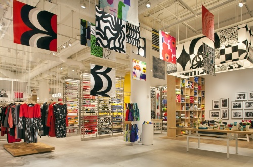
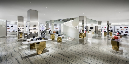
Marimekko’s NYC Flagship (above).
Other bands take note! Search your archives, bring back special items for a new day, and share that sense of joy with the world.