May 13, 2015 by dcwdesign
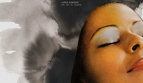
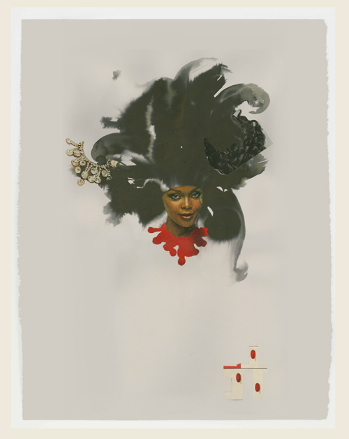
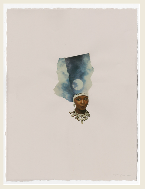
Today I stumbled across the a-mazing work of Brooklyn-based artist Lorna Simpson and I’m so in love with her mixed-media collages. A graduate of the School of Visual Arts, Simpson rose to prominence in the 80s and 90s. Simpson, who’s work has been exhibited at MoMA and have exhibitions all over the world, has been creating work for over 30 years. I’d never heard of her before today, but I’m totally in love with this series. I really really really need to get started creating my own work and collaging again. So until I do, get into the great work of Lorna Simpson!
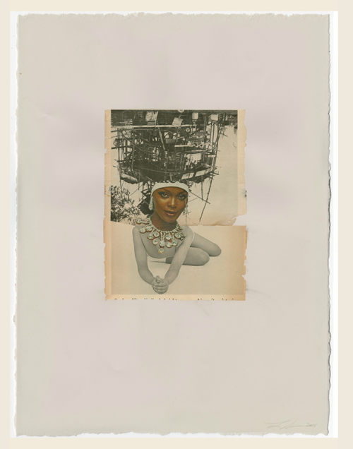
Detail (below).
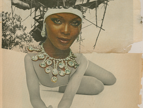
How great do these look in a group? (above and below).
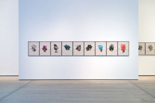
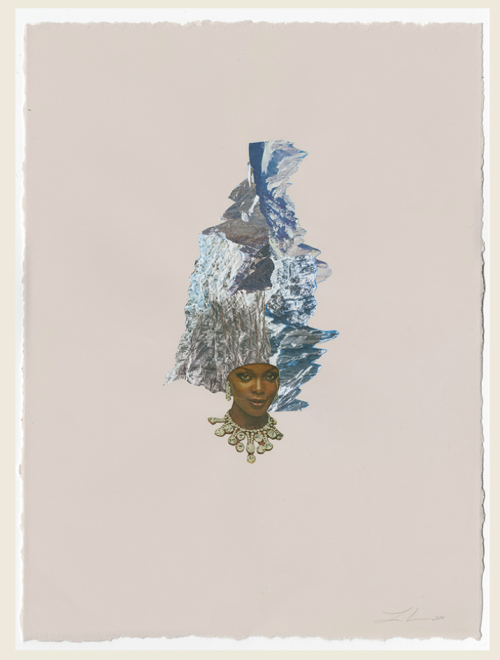
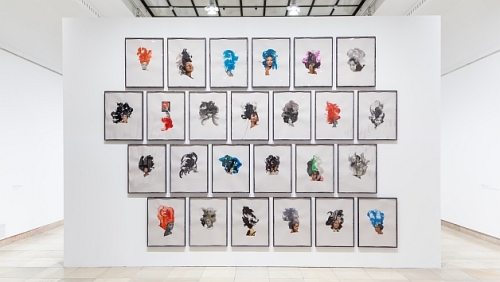 So in love with these as a series!
Continue Reading »
Posted in Art | Tagged art, collage, collage art, collage artist, ebony collages, lorna simpson | Leave a Comment »
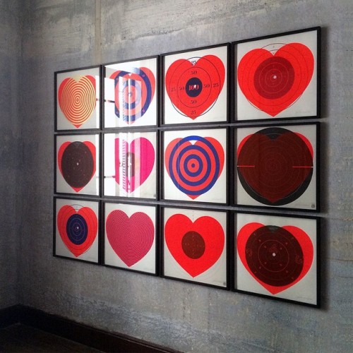
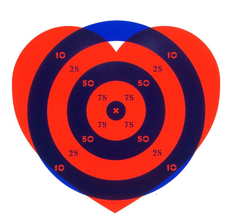
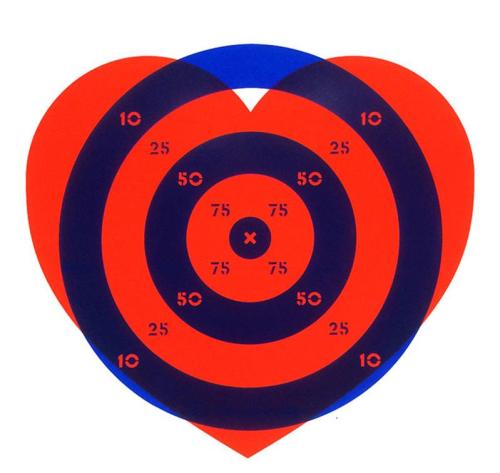
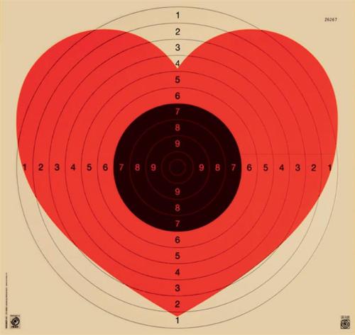
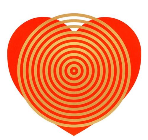
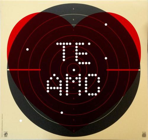
Yesterday on Tumblr, I stumbled across this awesome series of heart prints and immediately fell in love. How great do these look in a series? So bold and graphic! After some research, I discovered these prints are the work of British graphic artist Patrick Thomas. This series was featured in Thomas’ 2013 London exhibition, ‘100 BPM.” The show was a series of silkscreened bold heart ideograms combined with found imagery and collage, a recurring motif throughout the exhibition, which was timed to coincide with the Feast of Saint Valentine. The majority of works were limited editions and unique pieces created using free-form screenprinting and collage. Much of Thomas’ other work is super graphic in nature, so naturally I love everything! According to the Hang-Up gallery in London,
Thomas has been described as an ‘icongraphiste’ by American design critic Steven Heller. His work combines iconic images to create new, powerful messages. His art avoids labels, Thomas explains “I’m interested in process, in typography, in image-making and art. What I do is hopefully something that doesn’t fit neatly into any one of these categories.
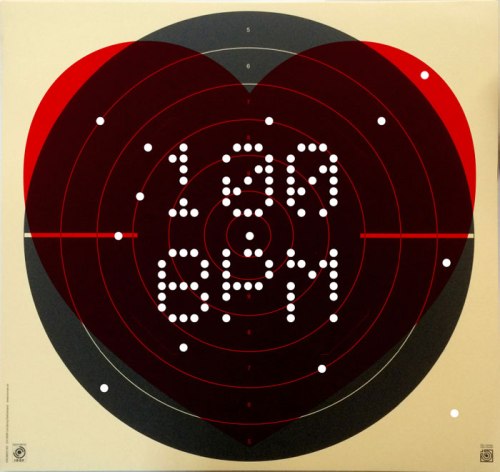
I’m super-inspired by this series, and the larger body of work by Thomas. It really motivates me to start designing some of my own projects. I’m jealous that he’s already done so much work with this heart/love/target motif, but maybe there’s a way I can take this idea and put a new spin on it? I might also look into purchasing some of these prints, I’d love to get a least 4 for my apartment and hang them together. So feel the love (like I did) and get into the awesome work of Patrick Thomas!
Continue Reading »
Posted in Art, Graphic Design, Inspiration | Tagged 100BPM, British Designers, heart target, heart prints, Hung-Up Gallery, London designers, London exhibition, Patrick Thomas, patrick thomas art, patrick thomas studio, silkscreen, Steven Heller, Target | Leave a Comment »
April 21, 2015 by dcwdesign
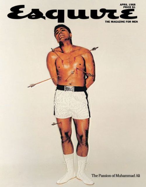
Esquire is a monthly mens magazine first published in 1933 with the mission “to become the common denominator of masculine interests—to be all things to all men.” Well 82 years later, Esquire is still around with several international editions and it’s own cable TV network. I’m a particularly a huge fan of some of their iconic covers from the 1940s and 50s, and their type-heavy covers of today. When I was in Nashville, TN over Christmas, I saw a clothing store that use spreads and covers from vintage issues as wallpaper. The images were so graphic and cool – now I’m on a mission to find some of my own. Until then, check out a few of my favorites through the years. Get into it.
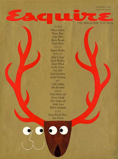
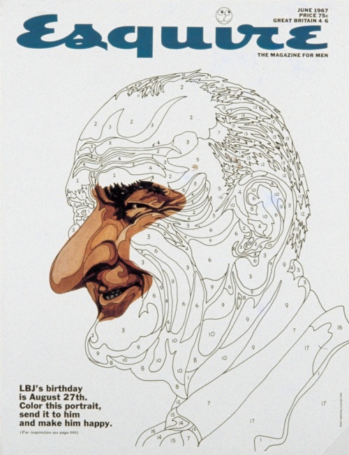
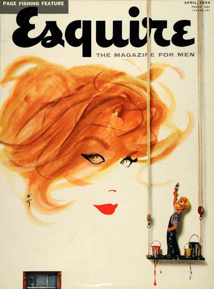
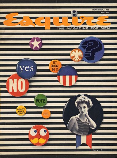
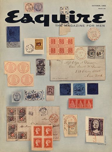
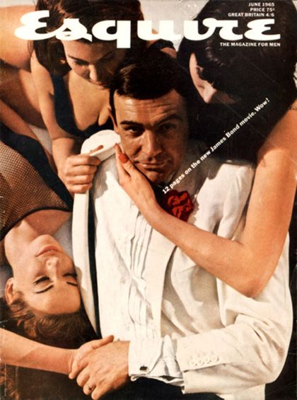 How great are these vintage covers (above)? Some of these covers were so iconic, they were redone years later …
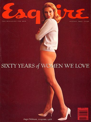
60 Years of Women We Love, 1966 (above).
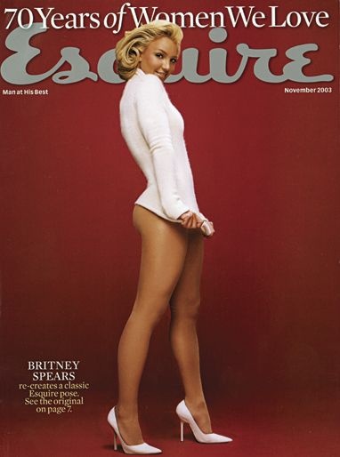
Britney Spears, 2003 (above).
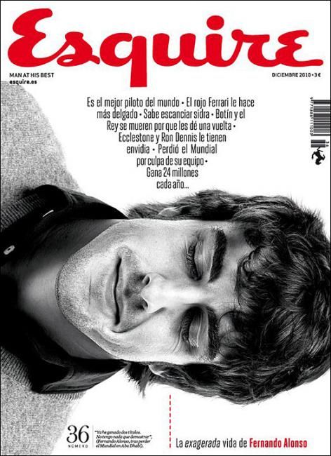
Today Esquire seems to be know for their type-heavy expressive covers. Can’t get enough of these! And for George Clooney.
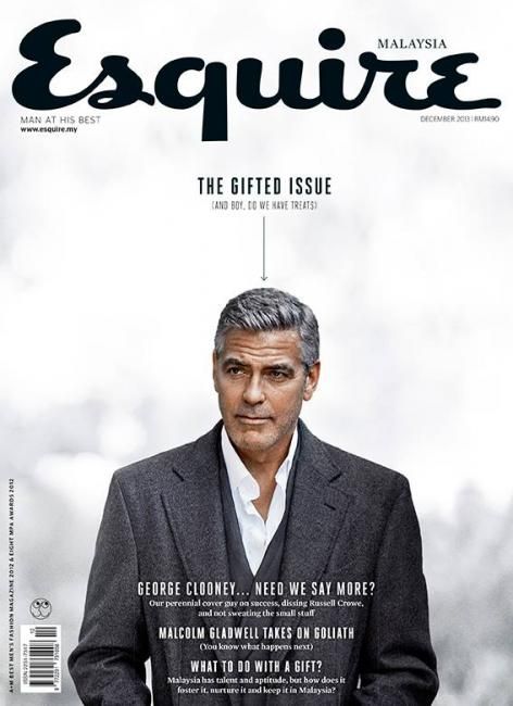
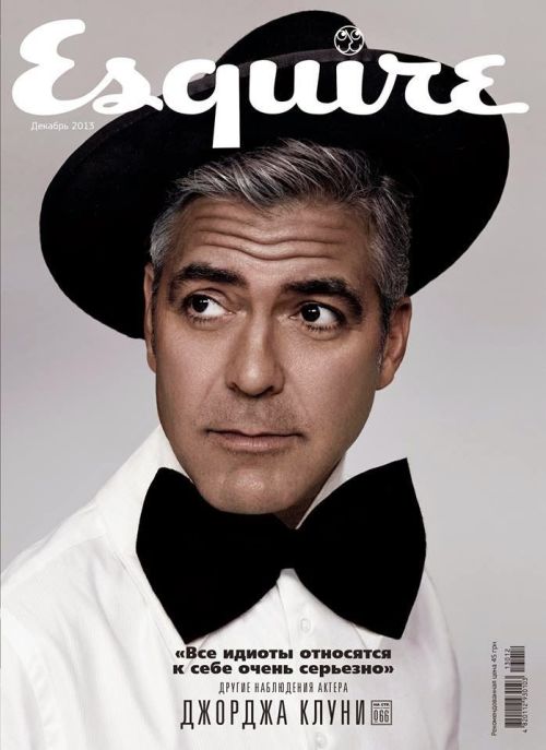
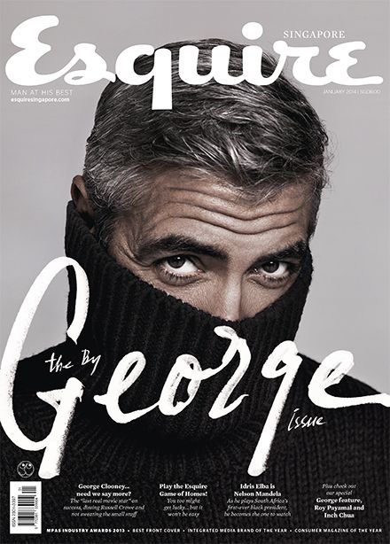

Seems like he’s graced the cover more than anyone else. But of course I can see why. If you enjoyed this post, check out my entire Pinterest board dedicated to magazine covers here.
Get into it!
Posted in Graphic Design | Tagged britney spears esquire, esquire, esquire magazine, esquire magazine covers, famous esquire covers, goerge clooney esquire, magazine covers, muhammad ali esquire, vintage magazine covers | Leave a Comment »
April 15, 2015 by dcwdesign
 Hello world, I’m alive! I’ve been a horrible contributor by not added anything to the blog in months, but I’m back! I’m finally ready to come back from winter hibernation.
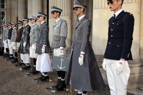
One designer I’ve been watching for years is Thom Browne. When I worked in Tribeca, I’d see his employees in the neighborhood (the HQ/showroom is around the corner from my old office), and I’d always envy how well-tailored the suits were, and how sharp all the guys looked. Thom Browne suits, for those that don’t know, are typically cut hight above the ankle, and gray/blue or black with his signature red, white and blue label details.

 How great do these guys look?
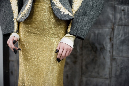
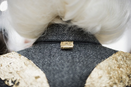
While these suits look amazing, I’m particularly drawn to how inventive his runway shows are each season at Fashion Week. Those collections are much more avant-garde and creative. Recently I stumbled across Thom Browne’s tumblr and really fell in love with his brand. On their own these images seem crazy, and I used to always think, who would wear that ?!?! Together, I see the vision of a truly original designer, and I’m so excited to see what he’ll produce in the future. Now I’ll have to add a gray Thom Browne suit to my fashion/closet bucket list … now check out the looks below, and get into the fanciful world of Thom Browne.


Spring/Summer 2015 Mens collection (above), women’s below.


Thom Browne Spring 2014 (above).


Spring 2011 (above). How awesome is this blazer?


So there you have it, my best-of Thom Browne collection. Cool right?
If you like what you see, check out Thom Browne’s tumblr here. Get into it!
Posted in Fashion, Inspiration | Tagged men's fashion, menswear, Thom Browne, thom browne ny, thom browne suits | Leave a Comment »
December 29, 2014 by dcwdesign
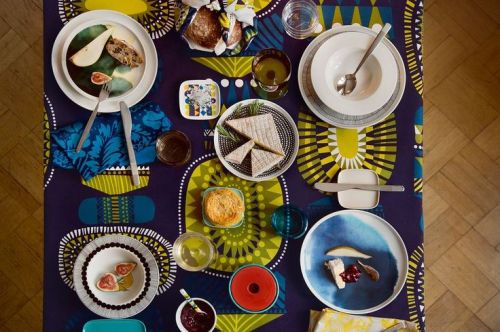
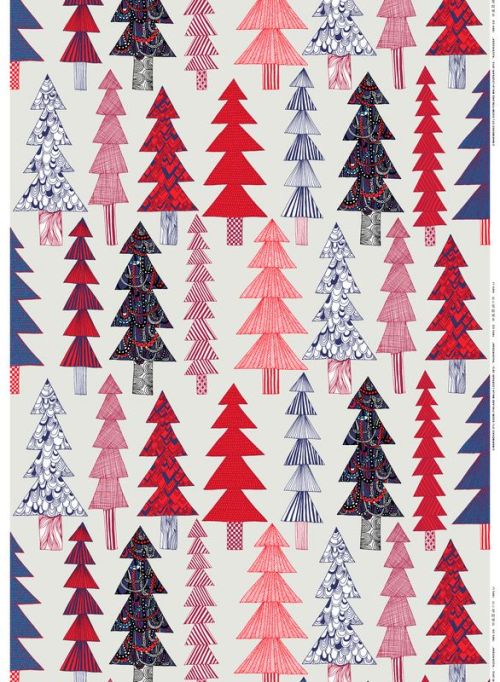
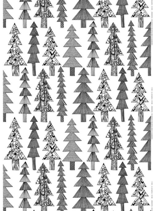
Today I’m sharing my last in a series of favorite Holiday brands from 2014. Earlier I shared Shinola’s + Sephora’s holiday campaigns + mood boards, and today I’m blogging about one brand that should be very familiar on this blog, Marimekko. Every year the folks at Marimekko select prints and color ways to spotlight during the holiday season. They aren’t always “Christmas” patterns, as some are existing patterns in new color ways for the season. I especially love Sanna Annukka’s Lamppupampula pattern (pictured above), how great are those colors? I also like Maija Louekari’s playful Kuusikossa pattern that is very holiday themed (christmas trees, see below in post). Another favorite is Sami Ruotsalainen’s Hauki pattern, with the fish. These patterns and products would look great in any home during the holidays, or throughout the year. Hope you enjoyed these Holiday-themed posts and get into the wonderful world of Marimekko below.
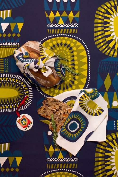
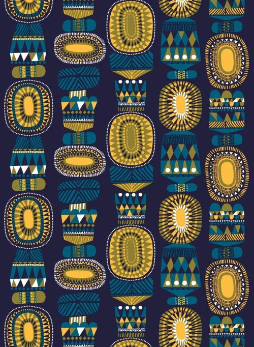
Sanna Annukka’s Lamppupampula Pattern, pictured above.
Maija Louekari’s Kuusikossa Pattern, below.

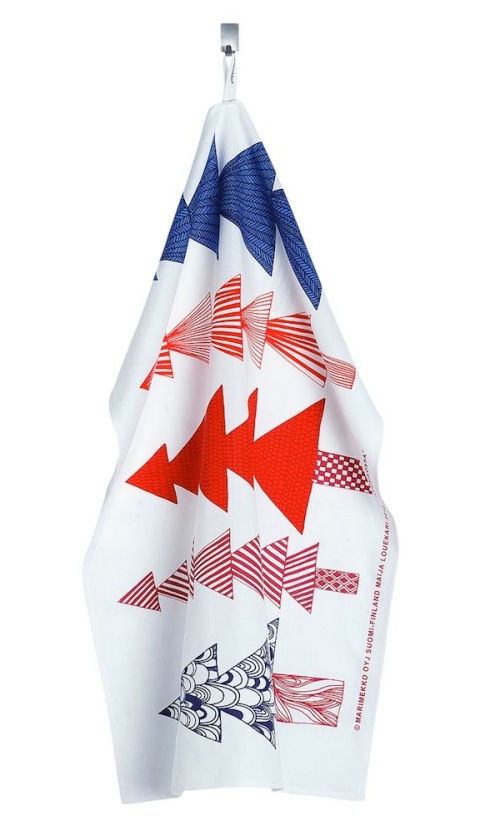
Sami Ruotsalainen’s Hauki Pattern, pictured below.
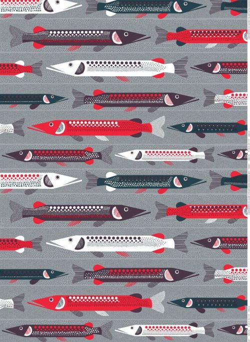
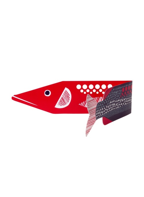
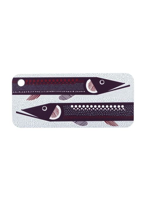
I love these fish! How great are these?
Posted in Patterns, Scandinavian Design, Textiles | Tagged Hauki Pattern, Kuusikossa pattern, Lamppupampula pattern, Maija Louekari, marimekko, marimekko holiday, marimekko holiday 2014, pattern design, prints, prints and patterns, Sami Ruotsalainen, Sanna Annukka, scandinavian design, textile design | Leave a Comment »
December 28, 2014 by dcwdesign
Posted in Advertising, Graphic Design, Patterns | Tagged design, holiday campaign, holiday packaging, packaging, patterns, sephora, sephora giftopia, sephora holiday, sephora holiday 2014 | Leave a Comment »
December 18, 2014 by dcwdesign
Posted in Color, Fashion | Tagged color, colour, detriot, green, grey, holiday 2014, holiday brands, holiday gifts, shinola, shinola detriot, shinola holiday, shinola store, watches | Leave a Comment »
December 10, 2014 by dcwdesign
Posted in Advertising, Graphic Design | Tagged nike, nike flatiron posters, nike graphic design, nike posters, nike run, nike run flatiron, nike run nyc, nike run posters, nike wheatpaste posters, wheatpaste posters | Leave a Comment »
November 29, 2014 by dcwdesign
Posted in Graphic Design, Life Rants | Tagged civil rights, civil rights protests, design, Ferguson, i am a man, i am a man poster, memphis protests, protest posters, typography |
November 15, 2014 by dcwdesign
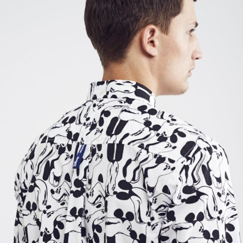
Recently I stumbled across the a-mazing collaboration between Scandinavian streetwear brand Wood Wood, and Disney. This capsulate collection was first released at Colette in Paris, then online in Europe. I was immediately drawn to the abstracted patterns and prints designer Brian SS Jensen created of Disney’s Mickey Mouse. How inventive and creative! It’s frankly surprising a mega-brand like Disney would license their creative in this way. So forward thinking and cool of them. I can’t get enough of this entire collection. What do you guys think?

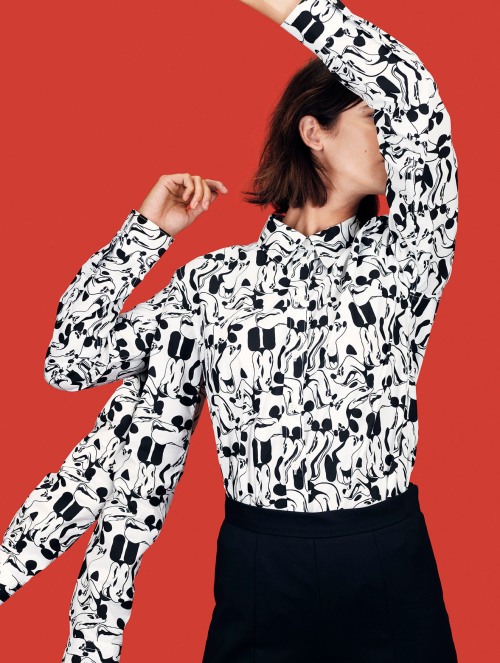
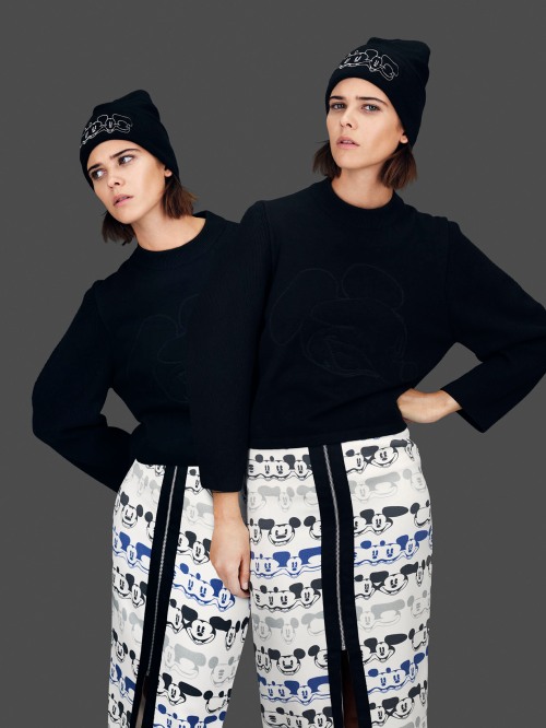
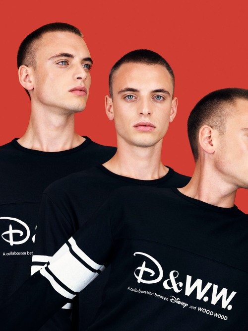
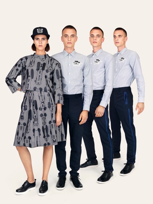
Continue Reading »
Posted in Fashion, Patterns, Scandinavian Design, Textiles | Tagged design, disney, fashion, mickey mouse, patterns, prints, scandinavian design, street style, streetwear, textile design, wood wood, wood wood x disney | Leave a Comment »
« Newer Posts - Older Posts »


 So in love with these as a series!