Feeds:
Posts
Comments

Archive for the ‘Patterns’ Category

W_December 2013_Art Issue_George_Clooney_Cover

I’m literally obsessed, OBSESSED with the W Magazine‘s new December 2013 cover for “The Art Issue.” I can’t get enough of it. What a playful use of color and pattern, and doesn’t George Clooney look great? So unexpected. Clooney is wearing a Giorgio Armani suit, shirt, and shoes, customized by Yayoi Kusama. According to W’s site, In the late ’60s, Kusama’s celebrity rivaled that of Andy Warhol. A central figure on the New York avant-garde scene, Kusama was famous for her delicately patterned abstract canvases, soft furniture with phalluses, and happenings in which she painted naked participants with her now signature polka dots. She also had her own clothing shop, where she sold her racy designs. But when the emotional issues that had plagued her since childhood proved overwhelming, she quit New York and entered a Tokyo psychiatric hospital, where she has resided ever since. You may also recognize Kusama’s work from the Louis Vuitton collaborations a year or two ago. The December 2013 issue of W magazine is on newsstands now.

W_December 2013_Art Issue_George_Clooney_2

W_December 2013_Art Issue_George_Clooney_3

W_December 2013_Art Issue_George_Clooney_1

vuitton_kusama9_v_6jul12_pr_b
Yayoi Kusama x Louis Vuitton (above & below).

lv_neverfull_louis_vuitton_yayoi_kusama_waves_adv_3

lv_neverfull_louis_vuitton_yayoi_kusama_waves_adv_1

Louis-Vuitton-Infinity-Dots-yayoi-kusama
louis_vuitton_yayoi_kusama_monogram-town-speedy1 (more…)

Read Full Post »

Josef Frank_Textile Manhattan 315 Linen

Josef Frank “Manhattan” textile on Linen (above).

Today I bring you my third (and final) post in a series about Scandinavian textile designer Josef Frank. Originally I’d intended to release these posts back to back (to back) but work got a little crazy, so better late than never! As my other posts focused on nature/plants and bird motifs, this post contains some of Frank’s more unique patterns. “Manhattan” is one of my favorite Frank patterns, partly because I live in NYC, but also because how graphic it is. The way it repeats is also pretty inventive. From 1942-1946, Josef Frank lived and worked as a visiting professor at the New School for Social Research in New York. Frank found Manhattan’s city plan so interesting in its brutal simplicity that he created the Manhattan design which includes a map of the island. Frank designed similar patterns in this style for Stockholm, both of its city grid and another depicting its architecture. I hope you enjoy this final look (at least for now) of one of my favorite textile designers, Josef Frank. If you see anything you like, check out Svenskt Tenn‘s website, or Just Scandinavian here in NYC to see Frank’s work in person.

Svenskt Tenn Josef Frank Textiles_Manhattan

Frank’s “Manhattan” textile in person at Svenskt Tenn in Stockholm (above) from my study tour of Sweden. As you can see below, this pattern has been applied to several products at Svenkst Tenn including coasters, laminated wooden trays and pillows. I have one of the small trays, but would love the Manhattan print on just about anything.

Joes Frank Svenskt Tenn Manhattan Birch Tray Josef Frank Svenskt Tenn Manhattan Coasters Josef Frank Svenskt Tenn Manhattan pillow

Josef Frank_Textile Terrazzo PillowJosef Frank “Terrazzo” pillow (above).

According to Svenskt Tenn’s website, of Frank 160+ patterns, only two varied from nature motifs, “Terrazzo” is one of such prints (below). This print was sent to Estrid Ericson as a gift on her 50th birthday in 1944.

Josef Frank_Textile Terrazzo 315 Linen

Svenskt Tenn Josef Frank Textiles_Terrazzo

I was lucky enough to see “Terrazzo” in person during my visit to Svenkst Tenn in 2011. This pattern also comes on everything from pillows to plates (below).

 Josef Frank_Textile Terrazzo Plate
(more…)

Read Full Post »

svenskt_tenn_interior

Interior by Svenskt Tenn (above) – the Stockholm-based store producing Frank’s textiles

Almost 3 years ago, I blogged about the amazing architect turned textile designer Josef Frank during my study tour across Scandinavia. Since it’s been so long I thought I’d refresh everyone’s memory this week with a series of posts devoted to this wondrous designer. For those that don’t know, Josef Frank (1885-1967) is very famous in the Scandinavian design (and especially textile world) but I hadn’t heard of him until studying abroad in 2011. During his long career, Frank designed 170 patterns for printed fabrics, about 125 of which have been printed at least once. Roughly 40 of them are classics, most of them floral patterns, which although more than fifty years old, have not lost their freshness. These fabrics were produced exclusively for Svenskt Tenn, the modern day gatekeeper of Frank’s legacy. Today his fabrics are applied to everything from curtains, pillows, wood trays, handbags and furniture. Visiting their store was an amazing experience and I can’t wait to go back!

Today I’m sharing a few of my favorite floral motif patterns. It’s clear nature served as a hugely inspiring source for the designer. Many of these prints are considered “classics” and are printed on just about anything today. What I love so much about these patterns is that despite having a narrow focus (plants, flowers, etc), each is illustrated so differently. Some prints are very realistic, a few look like botanical specimens, while others are fantastical imaginations of exotic botanical scenes. I hope you enjoy this trip down (blogging) memory lane as I once again share the beautiful work of Josef Frank. Get into it!

Josef Frank Textile La Plata 315 Linen

“La Plata” by Josef Frank on Linen (above).

Josef Frank Textile Loops 315 Linen copy

“Loops” by Josef Frank on Linen (above).

Josef Frank Textile Milles Fleur Cotton

“Milles Fleur” (the French translation for a Thousand Flowers) by Josef Frank on Linen (above). I love in this pattern, none of the flowers touch, each is an individual precious illustration instead of an all-over pattern repeat, less intertwined and complex, but still beautiful.

Josef Frank Textile Primavera 315 Linen

“Primavera” by Josef Frank on Linen (above).

Josef Frank_Textile Brazil 315 Linen

“Brazil” by Josef Frank on Linen (above). One of my favorites – look at the amazing colors!

Josef Frank_Textile Celotocaulis 315 Linen

“Celotocaulis” by Josef Frank on Linen (above). This pattern was originally designed by Josef Frank in the 1920s. Caulis is the Latin word for flower stalk and Celoto comes from an Asian flower species characterized by a plume-like flower cluster. This pattern is very different in style and repeat as you can see above with only slight pattern shifts.

Josef Frank_Textile Djungel 315 Linen
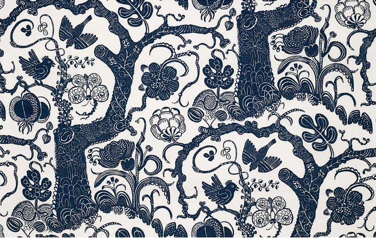
“Djungel” (or jungle) by Josef Frank on Linen (above).

Josef Frank_Textile Nippon 315 Linen

“Nippon” by Josef Frank on Linen (above).

Josef Frank_Textile Notturno 315 Linen

“Notturno” by Josef Frank on Linen (above).

Josef Frank_Textile Drinks 315 Linen

“Drinks” by Josef Frank on Linen (above). Also one of my favorites, love how this pattern looks like botanical illustrations, and how each plant is surrounded by black, making the illustrations look like cutouts. Super graphic!

Josef Frank_Textile Poisons 315 Linen

“Poisons” by Josef Frank on Linen (above).

Josef Frank_Textile Tulpan Cotton

“Tulpan” (or Tulips) by Josef Frank on Linen (above). Huge Frank classic.

Josef Frank_Textile Vegetable Tree 315 Linen

“Vegetable Tree” by Josef Frank on Linen (above).

Hope you enjoyed Day 1 of my Josef Frank series, tomorrow I’ll be sharing more of Frank’s patterns, but with a new theme. Stay tuned.

Read Full Post »

Geometric_Two_4

Exciting news! The fine folks at Kapitza studio in the UK are at it again. You may remember, this past February I blogged about Kapitza’s first Geometric Pattern book and the beautiful digital textiles that fill its pages. Sadly I was never able to get my hands on a copy (welp!), but now you’re in luck. The duo behind Kapitza (sisters Nicole and Petra Kapitza) started a Kickstarter project to fund printing this second volume. So here’s your chance to own one for yourself. There’s also cool goodies that come with supporting this project like tote bags, prints, signed copies, etc – so check it out. I’m particularly excited about the printer test sheets. I think this is SUCH a good idea. Saturdays Surf NYC sold limited edition test sheets of their latest magazine. There’s something cool about the printer marks and seeing the book spreads laid out on a flat sheet. Must be the graphic designer in me. So if you’re a lover of color and pattern like me, head over to Kickstarter now to get Geometric Two for yourself! Get into it.

Geometric_Two_Pattern_Book_1

Geometric_Two_Pattern_Book_2

Geometric_Two_Pattern_Book_3

Geometric_Two_Pattern_Book_5

Geometric_Two_Pattern_Book_6

Geometric_Two_Pattern_Book_7

Geometric_Two_Pattern_Book_8

Geometric_Two_Pattern_Book_9

Geometric_Two_Pattern_Book_10

Geometric_Two_Pattern_Book_Spreads

How cool do these look (page spreads above).
Keep in mind these are all “pattern fonts,” instead of using letters within a font on the computer, Kapitza created patterns with each character, or parts of a pattern (like shapes) where each letter would normally be, and manipulated the colors to create the patterns you see above. I have abolutley NO idea how they do it, but what a great idea!

Geometric_Two_Pattern_Test Sheet

Test sheet (above). Would make a great print to hang in your apartment.
Again, check out their Kickstarter project here.

Read Full Post »

Buffalo Pong Wallpaper: Digital and gouache Na Kim 2012
Buffalo Pong Wallpaper, 2012.

Today I’m super excited to share illustrated patterns by Na Kim and her delightfully illustrated resume (scroll down). How great is this buffalo x ping pong wallpaper pattern? I love this style of pattern making; taking individual illustrations and repositioning them to create a repeat pattern. And I like that she’s doing so in such a playful way. They’re totally random (or at least appear to be) but work together so well. I love the unexpected combinations! Wouldn’t this pattern, and the ones below, make really cool socks or something? I’m all about it.

Buffalo Pong Gouache on Paper © Na Kim 2012

Her original Buffalo Pong illustration (above).

Mallard-mallot Pattern 2012 Digital+Gouache © Na Kim 2012

Mallard-mallot Pattern, 2012 (above).

Mallard-Mallot 2012 Gouache on paper © Na Kim 2012

Whale Ballin’ Reloaded Wallpaper © Na Kim 2012

Whale Ballin’ 2012 (above). Aren’t these fun?

So I found Na Kim’s illustrated resume first (below), and patterns second, which reminded me of a subject I’ve touched on a few times, resume design. Some months ago, I blogged about what a bad idea “creative” resumes are, especially in the graphic design field. However, in this case I absolutely love Na Kim’s illustrated resume. It just makes sense. She’s a talented illustrator and has a unique typographic style of lettering. I’m not saying all designers (or typographers) should do this, but when it speaks to your skills, and you’re able to inject a sense of personality AND skill into it, then why not.

So if you’re liking what you see, check out Na Kim’s website and blog.
Get into it y’all!

na-kim illustration

graceplay003_640

Love love love! (everything above and below).

boys will be boys 2011 Ink on Paper

he said she said 2011

I AM NOT AFRAID OF RICHARD SERRA. 2009 Gouache on paper

im no kennedy 2011

the good life 2010

Read Full Post »

flat vernacular_meadow print

Flat Vernacular Sunset Floral Print

While perusing through my usual blogs, I stumbled across Flat Vernacular, a Brooklyn-based design studio specializing in hand-drawn, hand-printed, and one of a kind wallpapers. The studio was started by Payton Turner and Brian Kasper, two designers that have fully embraced their love for patterns and started Flat Vernacular. All the patterned prints are 100% made in the USA featuring custom details with some made of 3D elements. I’m in love with their sticker wallpapers, created by placing hundreds or thousands of stickers meticulously by hand. Flat Vernacular’s patterns blur the line between fine art and design while not taking themselves too seriously. For a few more days, they have a pop-up shop on Pier 17 in NYC’s South Street Seaport. I got to see a bunch of their work last night and I’m so impressed. I’m dying to get my hands on the Sunset Floral print (above). To see all of their work, check out their site, or follow them on Instagram + Twitter. Get into the patterns yall.

flat vernacular_headshot
The designers, Brian and Payton.

flat vernacular_argentina print
flat vernacular_avalanche print
flat vernacular_buccal print

flat vernacular_delphinium_print

(more…)

Read Full Post »

colettecolab2

I’ve had my eye on the Saturdays Surf NYC x Colette collaboration for a few weeks now as I’m pretty much obsessed with anything Saturdays Surf NYC. I stumbled across this pattern they’re using on shorts in their spring 2013 collection and I’m so in love. The print is simple and graphic, and works really well in multiple applications. I like that it appears hand painted too. Patterns like this are so simple to create and put into repeats. Once this is done you can apply them to anything: clothes, product design, packaging and digital applications too. I’ve been feeling the itch to get back to designing new prints and patterns so keep on the lookout.

saturdays_surfnyc_colette_shorts1

saturdays_surfnyc_colette_shorts2

saturdays_surfnyc_colette_shorts3

saturdays_surfnyc_colette_window1

Colette window in Paris displaying the Saturdays Surf NYC x Colette collabo

saturdays_surfnyc_colette_window2

saturdays_surfnyc_colette_window3

Notice how the pattern is applied to bags and hats too, and how well they match with the shirts? Get into it!

Read Full Post »

Kenzo Spring:Summer 2013 Campaign - Single

While looking through the March fashion magazines, Kenzo’s Spring 2013 ads caught my eye with their bold colors, prints and layout. Compared to other advertising in the March issues, these really stand out. Also I can’t get enough of the bold patterns! Now I can’t truly see myself wearing something like this, but I’m very into the pattern mixing that’s trending right now. I love how playful and graphic these combiations are. From a textile/pattern design standpoint, fashion is a great place to be inspired. And Kenzo’s Spring 2013 collection is a great place to look for new ideas.

Kenzo Spring:Summer 2013 Campaign1 Kenzo Spring:Summer 2013 Campaign2

Kenzo Spring/Summer 2013 Ads – great right?

kenzo-spring-2013 runway 1

kenzo-spring-2013 runway 2

kenzo-spring-2013 runway 3

kenzo-spring-2013 runway 4

kenzo-rtw-ss2013-runway-26_073857900111

(more…)

Read Full Post »

Marimekko_spring2013_textile1

Marimekko Spring 2013 – full catalog here.

It’s (almost) that time of year again, SPRING! To celebrate, I’m sharing new images from Marimekko‘s Spring 2013 campaign, “Colour for a reason.”  Aren’t these colors and textiles like a breath of fresh air?? Be sure to drop by one of their stores, or check out their new collections online here.

Marimekko_spring2013_bags_fashion2

Marimekko_spring2013_textile2

Marimekko_spring2013_textile3

Marimekko_spring2013_textile4

Marimekko_spring2013_textile5

Spring 2013 at Marimekko – Colour for a reason. Get into it!

Marimekko_spring2013_bags_fashion

Maija Isola pattern from 1961, today in 2013. How great is that?

Read Full Post »

dvf_love_is_life_2

Last week I began following Diane von Furstenburg (@DVF) on Instagram and they’ve been posting some really interesting photos. I love fashion brands that use Instragram, Tumblr, Facebook etc. to give fans a unique behind the scenes look at the brand. DVF does this quite well, and even shares a “Print of the Week” from their pattern/textile library. As a textile/pattern design lover I get so excited when they post them.

dvf_pattern1 dvf_pattern2 dvf_pattern3 dvf_pattern4

How great are these patterns? The first one is hands down my favorite! If I was a girl I’d dress ALL in graphic patterns.

dvf_animalprint dvf_patterns_models dvf_patterns_models2 dvf_patterns_models3

I love seeing how they mix patterns and textiles at DVF. It’s a tricky business and they do it so well!

dvf_diane_group

Couldn’t have a DVF post without posting one of Diane herself!

dvf_love_is_life_1

So get into the graphic print greatness that is DVF and be sure to check out their Spring 2013 show at NY Fashion Week. Also be sure sure to follow Diane von Furstenburg on Twitter and Instagram (@DVF) for a behind the scenes look at the brand. And remember, love is life! -Diane

Read Full Post »

« Newer Posts - Older Posts »