Feeds:
Posts
Comments

Archive for the ‘Patterns’ Category

Click image above to flip through entire book!

If you follow the link above, you can literally flip through one of my two inspiration sketchbooks I created during my 7 weeks in Copenhagen. During our study tour of Sweden and Finland we were instructed to collect everything: scarps of paper, brochures, posters, postcards, anything. Everyday we had drawing assignments to help us get used to sketching and drawing inspiration. As someone that doesn’t consider themselves a strong drawer, this was quite a challenging exercise. So many times I take pictures or collect them online so I can “remember” something I liked. While it’s good practice to document as many sources of inspiration one can find, something magical happens when you take time to draw it. Taking the extra time to figure something out and draw the lines and angles cements it in your mind much more vividly than a picture can. We take pictures in a secon, and we quickly forget about them. With drawing you are investigating and thinking about what you see, and transfering it from life onto the page. Milton Glaser talked a lot about this during this summer course. He also talks about it a lot in his book, Drawing is Thinking. In The Accidental Masterpiece, Michael Kimmelman talks about this too. He says,

“Cameras made the task of keeping a record of people and things simpler and more widely available, and in the process reduced the care and intensity with which people need to look at the things they wanted to remember well, beacuse pressing a button required less conectration and effort than coposing a percise and comely drawing.”

But this isn’t a post about drawing per say. It’s more a post about process and the documentation of mine during my trip. One of the greatest hallmarks of Scandinavian Design is process. We were told this again and again. We were encouraged to experiment, make, sketch, paint and take pictures. Many of our experiments were trail and error but together culminated in our final textile designs. In this course, the process was more important than the final product. This is in stalk contrast to design education in the US. I can say this honestly because there’s many times I’ve done a project in a night or two days, totally disregarding process. While this helps me and other designers get by, we’re not really learning anything. We often resort to ideas we already had and that process gets exhausting. We’re left with uninspired work and no new ideas. That’s why process is so important. After this trip I feel more full with ideas for design projects than ever before. A lot of this I credit to the first mentioned sketchbooks!


I loved the shades of greens and brown I saw on buildings in Helsinki, Finland. The organ pipes appear many times in my sketchbook – I think they’d make a great pattern so that’s something I hope to work with later on.

A study of black & white.

This is a free giveaway we were given at Valilla Interior. I loved the colors and graphic patterns of their textiles. Instead of keeping this brochure in a folder I decided to bite the bullet, cut it up and glue it into my book. Now all my inspiration is together and in context with similar inspiration.

Illums Bolighus is a BEAUTIFUL store in Denmark and Sweden. It’s part design store, part kitchen, bath, home, and clothing department store. Basically they have everything you need to make your home beautiful. They also have beautiful ads like this one above. In love with the shades of grays here.

I ripped this down from the street in Copenhagen. Love the ripped edges too – gives it some character. Don’t be afraid to leave edges unfinished and rough, you can use it to create interest in your sketchbook or design work later on.

In this page I ripped up a Marrimeko ad to try and create something new. The opposite page is one of the early circles exercises I drew in the process of creating my final print.

Here’s an example of printed things I found during my trip. I saved everything and glued them into this book. Now its all in one place anytime I need to look at it. To see the entire sketchbook, go here!

Now when I look back at this book, I can isolate type treatments, color combinations, textures, techniques, and general inspiration for new projects. I tried to think of each spread as a compositions by mixed unrelated materials together creating new juxtapositions. Now I can’t take all the credit for collecting and documenting design in this style. All the credit goes to one of our instructors, Helle Vibeke Jensen. We visited her studio early in our trip and that day had a profound effect on everyone in the program. Helle Vibeke has been keeping sketchbooks in this manner for YEARS. Her studio is a library of cataloged inspiration from all over the world. Each time she goes on a trip, she buys a new Moleskine and begins collecting scraps and drawing. Here’s some photos from our studio visit.

Above: Her studio. Loved these blue chairs. Makes me dream for my own studio one day.

One of her many supply and inspiration drawers. So much fun stuff to play with.

Helle Vibeke’s library, full of her sketchbooks and books she’s illustrated and designed. To see more of her work, check out her website here.

Read Full Post »

”Signed Textile” took its start in 1954 when the Swedish department store NK launched a new collection of fabrics for the expanding public sector in Sweden. The idea was to improve the status of textile design as an art form by letting the artists sign their work. The copy right regulations regarding art work at the time was still neglected. This collection consists of 21 different patterns, some of them famous Swedish design classics. Karl Axel Pehrson´s ”Delfinisk Rörelse” (”Dolphinian Movements”) is still part of Ljungbergs assortment. You can check out all the designers and see their work here.

Sven Markelius (1889-1972) was an advocate for Swedish Functionalism. Some of his most important commissions were the Students´ Union Building of the Royal Institute of Technology in Stockholm 1928 – 1930, the Swedish pavilion at the World Fair in New York in 1939. He was also a member of the distinguished committee of architects occupied with the creation of the UN-building in New York at the beginning of the 1960’ies. The pattern consists of a field of triangles in four different sizes. They are constantly repeated in a complex play between light and dark, big and small. The variation of the sizes gives the pattern depth and movement, an impression that is enhanced if you view it at a distance. Here it is printed on modal satin.

I’m in love with this design by Sven Markelius – read his bio here.

I saw the blue colorway at the National Museum in Sweden. Love it.

Theodor “The” Svedberg (1884-1971) was a scientist and was awarded the Nobel Prize for Physics in 1926. Svedberg was an intellectual leader in culture and had a wide interest in literature. He had an extensive correspondence with August Strindberg and he was also a good amateur water-colour painter. The Svedberg participated with two patterns to ”Signed Textile”: ”Genetics” and ”Atomics”. If you know a bit about chemistry you will probably recognize the DNA of Drosophilia (the fruit fly) in the pattern ”Genetics”. ”Atomics” is a playful pattern where figures from the world of atom physics form decorative patterns in brilliant orange and rose on a black background. ”Atomics” is printed here on hardwearing pure linen.

Astrid Sampe (1909-2002) was born in Stockholm, but has her roots in Sjuhäradsbygden (Seven counties region). During the years 1928 – 32, when she attended the College of Applied Art in Stockholm, she was given the opportunity of pursuing parallel studies at the Royal College of Art in London. After having completed her education, Astrid made several journeys in Europe. It was she who set in motion the project ”Signed Textile” that was launched at NK in 1954. The aim of the project and the collection was to create materials with strict graphic patterns for public interiors, both for big theatre-curtains and for small windows in ships and trains. It was widely considered a great achievement that Sampe managed to rally so many well-known names for the collection and later on this contributed more than anything else to stress the importance of the designer behind the pattern. Earlier the designers of patterns were never given a prominent place in marketing.


Anders Beckman (1907-1967) was a pioneer in modern Swedish advertising art and a well-known poster artist. Beckman was in charge of prestigious commissions such as the marketing of the Swedish Pavilion at the world Fair in New York in 1939 and the graphic design of the Helsingborg Exhibition, H55, among other things. Anders Beckman contributed with two patterns to ”Signed Textile”: ”West Coast” and ”Smoke” (above). This was the first time that the advertising expert Anders Beckman drew patterns for textile prints. He was of the opinion that the same freedom existed when you composed a textile pattern as when you composed for advertising purposes and while the ever-present cigar in his hand sent its smoke upwards, the pattern ”Smoke” curled its way continually upwards.

Olle Eksell (1918 – 2007) made himself a name as an innovator of artistic graphic designs for utility goods during the 1950´ies. He became inspired by the American way of life, after having spent a short period at an art-school in Los Angeles. When he returned to Sweden, he started working as an illustrator, advertising expert and exhibition curator. Olle Eksell contributed with two patterns to ”Lena Horne”Signed Textile”Lena Horne”: ”Lena Horne”Lena Horne” and ”Margret Rose”. He has given both his patterns female names, because, it is said, he had two different types of women in mind: Lena Horne represents the sensuous, primitive woman and Margret Rose the romantic aristocratic. Both of these patterns are small in scale and are intended for various decorating details in public interiors.

Olle Bonniér (born 1925) belongs to a group of artists of concrete art, ”The Concretians” and he explored the principles of Concretism in theory as well as in his art. At the beginning of his career he used very bright and strong colours, but later he changed to contrasting colours, often black and white. Bonniér’s expression was non-figurative and he was interested in the dynamics of colours and forms. His sculptures in Plexi-glass and metal were produced as pure objects, concrete but non-representing. Olle Bonniér contributed with two patterns to ”Signed Textile”: ”Positive – Negative” and the pattern ”Raxt”, which has been described as follows: ”This composition sounds what it looks like: ”Raxt” – the sound of the jet-planes in black thunderbolts.” ”Raxt” is printed here on a strongly bleached cotton-canvas in black, grey and light beige.


Read Full Post »

Stig Lindberg “Lustgarden” in Green

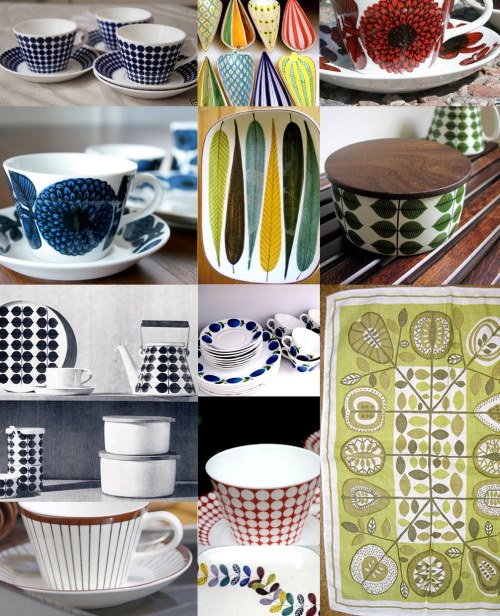
The designer I wanted to spotlight today is the amazing Swedish industrial and textile designer Stig Lindberg. We were introduced to Lindberg during a lecture after our study tour. It’s too bad that I didn’t have the opportunity to find more Lindberg’s work while I was in Sweden, but I’ll save you a trip to Sweden and show you a sampling of his work here. Lindberg is often regarded as one of the most popular and important Swedish designers of the last century. During his life, (1916-1982) Lindberg created a large amount of surface designs for countless products and textiles. One of my favorite things about him is how he filled his patterns. Every corner and nook is filled with an object, figure, or plant. There are almost no empty spaces in his designs but they all look perfectly balanced and full – but never too full! I particularly like how he was able to translate his skill for surface design into creating repeat textile patters. The same eye for color, proportion, and space present in his design for plates, teapots, and cups are just as visible in his textile pattern designs. Though later in his career, Lindberg’s textile designs still display his playful inventive approach to design.

According to Ljungberg Textile, that carries and prints many of the Lindberg textiles today,

“Stig Lindberg was an industrial designer, ceramist and illustrator. He was born in Umeå, but began his career at Gustavsberg´s Porcelain factory in the summer of 1937. After many years of work, he became Wilhelm Kåge´s successor as the artistic leader. His decorated faience, with a character totally of its own and his fanciful stoneware were pioneering during the whole of the 40’s and 50´s. Lindberg also created decorative works of art for public environments, several of them in enamel, mostly during the last period of his career. His co-operation with NK´s Textile Studio was initiated in 1947, when the legendary leader of the Textile Studio, Astrid Sampe and Stig Lindberg became friends. In Gisela Eronn´s book ”Stig Lindberg, Jack-of-all-trades” we can read that Astrid Sampe was much fascinated by Stig´s creativity and the way he renewed ceramic decoration at Gustavsberg.”

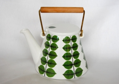
See more of his Berså Collection here.

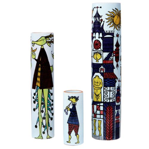
I love the playful illustrations on this set of vases. I read that he did some children’s books illustrations which seems fitting in this style.

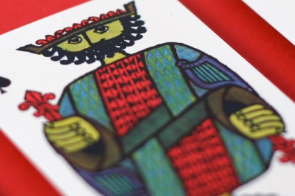
I also ground a great post here about a set of playing cards he design. I’d kill to have these. Totally in love.

These cards would make amazing prints, blown-up poster size.

Above. Lingberg print from his “Pottery” textile design.

Above. “Melody” – one of my favorite patterns.

Above. “Fruitbox” in blue.

Pillow from the “Green Lustgarden” print – see more of these at Design House Stockholm.

Read Full Post »

I’m coming out of the closet and confessing my love for a girl, the one and only, Kate Spade. My love affair with Kate is truly so secret to anyone that knows me. Now I going to pronounce my love for the world to see. Since I’m returning to the US in less than 7 days, I thought I’d do another 7 Designers series, and while Kate Spade isn’t an example of Scandinavian design, some comparisons can easily be made. What makes Kate Spade stand out to me is their playful use of color. Every time I pass their store in Soho or see one of their ads, I always think about how beautiful their world looks. Color is also incredibly important in textile design, perhaps the most important element. Our teachers have told us colors are what sells patterns and textiles, not necessarily the design. This is also true in graphic design – color adds so much to design and is so loaded with content and meaning. I’m also in love with the photography and type that’s used in the Kate Spade ads from the last several years. They’re really stepping up their design game. I’d love to find out who is the creative mastermind behind their current look. Let’s look at some examples ..

Now my favorite ads Kate Spade has done is their 2009 Holiday campaign. I remember seeing these in Manhattan during my first Christmas in the city. I saw the ads below wheatpasted to a wall in Soho and tried to take the best pictures I could with my iphone. Here’s what I got.

Notice the use of my favorite typeface Bodoni!

Love the picture, love the colors, and especially love how they’re playing with type. So beautiful I think.

Here’s another one I found online – I wish I had copies of the whole “20 ways to merry-make” campaign.

So want to know more about how color inspires the Kate Spade team? I recently noticed Kate Spade set up a blog, The Weekly Spade: a blog about color. Lots of great color inspiration there. They also have a Behind the Curtain blog showing sneak peaks into their campaigns, special projects, and things they love. So much beautiful inspiration. Enjoy and fall in love!

Green from the Weekly Spade.

And Blue for July!

Read Full Post »

Above is my final digital textile print !!! It’s all lead up to this 130x130cm piece of fabric. At this point (above) in the printing process it was drying before the washes started. While digital printing seems quicker because everything is printed from a super fancy fabric plotter, you still have to do ALL the washes. Also steaming and washing a huge piece of dark fabric is also tricky … and heavy when wet. But after a few hours of work, my piece is printed, steamed, washed, boiled, washed, dried, and ready to hang! I’ll give you a guys a peak into the process for the creation of my print.

As for inspiration for my print I kept noticing/sketching circle patterns. I noticed them again and again on our study tour. Circles were in the piles of wood, on the manhole covers, street signs, and were strong elements in one of my favorite monuments in Finland. During the study tour our primary task was to create a sketchbook documenting our inspiration. I collected and drew anything I found or saw that was interesting. Here are a few of my favorite pages, many of which you’ll see inspired my print.

Above: The yellow and oranges here were used in my final print.


I have an entire Moleskine filled from the study trip. Normally when I go on trips or look for inspiration I just take photos. I think to myself, “I have a photo, that’s enough, I can go back to it later.” But how many times do we actually go back to those photos? Not very often in my case. Drawing the actual thing, or printing the photo out and writing notes about it in a book crystallizes the memory so much more vividly. I took found pieces of design I liked, booklets, posters from the street, and combined these with drawings, color swatches and notes to create a visual diary full of inspiration. Now anytime I want to look for an idea from the trip, it’s all in one place, and having a physical object is so much nicer than photos on the computer.

So I knew I wanted to create a pattern with circles, and I’d been greatly inspired by all the Scandinavian design I’d been experiencing over the last few weeks. In the beginning a lot of my designs were very retro looking, which I liked. But this direction got away from my original idea creating a pattern that dealt with circles, in wood specifically. The rings of a tree make really beautiful patterns in wood – so why not a print ?!? So I began to move back to that direction and I came up with this final design (below).

Above: The final print and color way, dark blue background with accents of white, yellow, and light blue.

Above: Light background color way. I liked this too but thought the dark background had more depth and contrast.

Above: For some reason this reminds me of candy – like candy canes.

THE PRINTING PROCESS …

The textile prints from a fancy digital textile printer ..

Fabric is loaded like a roll of paper then printed on.

(more…)

Read Full Post »


Read Full Post »

As many of you know, I’m currently enrolled at the DIS school in Copenhagen for six weeks learning about textile design. I spent last week blogging about all the amazing designers and artist we’ve come across. Now I’ll show you some of what I’ve been working on. Since we returned from our study tour two weeks ago, we’ve been in the studio everyday printing and creating textile samples.

First we started with the heat transfer method. With this type of printing, you mix dye to create colors, then paint them onto pieces of paper. Once this is dried, you can cut out shapes, layer, and overprint these pieces of dyed paper to create patterns. Once you’ve created your design, you place the dyed paper onto the fabric’s surface, then apply heat. We used a heat press machine, but I assume this could be done by ironing at home. The nice thing about this meathod – you see immediate results, and there isn’t a lengthy wash process, like with screen printing. The bad part, when using synthetic fabric, this particular dye comes out totally different than it looks in dye form or even on the dry paper. The colors change so much when applied to heat. After much trail and error, I came up with these two designs inspired by wood patterns I kept seeing during our trip.

My first attempt at layering with heat transfer to create something tree-looking.

My finished design, using four layers. From background green to black on top, hiding registration marks.

After a few days of this method, we moved to screen printing with fabric and dyes. I’ve had experience with ink and paper screen printing so the process came quickly to me. BUT – fabric takes SOOO much longer to dry, so I quickly became frustrated by how much longer screen printing fabric takes. If you don’t wait for your layers or dry, you’ll ruin your print and the colors will mix or run. The first few days we used cut outs and open screens to create designs. This is a great way to screen print at home. It’s very similar to the method of using contact paper to create a stencil. The last few days we burned a screen to create a stencil with photo emulation. This allows for more intricate designs with finer detail. While I love screen printing, each design has to be steamed, then washed in cold and hot water (4 or 5 washes sometimes), then boiled, washed one more time, then dried. By this point your colors have likely changed and faded. One of my plaid designs I was so excited about pre-wash faded into light neon pastels post-wash. But it’s all part of the process I guess.

Above: First stripe design created using paper cutouts.

Above: My final stripe design.

Above: My paid before washing (and fading).

This design was created using cutouts, which I later turned into a series studying overlapping.

Below: After this series, I moved to photo stencils, and I created the following designs:

I wanted to create a series of 3 textiles with the same colors and different variations on the same theme.

Above may be my final pattern turned into a digital print .. but I’m coming up with some new ideas this weekend.

In this design I played with just my stencils and no solid circles of color.
The colors aren’t quite right but interesting to see.

Read Full Post »

So I couldn’t pick just 7 designers in seven days! I came across Maija Loukari and her work for Marimekko and immediately fell in love. Along with Maija Isola, I think Maija Loukari is one of my favorite designers currently working for the company. I really like her illustration style with simple shapes, bold outlines, and pops of color. Her website is also pretty cool with a wider selection of her illustration and textile work beyond Marimekko.

I found this video (above) by Marimekko from their 60th Anniversary show in Helsinki, Finland. Marimekko is really stepping up their branding in addition to the products they sell with their signature textiles. In Helsinki I got to visit one of their concept stores with new product ideas and store layouts. There’s another concept store here in Copenhagen I need to visit. I’m hoping for my final pattern design to create something with a vintage feel, in color and form, with a modern twist. I think Loukari has a natural skill for illustrating in this way.

Marimekko just opened their online store in the US – so I predict they’re looking to expand more in the states. So far the only store I’ve seen is their pop up store in Soho’s Crate & Barrel. So if you’re in NYC, or lucky enough to be in a place with a Marimekko store, be sure to check out their colorful world of beautiful patterns. Here’s more examples of their work and another GREAT video from their youtube channel.

Maija Louekari coasters for Marimekko. Love her B&W images with pops of color.

A selection of Marimekko pillows.

Louekari textile print, from her website.

I love how this Louekari print is paired with matching dishes that look like they’re part of the print.

Check out the Secret of Marimekko video – so well done and inspiring!

A little more about the company:

“Marimekko is a Finnish textile and clothing design house renowned for its original prints and colors. The company designs and manufactures high-quality interior decoration items ranging from furnishing fabrics to tableware as well as clothing, bags and other accessories.

When Marimekko was founded in 1951, its unparalleled printed fabrics gave it a strong and unique identity. Marimekko products are sold in approximately 40 countries. In 2010, the brand sales of Marimekko products worldwide were around EUR 150 million and the net sales amounted to EUR 73 million. The number of Marimekko stores totalled 84 at the year end. The key markets in 2011 are North America, Northern Europe and the Asia-Pacific region. The Group employs around 390 people.”


Read Full Post »

Today brings us to the final 7 designers in 7 days post – though don’t be surprised if a few other designers pop up on my blog in the coming weeks. Today’s post is about Svenskt Tenn – an ANAZING furniture/interior design store in Sweden – and the home of Josef Frank’s textiles. According to their website, “Svenskt Tenn is an interior design shop located on Strandvägen in Stockholm, Sweden. It was founded in 1924 by Estrid Ericson, who recruited Josef Frank to the company 10 years later. Together they created the elegant and boldly patterned personal interior design style that continues to pervade the collection to this day” Josef Frank is the designer I talked about in my first “7 designers” post, so it’s fitting we start and end with him.


On their website, Svenskt Tenn talks about their design Philosophy, which I think is great and applicable to all types of designers:

Josef Frank’s vision of humane, soft modernism and Estrid Ericsson’s artistry are the foundations of Svenskt Tenn’s interior design philosophy. Together, the duo created a highly personal style with a combination of Viennese elegance and Swedish functionalism. Brightly coloured patterns went completely against the ideals of the day, as did unabashed borrowing from both high and low cultures and eras.

They called it “Accidentism” or “The Happy Chances Philosophy.” In 1958, Josef Frank wrote in the magazine Form: “There’s nothing wrong with mixing old and new, with combining different furniture styles, colours and patterns. Anything that is in your taste will automatically fuse to form an entire relaxing environment. A home does not need to be planned down to the smallest detail or contrived; it should be an amalgamation of the things that the owner loves and feels at home with.”

Always current.

That such a way of thinking is applicable even today is something that many can attest to. Josef Frank is held in great repute, not the least among today’s young designers. His National Museum Cabinet has received a number of design accolades and his textiles are a source of inspiration for many young textile designers today.  

Estrid Ericson and Josef Frank have succeeded in creating that timelessness which so many strive for but few manage to achieve.

While touring the store we saw all the beautiful Josef Frank couches, many were oversized (see above) and looked so comfortable, but we were afraid to sit on anything. Our tour guide told us to not be silly, and that anything they made was to be used and enjoyed. How great is that? And how untypical for a design store. I especially love how they mix all the different textiles together and don’t try to be matchy-matchy. Many of the combinations I would never dream of, but somehow they work together. One their website there is a great Inspiration section with decorating and design ideas. After printing textiles by hand and mixing colors for the last two weeks, I have a new found respect for all the work that goes into creating these textiles. It baffles my mind how beautiful and vivid their colors come out on such thick upholstery furniture.

Took this in their showroom – they’re building a new one, so their temporary space is an old movie theater.

Great example of how their patterns look together – applied on lampshades.

I’m obsessed with these plates!

Great right?

Love the green, glass, and golds in this picture, from their Inspiration page.

Pewter oddities.

I want to live in this world! One day I’ll have a Josef Frank chair to read in.


Read Full Post »

10-gruppen (or 10 Group in English) was formed in 1970 by ten young textile designers who wanted to be able to control the entire process, from the preliminary sketch to the printed textile, and to provide good Swedish design. Our teacher said many of these designers either couldn’t find work, or were unable to have ownership over what they produced and the execution, so together they formed their own company. Today, 10-gruppen is owned and operated by three of the original founding designers. Birgitta Hahn, Tom Hedqvist and Ingela Håkansson, who design all the fabrics. The 10-gruppen shop on Götgatan in Stockholm  sells the print collections by the metre as textile or oilcloth. It also markets a range of products with their own prints. The 10-gruppen designs are famous for their powerful and expressive style and colours. You can see their website here.

(Click on enlarge and read)

I didn’t actually get to visit the store, but several people from our class did. A few of them bought tote bags and I’m super jealous I didn’t get a chance to check it out in person. Their website does not do their designs justice, but from what I’ve read online, it looks like they’re doing well. Also worth checking out is their digital archive, where they’ve collected news and prints from their 40 years in business. About the archive:

“From the start in 1970 up until today’s date, Ten Swedish Designers have collected all material resulting from more than thirty years of textile design and production. In year 2000 all this material was organized into an archive. Today the archive contains 57 collections and more than 700 printed patterns, as well as wallpapers, sketches, images, press clippings and various products. Information about the collections, designs and products has been organized and filed in a database. Each item has been photographed and scanned and is thus easily accessible in digital form. The aim of the archive is to preserve and present the unique collection, a part of the Swedish cultural heritage, the result of more than 30 years work of Ten Swedish Designers.”

My friend Ellinor bought one of their yellow bags – look how beautiful it is with her blue dress!

I love the way everything looks together. So much pattern.

Above is a quilt I put together of my favorite textiles. It’s amazing that you can basically put a pattern on anything and sell it.

Pattern Power by Tiogruppen – the book

Plates! Don’t these look amazing together as a set?


Read Full Post »

« Newer Posts - Older Posts »